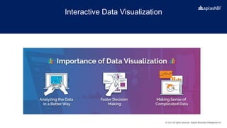
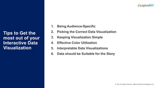
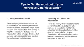
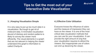
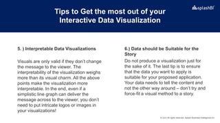
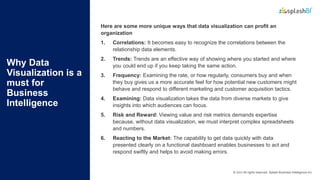
© 2022 All rights reserved, Splash Business Intelligence Inc.
Interactive Data Visualization – A
Must For Understanding BI!
© 2022 All rights reserved, Splash Business Intelligence Inc.
Agenda
1
2
3
What is Interactive Data Visualization?
Tips to Get the most out of your Interactive Data
Visualization
Why Data Visualization is a must for Business Intelligence
4 Explore SplashBI’s innovative charts & dashboards
© 2022 All rights reserved, Splash Business Intelligence Inc.
What is
Interactive
Data
Visualization?
Interactive data visualization facilitates data exploration via manipulating chart
images. The color, brightness, shape, and size of visual objects represent the
features of the dataset being analyzed. These products provide a collection of
visualization alternatives beyond pie, bar, and line charts. These tools allow
users to interpret the data by interacting with a visual illustration of it.
Interactive data visualization makes it more comfortable for the readers to
comprehend information when displayed visually. It enables you to control
business processes in real-time, which can be helpful if you face problems that
need to be fixed ASAP. Finally, users can select a specific data set or metric
and examine it closely to understand particular elements within the report
better.
© 2022 All rights reserved, Splash Business Intelligence Inc.
Interactive Data Visualization
© 2022 All rights reserved, Splash Business Intelligence Inc.
Tips to Get the
most out of your
Interactive Data
Visualization
1. Being Audience-Specific
2. Picking the Correct Data Visualization
3. Keeping Visualization Simple
4. Effective Color Utilization
5. Interpretable Data Visualizations
6. Data should be Suitable for the Story
© 2022 All rights reserved, Splash Business Intelligence Inc.
Tips to Get the most out of your
Interactive Data Visualization
While designing data visualizations, it is
crucial to know the necessity of the chart
and the audience. These two things alone
can take your visualization from nothing to
insights. This assures that you build a
visualization with a strategic direction that
answers a precise question and one that
the audience can quickly grasp.
There is a variety of visualization graphs
and charts out there. But picking the
right one is essential to highlight the
critical trend in the data efficiently. Also,
picking the correct chart for your
visualization will ensure the information
is easy to understand and the viewers
are drawn to your work.
2.) Picking the Correct Data
Visualization
1. ) Being Audience-Specific
© 2022 All rights reserved, Splash Business Intelligence Inc.
Tips to Get the most out of your
Interactive Data Visualization
It is very easy to put up too much data in a
visualization. But tough to get rid of
irrelevant data. A minimalist visualization
devoid of distress and random patterns is
likely to convey the viewer more
efficiently. The visual elements in a graph
that are not relevant in helping the viewer
understand the graph’s information is
called Chartjunk.
Everyone knows the influence of colors
and the measure of impression they can
have on the viewer. It is one of the most
critical data visualization methods that
you can use for your visualization. It can
provide the right amount of zing that
your visualization requires to attract the
viewers. But inappropriate use of colors
can end up deceiving the viewer.
4.) Effective Color Utilization
3. ) Keeping Visualization Simple
© 2022 All rights reserved, Splash Business Intelligence Inc.
Tips to Get the most out of your
Interactive Data Visualization
Visuals are only valid if they don’t change
the message to the viewer. The
interpretability of the visualization weighs
more than its visual charm. All the above
points make the visualization more
interpretable. In the end, even if a
simplistic line graph can deliver the
message across to the viewer, you don’t
need to put intricate logos or images in
your visualizations!
Do not produce a visualization just for
the sake of it. The last tip is to ensure
that the data you want to apply is
suitable for your proposed application.
Your data needs to tell the content and
not the other way around – don’t try and
force-fit a visual method to a story.
6.) Data should be Suitable for the
Story
5. ) Interpretable Data Visualizations
© 2022 All rights reserved, Splash Business Intelligence Inc.
Why Data
Visualization is a
must for
Business
Intelligence
Here are some more unique ways that data visualization can profit an
organization
1. Correlations: It becomes easy to recognize the correlations between the
relationship data elements.
2. Trends: Trends are an effective way of showing where you started and where
you could end up if you keep taking the same action.
3. Frequency: Examining the rate, or how regularly, consumers buy and when
they buy gives us a more accurate feel for how potential new customers might
behave and respond to different marketing and customer acquisition tactics.
4. Examining: Data visualization takes the data from diverse markets to give
insights into which audiences can focus.
5. Risk and Reward: Viewing value and risk metrics demands expertise
because, without data visualization, we must interpret complex spreadsheets
and numbers.
6. Reacting to the Market: The capability to get data quickly with data
presented clearly on a functional dashboard enables businesses to act and
respond swiftly and helps to avoid making errors.
© 2022 All rights reserved, Splash Business Intelligence Inc.
Explore SplashBI’s Innovative Charts
& Dashboards
With over 100 chart types and interactive dashboards, you
can see what you need when you need to see it. Improve
visibility into your organization and leverage hidden patterns
within your company’s data to make impactful data-driven
decisions.
Our Interactive Data Visualizations Bring You:
•Customizable Parameters
•Interactive Dashboards
•Visual Composer
•Drill Down
Read the complete blog to
learn more about
Interactive Data Visualization
© 2022 All rights reserved, Splash Business Intelligence Inc.
United States (HQ)
3079 Peachtree Industrial Blvd.
Duluth, GA 30097 , USA
Ph: +1 678-248-5756.
Europe/Middle East/Africa
Unit no 43 Sussex Innovation Centre,
Sussex University,
Brighton, England BN1 9SB
Ph: +44 (0) 7775 653956
India
H.NO. 17-1-383/M/31, Vinay Nagar
Colony, Saidabad, Hyderabad, Telangana
500059, India
Ph: +1 678-248-5756.

Interactive Data Visualization.pptx

  • 1.
    © 2022 Allrights reserved, Splash Business Intelligence Inc. Interactive Data Visualization – A Must For Understanding BI!
  • 2.
    © 2022 Allrights reserved, Splash Business Intelligence Inc. Agenda 1 2 3 What is Interactive Data Visualization? Tips to Get the most out of your Interactive Data Visualization Why Data Visualization is a must for Business Intelligence 4 Explore SplashBI’s innovative charts & dashboards
  • 3.
    © 2022 Allrights reserved, Splash Business Intelligence Inc. What is Interactive Data Visualization? Interactive data visualization facilitates data exploration via manipulating chart images. The color, brightness, shape, and size of visual objects represent the features of the dataset being analyzed. These products provide a collection of visualization alternatives beyond pie, bar, and line charts. These tools allow users to interpret the data by interacting with a visual illustration of it. Interactive data visualization makes it more comfortable for the readers to comprehend information when displayed visually. It enables you to control business processes in real-time, which can be helpful if you face problems that need to be fixed ASAP. Finally, users can select a specific data set or metric and examine it closely to understand particular elements within the report better.
  • 4.
    © 2022 Allrights reserved, Splash Business Intelligence Inc. Interactive Data Visualization
  • 5.
    © 2022 Allrights reserved, Splash Business Intelligence Inc. Tips to Get the most out of your Interactive Data Visualization 1. Being Audience-Specific 2. Picking the Correct Data Visualization 3. Keeping Visualization Simple 4. Effective Color Utilization 5. Interpretable Data Visualizations 6. Data should be Suitable for the Story
  • 6.
    © 2022 Allrights reserved, Splash Business Intelligence Inc. Tips to Get the most out of your Interactive Data Visualization While designing data visualizations, it is crucial to know the necessity of the chart and the audience. These two things alone can take your visualization from nothing to insights. This assures that you build a visualization with a strategic direction that answers a precise question and one that the audience can quickly grasp. There is a variety of visualization graphs and charts out there. But picking the right one is essential to highlight the critical trend in the data efficiently. Also, picking the correct chart for your visualization will ensure the information is easy to understand and the viewers are drawn to your work. 2.) Picking the Correct Data Visualization 1. ) Being Audience-Specific
  • 7.
    © 2022 Allrights reserved, Splash Business Intelligence Inc. Tips to Get the most out of your Interactive Data Visualization It is very easy to put up too much data in a visualization. But tough to get rid of irrelevant data. A minimalist visualization devoid of distress and random patterns is likely to convey the viewer more efficiently. The visual elements in a graph that are not relevant in helping the viewer understand the graph’s information is called Chartjunk. Everyone knows the influence of colors and the measure of impression they can have on the viewer. It is one of the most critical data visualization methods that you can use for your visualization. It can provide the right amount of zing that your visualization requires to attract the viewers. But inappropriate use of colors can end up deceiving the viewer. 4.) Effective Color Utilization 3. ) Keeping Visualization Simple
  • 8.
    © 2022 Allrights reserved, Splash Business Intelligence Inc. Tips to Get the most out of your Interactive Data Visualization Visuals are only valid if they don’t change the message to the viewer. The interpretability of the visualization weighs more than its visual charm. All the above points make the visualization more interpretable. In the end, even if a simplistic line graph can deliver the message across to the viewer, you don’t need to put intricate logos or images in your visualizations! Do not produce a visualization just for the sake of it. The last tip is to ensure that the data you want to apply is suitable for your proposed application. Your data needs to tell the content and not the other way around – don’t try and force-fit a visual method to a story. 6.) Data should be Suitable for the Story 5. ) Interpretable Data Visualizations
  • 9.
    © 2022 Allrights reserved, Splash Business Intelligence Inc. Why Data Visualization is a must for Business Intelligence Here are some more unique ways that data visualization can profit an organization 1. Correlations: It becomes easy to recognize the correlations between the relationship data elements. 2. Trends: Trends are an effective way of showing where you started and where you could end up if you keep taking the same action. 3. Frequency: Examining the rate, or how regularly, consumers buy and when they buy gives us a more accurate feel for how potential new customers might behave and respond to different marketing and customer acquisition tactics. 4. Examining: Data visualization takes the data from diverse markets to give insights into which audiences can focus. 5. Risk and Reward: Viewing value and risk metrics demands expertise because, without data visualization, we must interpret complex spreadsheets and numbers. 6. Reacting to the Market: The capability to get data quickly with data presented clearly on a functional dashboard enables businesses to act and respond swiftly and helps to avoid making errors.
  • 10.
    © 2022 Allrights reserved, Splash Business Intelligence Inc. Explore SplashBI’s Innovative Charts & Dashboards With over 100 chart types and interactive dashboards, you can see what you need when you need to see it. Improve visibility into your organization and leverage hidden patterns within your company’s data to make impactful data-driven decisions. Our Interactive Data Visualizations Bring You: •Customizable Parameters •Interactive Dashboards •Visual Composer •Drill Down Read the complete blog to learn more about Interactive Data Visualization
  • 11.
    © 2022 Allrights reserved, Splash Business Intelligence Inc. United States (HQ) 3079 Peachtree Industrial Blvd. Duluth, GA 30097 , USA Ph: +1 678-248-5756. Europe/Middle East/Africa Unit no 43 Sussex Innovation Centre, Sussex University, Brighton, England BN1 9SB Ph: +44 (0) 7775 653956 India H.NO. 17-1-383/M/31, Vinay Nagar Colony, Saidabad, Hyderabad, Telangana 500059, India Ph: +1 678-248-5756.