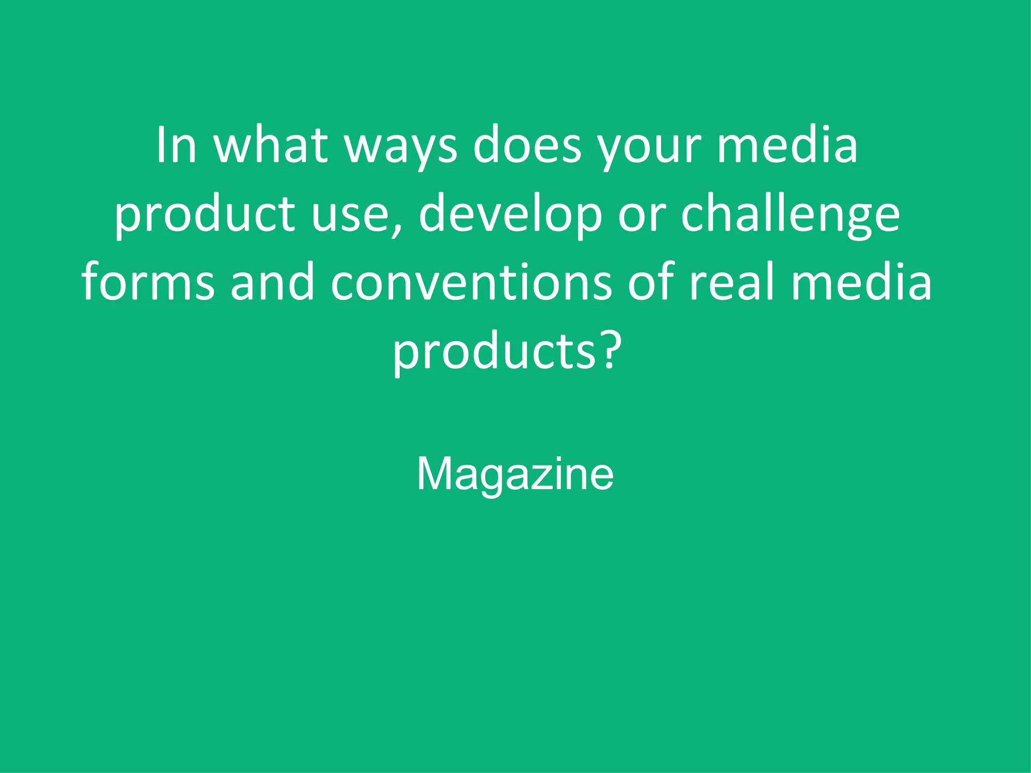
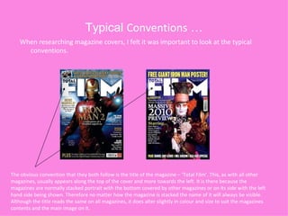
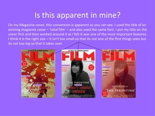
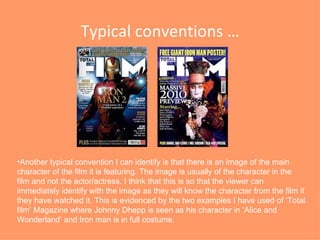
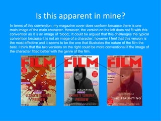
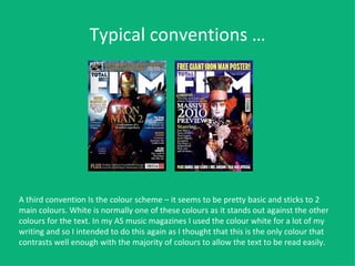
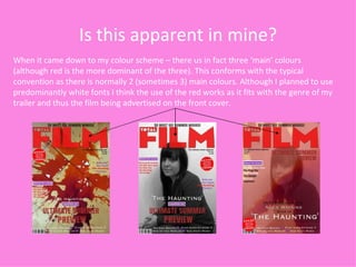
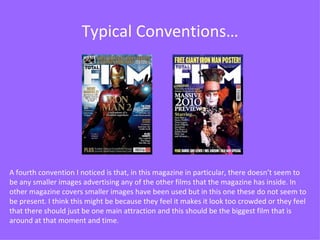
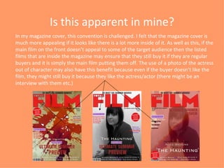
1. In what ways does your media product use, develop or challenge forms and conventions of real media products? Magazine
2.
3. Is this apparent in mine? On my Magazine cover, this convention is apparent as you can see. I used the title of an existing magazine cover – ‘total film’ – and also used the same font. I put my title on the cover first and then worked around it as I felt it was one of the most important features. I think it is the right size – it isn't too small so that its not one of the first things seen but its not too big so that it takes over.
4.
5. Is this apparent in mine? In terms of this convention, my magazine cover does conform because there is one main image of the main character. However, the version on the left does not fit with this convention as it is an image of ‘blood;. It could be argued that this challenges the typical convention because it is not an image of a character; however I feel that this version is the most effective and it seems to be the one that illustrates the nature of the film the best. I think that the two versions on the right could be more conventional if the image of the character fitted better with the genre of the film.
6. Typical conventions … A third convention Is the colour scheme – it seems to be pretty basic and sticks to 2 main colours. White is normally one of these colours as it stands out against the other colours for the text. In my AS music magazines I used the colour white for a lot of my writing and so I intended to do this again as I thought that this is the only colour that contrasts well enough with the majority of colours to allow the text to be read easily.
7. Is this apparent in mine? When it came down to my colour scheme – there us in fact three ‘main’ colours (although red is the more dominant of the three). This conforms with the typical convention as there is normally 2 (sometimes 3) main colours. Although I planned to use predominantly white fonts I think the use of the red works as it fits with the genre of my trailer and thus the film being advertised on the front cover.
8. Typical Conventions… A fourth convention I noticed is that, in this magazine in particular, there doesn’t seem to be any smaller images advertising any of the other films that the magazine has inside. In other magazine covers smaller images have been used but in this one these do not seem to be present. I think this might be because they feel it makes it look too crowded or they feel that there should just be one main attraction and this should be the biggest film that is around at that moment and time.
9. Is this apparent in mine? In my magazine cover, this convention is challenged. I felt that the magazine cover is much more appealing if it looks like there is a lot more inside of it. As well as this, if the main film on the front doesn’t appeal to some of the target audience then the listed films that are inside the magazine may ensure that they still buy it if they are regular buyers and it is simply the main film putting them off. The use of a photo of the actress out of character may also have this benefit because even if the buyer doesn’t like the film, they might still buy it because they like the actress/actor (there might be an interview with them etc.)