This is Emily's answer to the first question of our evaluation for our music magazine. The question is, "In what way does your media product use, develop or challenge codes and conventions of real media products?".
My magazine analysis for my A-Level Media Blog. I have analysed two Music magazines, Metal Hammer and Kerrang, I chose both of these magazines because my magazine will be focused on the same genre of music as these and both of the main articles were Slipknot.
Similar to Codes and Conventions of Film Magazines-2.pptx (20)
How to Split Bills in the Odoo 17 POS ModuleCeline George
Bills have a main role in point of sale procedure. It will help to track sales, handling payments and giving receipts to customers. Bill splitting also has an important role in POS. For example, If some friends come together for dinner and if they want to divide the bill then it is possible by POS bill splitting. This slide will show how to split bills in odoo 17 POS.
Welcome to TechSoup New Member Orientation and Q&A (May 2024).pdfTechSoup
In this webinar you will learn how your organization can access TechSoup's wide variety of product discount and donation programs. From hardware to software, we'll give you a tour of the tools available to help your nonprofit with productivity, collaboration, financial management, donor tracking, security, and more.
Model Attribute Check Company Auto PropertyCeline George
In Odoo, the multi-company feature allows you to manage multiple companies within a single Odoo database instance. Each company can have its own configurations while still sharing common resources such as products, customers, and suppliers.
This is a presentation by Dada Robert in a Your Skill Boost masterclass organised by the Excellence Foundation for South Sudan (EFSS) on Saturday, the 25th and Sunday, the 26th of May 2024.
He discussed the concept of quality improvement, emphasizing its applicability to various aspects of life, including personal, project, and program improvements. He defined quality as doing the right thing at the right time in the right way to achieve the best possible results and discussed the concept of the "gap" between what we know and what we do, and how this gap represents the areas we need to improve. He explained the scientific approach to quality improvement, which involves systematic performance analysis, testing and learning, and implementing change ideas. He also highlighted the importance of client focus and a team approach to quality improvement.
2024.06.01 Introducing a competency framework for languag learning materials ...Sandy Millin
http://sandymillin.wordpress.com/iateflwebinar2024
Published classroom materials form the basis of syllabuses, drive teacher professional development, and have a potentially huge influence on learners, teachers and education systems. All teachers also create their own materials, whether a few sentences on a blackboard, a highly-structured fully-realised online course, or anything in between. Despite this, the knowledge and skills needed to create effective language learning materials are rarely part of teacher training, and are mostly learnt by trial and error.
Knowledge and skills frameworks, generally called competency frameworks, for ELT teachers, trainers and managers have existed for a few years now. However, until I created one for my MA dissertation, there wasn’t one drawing together what we need to know and do to be able to effectively produce language learning materials.
This webinar will introduce you to my framework, highlighting the key competencies I identified from my research. It will also show how anybody involved in language teaching (any language, not just English!), teacher training, managing schools or developing language learning materials can benefit from using the framework.
Read| The latest issue of The Challenger is here! We are thrilled to announce that our school paper has qualified for the NATIONAL SCHOOLS PRESS CONFERENCE (NSPC) 2024. Thank you for your unwavering support and trust. Dive into the stories that made us stand out!
Ethnobotany and Ethnopharmacology:
Ethnobotany in herbal drug evaluation,
Impact of Ethnobotany in traditional medicine,
New development in herbals,
Bio-prospecting tools for drug discovery,
Role of Ethnopharmacology in drug evaluation,
Reverse Pharmacology.
Operation “Blue Star” is the only event in the history of Independent India where the state went into war with its own people. Even after about 40 years it is not clear if it was culmination of states anger over people of the region, a political game of power or start of dictatorial chapter in the democratic setup.
The people of Punjab felt alienated from main stream due to denial of their just demands during a long democratic struggle since independence. As it happen all over the word, it led to militant struggle with great loss of lives of military, police and civilian personnel. Killing of Indira Gandhi and massacre of innocent Sikhs in Delhi and other India cities was also associated with this movement.
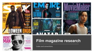
3. Codes and Conventions
Masthead - the title of the magazine. Printed in large, bold type, usually positioned at the top of the page and fills the width of the
cover, ensuring the brand is instantly recognisable.
Cover image – dominates the page and often is placed in front of the masthead, usually of main characters but sometimes
features other characters in the background. Types of shots – close ups or mid shots are normally used
Box outs – colored box around text, to make it stand out
Sell lines and Secondary leads – state what other content is in the magazine. Are also sometimes used for promoting competitions
of free gifts with the magazine.
Tagline - a short text which is designed with a form of dramatic effect. Many tagline slogans are reiterated phrases associated with
an individual, social group, or product. Sometimes can be altered to link with the film.
Colours – primary colours are often used because they are bold yet simple. Graphics and colours also often change depending on
the featured film e.g different genres.
Date, price, website and issue number - usually placed out of the way and in small text under the masthead, sometimes near the
barcode and close together. These are important for the audience so readers know if they're issue is up to date, where they can go
for online exclusives and how much they are paying.
5. Analysis
Masthead – bold distinctive red
font that is specific to Empire
magazines front covers.
Tagline – small text,
underneath the masthead
which is a typical
convention for magazines
Main story – links to the cover
image, in a bold font and a
different colour to the other
secondary leads, making it stand
out more.
Secondary leads – with the
more interesting stories in
slightly bigger text size because
they would be more intriguing
to readers
Date and price Weblink
Barcode – placed at the edge of the cover in the
corner because it is not appealing and
shouldn't distract from the film and rest of the
cover
Main image - features main character
and well-known actor,
Hugh Jackman which would also attract
fans of him. The camera angle seems to
be slightly below wolverine, making it
seem like he is above us and more
powerful/strong than the average
human.
Background – the main image has been
edited onto this dramatic background to fit
the genre of the film
Colours – there are few colours, and they
are blended well together, apart from the
masthead which is designed to stand out
7. § Layout – usually is across a double page spread,
includes 2 columns of contents down the left of the
page and on the other side is a large image on one
page, and on the other page there are several smaller
images in a line going down and one more column
of contents.
§ Colours – The colour schemes usually match the
front covers. White background so that the
darker text stands out. Main headings and page
numbers are in red because they are most important
and the titles next to each page number are in a bold,
black font.
§ Images - on the right next to the text is a large
image, spreading across both pages, that links to the
front cover, it dominates the page and is usually a
mid-shot of the same character shown on the cover.
There is also always a cut out image of a different
character from a different film/series at the bottom of
the columns on the left, with a page number next to it
with white text against a black background in a
circle to stand out.
§ Page numbers on/next to every image. The
§ Typography – the subheadings are in a sans-
serif, bold, cartoony type font , all titles/sub-
headings are in bold.
Codes and Conventions of Total Film
magazines contents pages
8. Analysi
s
Masthead/title - a
bold, serif font in
black which stands out
against the pages
white background
Images – there is representation of men
and women, a specific gender demographic
isn't targeted for their readers. All the
images have a page number on or next to
and the main image of john wick includes a
short caption
The largest image is a medium close-
up that uses shallow focus, it
spreads across and dominates both
pages. This image links to the front
cover which is also of John Wick,
showing that this will be the main
feature of this magazine.
Above the title is the
issue number and
the date. There is also
a small picture of the
front cover of that
issue
Language – the
writers use a
colloquial tone
throughout
which adds
authenticity
and allows
readers to
engage more
as it's fun and
easier to read.
Separate columns,
two on one page and
one on the other
which improves the
readability and allows
there to be more
room for the pictures
There is weblink asking readers to subscribe and
another one which is the magazines actual website.
The date and magazine
name in the corner
Sublines under
headings on
articles
9. Analysis
Picture of the front
cover of the issue
underneath the title
more columns in one
place because there's
not a large picture
separating them
Promotions
to look at
their online
version
Almost all
included images
are at the top of
the page
Images that vary in
size and shape
relating to different
articles and they all
have page numbers
on them
§ This has most of the
same codes conventions
as the previous
contents page
§ However, it has a slightly
different layout as this
style is only across
one page
Striped border
around the page
Small cut out image
that looks like a
sticker, with a short
caption beside it
telling readers about
that article and the
page number