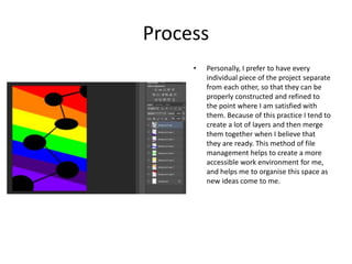
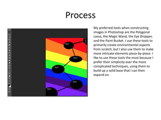
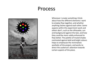
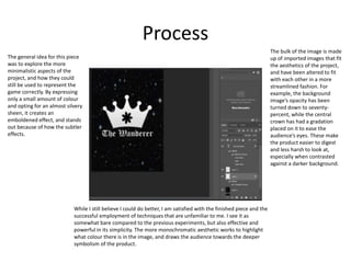
Experiments
Your Name
Process
• Personally, I prefer to have every
individual piece of the project separate
from each other, so that they can be
properly constructed and refined to
the point where I am satisfied with
them. Because of this practice I tend to
create a lot of layers and then merge
them together when I believe that
they are ready. This method of file
management helps to create a more
accessible work environment for me,
and helps me to organise this space as
new ideas come to me.
Process
My preferred tools when constructing
images in Photoshop are the Polygonal
Lasso, the Magic Wand, the Eye Dropper,
and the Paint Bucket. I use these tools to
primarily create environmental aspects
from scratch, but I also use them to make
more intricate elements piece-by-piece. I
like to use these tools the most because I
prefer their simplicity over the more
complicated techniques, using them to
build up a solid base that I can then
expand on.
Process
Whenever I create something I think
about how the different elements I want
to employ flow together, and whether
anything clashes against each other. Some
aspects within this experiment work and
others don’t, such as the silhouette, sun
and background against the text, and how
they could be more subtly enhanced to
flow better. The palette of muted shades
contrasted against bold and bright colours
helps to emphasize the minimalistic
aesthetic of the project, and works to
direct the audience’s attention towards
certain aspects of the piece.
Process
While I still believe I could do better, I am satisfied with the finished piece and the
successful employment of techniques that are unfamiliar to me. I see it as
somewhat bare compared to the previous experiments, but also effective and
powerful in its simplicity. The more monochromatic aesthetic works to highlight
what colour there is in the image, and draws the audience towards the deeper
symbolism of the product.
The bulk of the image is made
up of imported images that fit
the aesthetics of the project,
and have been altered to fit
with each other in a more
streamlined fashion. For
example, the background
image’s opacity has been
turned down to seventy-
percent, while the central
crown has had a gradation
placed on it to ease the
audience’s eyes. These make
the product easier to digest
and less harsh to look at,
especially when contrasted
against a darker background.
The general idea for this piece
was to explore the more
minimalistic aspects of the
project, and how they could
still be used to represent the
game correctly. By expressing
only a small amount of colour
and opting for an almost silvery
sheen, it creates an
emboldened effect, and stands
out because of how the subtler
effects.
Reflection
• What elements of your experiments will you
include in your final product?
• I believe that overall style of the project has been accurately nailed down, with
primarily grey tones contrasted against small patches of colour, and overlaid with
patterns to highlight an individual aspect of the piece.
• I think that things to avoid would be overwhelming the audience with too much
vibrancy, as it would clash against the aesthetics and come off as gaudy.

4. production experiments(1)

  • 1.
  • 2.
    Process • Personally, Iprefer to have every individual piece of the project separate from each other, so that they can be properly constructed and refined to the point where I am satisfied with them. Because of this practice I tend to create a lot of layers and then merge them together when I believe that they are ready. This method of file management helps to create a more accessible work environment for me, and helps me to organise this space as new ideas come to me.
  • 3.
    Process My preferred toolswhen constructing images in Photoshop are the Polygonal Lasso, the Magic Wand, the Eye Dropper, and the Paint Bucket. I use these tools to primarily create environmental aspects from scratch, but I also use them to make more intricate elements piece-by-piece. I like to use these tools the most because I prefer their simplicity over the more complicated techniques, using them to build up a solid base that I can then expand on.
  • 4.
    Process Whenever I createsomething I think about how the different elements I want to employ flow together, and whether anything clashes against each other. Some aspects within this experiment work and others don’t, such as the silhouette, sun and background against the text, and how they could be more subtly enhanced to flow better. The palette of muted shades contrasted against bold and bright colours helps to emphasize the minimalistic aesthetic of the project, and works to direct the audience’s attention towards certain aspects of the piece.
  • 5.
    Process While I stillbelieve I could do better, I am satisfied with the finished piece and the successful employment of techniques that are unfamiliar to me. I see it as somewhat bare compared to the previous experiments, but also effective and powerful in its simplicity. The more monochromatic aesthetic works to highlight what colour there is in the image, and draws the audience towards the deeper symbolism of the product. The bulk of the image is made up of imported images that fit the aesthetics of the project, and have been altered to fit with each other in a more streamlined fashion. For example, the background image’s opacity has been turned down to seventy- percent, while the central crown has had a gradation placed on it to ease the audience’s eyes. These make the product easier to digest and less harsh to look at, especially when contrasted against a darker background. The general idea for this piece was to explore the more minimalistic aspects of the project, and how they could still be used to represent the game correctly. By expressing only a small amount of colour and opting for an almost silvery sheen, it creates an emboldened effect, and stands out because of how the subtler effects.
  • 6.
    Reflection • What elementsof your experiments will you include in your final product? • I believe that overall style of the project has been accurately nailed down, with primarily grey tones contrasted against small patches of colour, and overlaid with patterns to highlight an individual aspect of the piece. • I think that things to avoid would be overwhelming the audience with too much vibrancy, as it would clash against the aesthetics and come off as gaudy.

Editor's Notes

  • #3 Discuss the tools and processes used in your experiments
  • #4 Discuss the tools and processes used in your experiments