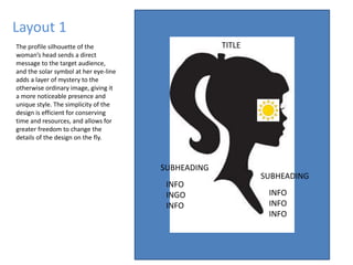
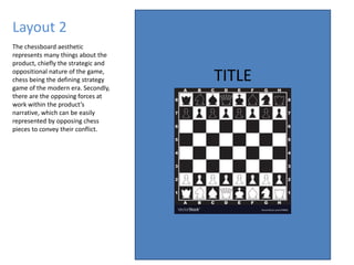
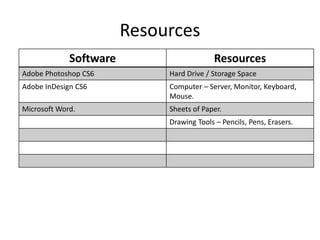
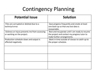
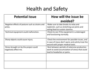
Pre-Production
Style sheet
This colour scheme highlights the contrast between light and dark tones, and establishes
the wide array of individual themes related to each in-game faction alignment, as well as
the overall desolate atmosphere. The juxtaposition between these two aesthetics creates
a unique and vibrant concept rife with potential, which could be further developed either
stylistically or narratively.
The fonts I have selected for the
project were chosen because of their
elegance, boldness, and edge
respectively. These mesh well with the
themes of the game, symbolising
sophistication, brutality, and
ruthlessness. Furthermore, they are
subtle and simplistic, and should
highlight the image rather than
distract from it.
Style sheet
I chose this font to be the main title piece of the project, as it is bold yet fluid,
which is a unique and often mishandled combination that stands out to the
audience. The font itself is thick, but doesn’t adhere to the commonality of
becoming blocky or obstructing, and is slightly slanted to achieve a more even
ratio between vertical and horizontal length.
This font was chosen because it exemplified what I believe to be a very natural yet
stylized form of handwriting, which conveys a more intimate and personal
atmosphere than a more technical font would. This represents the individualized
and choice-based narrative of the product, which can only progress based on the
user’s actions.
Thin, calculated, and edgy to the point it’s almost uncomfortable to look at,
this font was chosen to offset the fluid curves of the previous two, and to
widen the scope of the product’s thematic repertoire. This font contrasts and
therefore enhances the others, redirecting the focus around in an almost
circular pattern.
Colours
The colour black is used to convey
themes of a dark and mature
nature, often involving illegal or
taboo activities.
Grey is used to represent
stillness and stasis, or to
otherwise give depth to the
more mundane aspects of life.
White is often representative of
purity or innocence, and in
general things that have been
unspoiled by the world.
Synonymous with high-intensity
themes, like passion and violence, yet
also associated with deep emotional
connections.
Used to represent the lighter
aspects of the natural world, such
as the sun and the desert, and is
often linked with the earth.
Most often used to visualize
extremely positive themes like joy
and celebration, and is very rarely
used in somber contexts.
Representative of deep natural themes
and growth of all kinds, whether that
be physical or emotional, as well as
more organic environments.
A calm and peaceful colour, blue is
often linked with clear-headedness
and wisdom, but also distance and
isolation.
Indigo is an often negatively-aligned
colour, used to signalize darkness
and sorrow, with an oft-maligned
reputation.
The violet spectrum has a wide
breadth of meanings, including high
status, the unknown and mysterious,
and even mastery of a certain craft.
Layout 1
The profile silhouette of the
woman’s head sends a direct
message to the target audience,
and the solar symbol at her eye-line
adds a layer of mystery to the
otherwise ordinary image, giving it
a more noticeable presence and
unique style. The simplicity of the
design is efficient for conserving
time and resources, and allows for
greater freedom to change the
details of the design on the fly.
TITLE
SUBHEADING
SUBHEADING
INFO
INGO
INFO
INFO
INFO
INFO
Layout 2
TITLE
The chessboard aesthetic
represents many things about the
product, chiefly the strategic and
oppositional nature of the game,
chess being the defining strategy
game of the modern era. Secondly,
there are the opposing forces at
work within the product’s
narrative, which can be easily
represented by opposing chess
pieces to convey their conflict.
Resources
Software Resources
Adobe Photoshop CS6 Hard Drive / Storage Space
Adobe InDesign CS6 Computer – Server, Monitor, Keyboard,
Mouse.
Microsoft Word. Sheets of Paper.
Drawing Tools – Pencils, Pens, Erasers.
Contingency Planning
Potential Issue Solution
Files are corrupted or deleted due to a
technical error.
Save progress frequently and create at least
one back-up so that any lost data is
recoverable.
Sickness or injury prevents me from accessing
or working on the project.
Rest and recuperate until I am ready to resume
the project and contact my progress tutor to
make further arrangements.
Production schedule slows and output is
affected negatively.
Work in time outside of classes to catch up to
the proper schedule.
Health and Safety
Potential Issue How will the issue be
avoided?
Negative effects of posture such as strains and
aches.
Make sure to take breaks to relax and
replenish, such as stretching out joints and
eating food to sustain stamina.
Technical equipment could malfunction. Check to see if the equipment is undamaged
and functioning normally.
Sharp objects could cause injury. Check the environment for possible issues, and
in case of injury don’t panic and calmly treat the
wound with proper medical tools.
Stress brought on by the project could
negatively effect me.
Rest between periods of extensive production
work to avoid accumulation of stress that could
lead to headaches or pains.

5. pre production

  • 1.
  • 2.
    Style sheet This colourscheme highlights the contrast between light and dark tones, and establishes the wide array of individual themes related to each in-game faction alignment, as well as the overall desolate atmosphere. The juxtaposition between these two aesthetics creates a unique and vibrant concept rife with potential, which could be further developed either stylistically or narratively. The fonts I have selected for the project were chosen because of their elegance, boldness, and edge respectively. These mesh well with the themes of the game, symbolising sophistication, brutality, and ruthlessness. Furthermore, they are subtle and simplistic, and should highlight the image rather than distract from it.
  • 3.
    Style sheet I chosethis font to be the main title piece of the project, as it is bold yet fluid, which is a unique and often mishandled combination that stands out to the audience. The font itself is thick, but doesn’t adhere to the commonality of becoming blocky or obstructing, and is slightly slanted to achieve a more even ratio between vertical and horizontal length. This font was chosen because it exemplified what I believe to be a very natural yet stylized form of handwriting, which conveys a more intimate and personal atmosphere than a more technical font would. This represents the individualized and choice-based narrative of the product, which can only progress based on the user’s actions. Thin, calculated, and edgy to the point it’s almost uncomfortable to look at, this font was chosen to offset the fluid curves of the previous two, and to widen the scope of the product’s thematic repertoire. This font contrasts and therefore enhances the others, redirecting the focus around in an almost circular pattern.
  • 4.
    Colours The colour blackis used to convey themes of a dark and mature nature, often involving illegal or taboo activities. Grey is used to represent stillness and stasis, or to otherwise give depth to the more mundane aspects of life. White is often representative of purity or innocence, and in general things that have been unspoiled by the world. Synonymous with high-intensity themes, like passion and violence, yet also associated with deep emotional connections. Used to represent the lighter aspects of the natural world, such as the sun and the desert, and is often linked with the earth. Most often used to visualize extremely positive themes like joy and celebration, and is very rarely used in somber contexts. Representative of deep natural themes and growth of all kinds, whether that be physical or emotional, as well as more organic environments. A calm and peaceful colour, blue is often linked with clear-headedness and wisdom, but also distance and isolation. Indigo is an often negatively-aligned colour, used to signalize darkness and sorrow, with an oft-maligned reputation. The violet spectrum has a wide breadth of meanings, including high status, the unknown and mysterious, and even mastery of a certain craft.
  • 5.
    Layout 1 The profilesilhouette of the woman’s head sends a direct message to the target audience, and the solar symbol at her eye-line adds a layer of mystery to the otherwise ordinary image, giving it a more noticeable presence and unique style. The simplicity of the design is efficient for conserving time and resources, and allows for greater freedom to change the details of the design on the fly. TITLE SUBHEADING SUBHEADING INFO INGO INFO INFO INFO INFO
  • 6.
    Layout 2 TITLE The chessboardaesthetic represents many things about the product, chiefly the strategic and oppositional nature of the game, chess being the defining strategy game of the modern era. Secondly, there are the opposing forces at work within the product’s narrative, which can be easily represented by opposing chess pieces to convey their conflict.
  • 7.
    Resources Software Resources Adobe PhotoshopCS6 Hard Drive / Storage Space Adobe InDesign CS6 Computer – Server, Monitor, Keyboard, Mouse. Microsoft Word. Sheets of Paper. Drawing Tools – Pencils, Pens, Erasers.
  • 8.
    Contingency Planning Potential IssueSolution Files are corrupted or deleted due to a technical error. Save progress frequently and create at least one back-up so that any lost data is recoverable. Sickness or injury prevents me from accessing or working on the project. Rest and recuperate until I am ready to resume the project and contact my progress tutor to make further arrangements. Production schedule slows and output is affected negatively. Work in time outside of classes to catch up to the proper schedule.
  • 9.
    Health and Safety PotentialIssue How will the issue be avoided? Negative effects of posture such as strains and aches. Make sure to take breaks to relax and replenish, such as stretching out joints and eating food to sustain stamina. Technical equipment could malfunction. Check to see if the equipment is undamaged and functioning normally. Sharp objects could cause injury. Check the environment for possible issues, and in case of injury don’t panic and calmly treat the wound with proper medical tools. Stress brought on by the project could negatively effect me. Rest between periods of extensive production work to avoid accumulation of stress that could lead to headaches or pains.

Editor's Notes

  • #3 Explore colours, fonts and image styles similar to what you want to produce. Discuss all three elements in relation to why you chose them and where you may use them in your project. Go over as many pages as you need to
  • #4 Explore colours, fonts and image styles similar to what you want to produce. Discuss all three elements in relation to why you chose them and where you may use them in your project. Go over as many pages as you need to
  • #5 Explore colours, fonts and image styles similar to what you want to produce. Discuss all three elements in relation to why you chose them and where you may use them in your project. Go over as many pages as you need to
  • #6 Mock up of a potential design using the colours and fonts established in your style sheet and sourced images Alter this slide to make it appropriate for your planned product types. Add further layout slides to create at least one for each product you plan to make.
  • #7 Mock up of a potential design using the colours and fonts established in your style sheet and sourced images. Alter this slide to make it appropriate for your planned product types. Add further layout slides to create at least one for each product you plan to make.