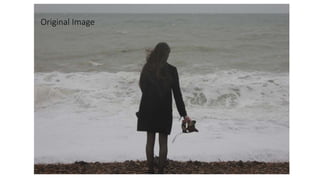
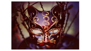
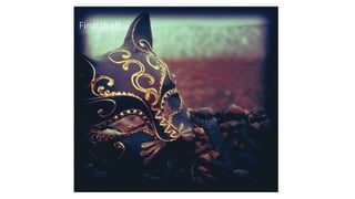
Original Image
First draft
First draft
I began to edit the original image in photoshop. I did not do anything
that drastic to the image as I simply enhanced features such as the
contrast, brightness and saturation. This was so the image was clearer
and so I could start to visualise what I wanted to advert to look like.
Seeing as the image is quite simple, I knew this brief image editing was
not going to be enough, however photoshop was still very new to me
and I was aware I would have to experiment with the image. I wanted
to enhance the overall image and make the top two corners darker as
they are very plain.
Final draft
Final draft
After the simplicity of my first image edit, I decided to utilise the tools
provided by photoshop to manipulate my image further. I added many
actions such as old photo, retro vintage and more, and selected the chosen
actions that I liked and I replaced the blue tones with red/purple tones as it
fits with my over all idea and ties into the colour of the mask. I enhanced all
these features by making the contrast and other elements higher to create a
more dramatic effect. The main feature was a gradient overlay which
darkened the corners as it created a diamond effect so the middle of the
image is untouched by the feature, but the edges are darkened. I played
around with this feature many times before I was pleased with the result. I
also added a very subtle inner shadow to create a more defined edge to the
image, however, it very feathered so it is not obvious. I kept darkening the
image to create more of a silhouette of the girl and then lightened up the
foam from the waves as I would be placing text there. I also added a very
slight grainy effect, it is hard to tell but I thought it helped to give it a less
refined look.
Final draft
I decided to change my idea completely and chose and manipulate a
whole new image as I was not happy enough with the original draft. I
chose this new image as I thought it was more dramatic and created a
more continuous line of products rather than feeling so spate to the
digipak. I dramatically altered this image by adding many actions and
constantly changing the brightness, contrast, saturation, colour levels,
hue/saturation and then adding effects to the image. I added an inner
shadow and very light purple colour overlay. I also put a gradient
overlay over the image to make the mask brighter and more central
and the background less focal so I could put readable text over it.
Additionally, I used the dodge and burn tool to make certain sections
such as the masks eye holes and gold swirls brighter and then further
darken the edges of the image. Furthermore, I changed the angle of the
image so the mask was more front on than at an angle.
Original Image
Final draft
Front cover
The original image for my digipak front cover felt quite bland and needed to
stand out more seeing as it is the front cover. I wanted the mask to be a focal
point as it is symbolic of the video and overall message. Firstly I cropped the
hand put of the image and made it the size it needed to be to fit the
specification of the didgipak. I then began to enhance features such as
brightness, contrast, exposure, levels, colour etc. I then added some actions
to give it a more colourful outlook and I began to enhance the gold on the
mask to make it stand out against the less colourful background. I also added
an inner shadow to create a boarder around the image that features out
slightly so it is not too harsh, this was something I did just for the front cover
and I think it makes it look more complete and gives it more of a front cover
effect as it makes it bolder. I added more actions and kept adapting the
brightness, contrast, colour, vibrance, saturation and more until I felt it
looked good enough.
Original Image
Final draft
Back Cover
The back image will have the sing titles and other short information, so
I wanted to have a picture that was not too distracting. I took the image
and heavily contrasted the brighter parts of the image such as the sea
and the mask to draw more attention to these aspects. Moreover, I
added colour overlays and actions to make the sea seem like it was
slightly coloured, as well as darkening up the top and bottom of the
image to focus attention on the middle. I continued with the theme of
purple as it is in the mask and is the main colour scheme for my digipak
and adverts so that they look like a complete set. I made the gold parts
of the mask more vibrant to give the mask a glow and juxtapose it with
the dark colours in the rest of the image. I was always adapting the
colour, contrast, saturation, colour overlays, brightness, exposure,
gamma correction and any other features to get my desired ‘look’.
Original Image
Final draft
This image ties the digipak in with the video as well as incorporating
the concept of love and loss which is a very key feature that filters
through the whole album. I had adjusted the colours and actions to
create the final image. I have not added many over the top features
such as boarders etc. I have kept it simple and added the red/purple
tones to make a coherent digipak. I have added actions such as old
photo and any others and chose the parts of each action that I liked.
Furthermore, I changed the brightness, contrast, colours etc to make
the image seem warm and old, as though it was a photo taken a long
time ago. I wanted to make sure the image seemed warm to follow the
theme of love.
Original Image
Final draft
This is the ‘special thanks’ page and the image is very simple
as I wanted the words on the page to be important. I added a
yellow filter as the image was very blue and didn’t tie in with
the digipak, I changed the contrast multiple times as every
time it did not seem to look how I wanted it. I also adapted
the brightness, saturation, vibrance and colour balance.
Moreover, I added many actions and chose the parts of each
action that I liked the most.
Original Image
Final draft
The original image needed to be very simplistic as I knew it would be a
photo used for background purposes. However, the colours seemed
dull and not vibrant enough on the original, so I knew I had to up the
contract, saturation, colour balance and more quite a lot. Furthermore,
as the CD is placed over the top and image is the same but to make a
clear separation I made the CD white and then lowered the
transparency of the CD, doing this meant the majority of the image was
dulled so I had to make it more vibrant to make up for this. I also added
many actions and would put the image in place on the digipak to see
how it looked and the go back to Photoshop, edit to look better and
kept doing this until I was happy. I also gave the image a boarder as it is
the central image of the three on the digipak and I think it needed it.
Original Image
Final draft
The final Image needed to be quite busy as there would not
be much writing on it, if any. So, I make the image more
contrasted and bright and saturated, whilst added actions and
choosing the parts that I felt worked and looked best. I
brought out the yellow colours in the lights and the red
colours in the mask so that the image matched that of the
others and felt more complete.

Image manipulation 2

  • 3.
  • 4.
  • 5.
    First draft I beganto edit the original image in photoshop. I did not do anything that drastic to the image as I simply enhanced features such as the contrast, brightness and saturation. This was so the image was clearer and so I could start to visualise what I wanted to advert to look like. Seeing as the image is quite simple, I knew this brief image editing was not going to be enough, however photoshop was still very new to me and I was aware I would have to experiment with the image. I wanted to enhance the overall image and make the top two corners darker as they are very plain.
  • 6.
  • 7.
    Final draft After thesimplicity of my first image edit, I decided to utilise the tools provided by photoshop to manipulate my image further. I added many actions such as old photo, retro vintage and more, and selected the chosen actions that I liked and I replaced the blue tones with red/purple tones as it fits with my over all idea and ties into the colour of the mask. I enhanced all these features by making the contrast and other elements higher to create a more dramatic effect. The main feature was a gradient overlay which darkened the corners as it created a diamond effect so the middle of the image is untouched by the feature, but the edges are darkened. I played around with this feature many times before I was pleased with the result. I also added a very subtle inner shadow to create a more defined edge to the image, however, it very feathered so it is not obvious. I kept darkening the image to create more of a silhouette of the girl and then lightened up the foam from the waves as I would be placing text there. I also added a very slight grainy effect, it is hard to tell but I thought it helped to give it a less refined look.
  • 10.
    Final draft I decidedto change my idea completely and chose and manipulate a whole new image as I was not happy enough with the original draft. I chose this new image as I thought it was more dramatic and created a more continuous line of products rather than feeling so spate to the digipak. I dramatically altered this image by adding many actions and constantly changing the brightness, contrast, saturation, colour levels, hue/saturation and then adding effects to the image. I added an inner shadow and very light purple colour overlay. I also put a gradient overlay over the image to make the mask brighter and more central and the background less focal so I could put readable text over it. Additionally, I used the dodge and burn tool to make certain sections such as the masks eye holes and gold swirls brighter and then further darken the edges of the image. Furthermore, I changed the angle of the image so the mask was more front on than at an angle.
  • 12.
  • 13.
  • 14.
    Front cover The originalimage for my digipak front cover felt quite bland and needed to stand out more seeing as it is the front cover. I wanted the mask to be a focal point as it is symbolic of the video and overall message. Firstly I cropped the hand put of the image and made it the size it needed to be to fit the specification of the didgipak. I then began to enhance features such as brightness, contrast, exposure, levels, colour etc. I then added some actions to give it a more colourful outlook and I began to enhance the gold on the mask to make it stand out against the less colourful background. I also added an inner shadow to create a boarder around the image that features out slightly so it is not too harsh, this was something I did just for the front cover and I think it makes it look more complete and gives it more of a front cover effect as it makes it bolder. I added more actions and kept adapting the brightness, contrast, colour, vibrance, saturation and more until I felt it looked good enough.
  • 15.
  • 16.
  • 17.
    Back Cover The backimage will have the sing titles and other short information, so I wanted to have a picture that was not too distracting. I took the image and heavily contrasted the brighter parts of the image such as the sea and the mask to draw more attention to these aspects. Moreover, I added colour overlays and actions to make the sea seem like it was slightly coloured, as well as darkening up the top and bottom of the image to focus attention on the middle. I continued with the theme of purple as it is in the mask and is the main colour scheme for my digipak and adverts so that they look like a complete set. I made the gold parts of the mask more vibrant to give the mask a glow and juxtapose it with the dark colours in the rest of the image. I was always adapting the colour, contrast, saturation, colour overlays, brightness, exposure, gamma correction and any other features to get my desired ‘look’.
  • 18.
  • 19.
  • 20.
    This image tiesthe digipak in with the video as well as incorporating the concept of love and loss which is a very key feature that filters through the whole album. I had adjusted the colours and actions to create the final image. I have not added many over the top features such as boarders etc. I have kept it simple and added the red/purple tones to make a coherent digipak. I have added actions such as old photo and any others and chose the parts of each action that I liked. Furthermore, I changed the brightness, contrast, colours etc to make the image seem warm and old, as though it was a photo taken a long time ago. I wanted to make sure the image seemed warm to follow the theme of love.
  • 21.
  • 22.
  • 23.
    This is the‘special thanks’ page and the image is very simple as I wanted the words on the page to be important. I added a yellow filter as the image was very blue and didn’t tie in with the digipak, I changed the contrast multiple times as every time it did not seem to look how I wanted it. I also adapted the brightness, saturation, vibrance and colour balance. Moreover, I added many actions and chose the parts of each action that I liked the most.
  • 24.
  • 25.
  • 26.
    The original imageneeded to be very simplistic as I knew it would be a photo used for background purposes. However, the colours seemed dull and not vibrant enough on the original, so I knew I had to up the contract, saturation, colour balance and more quite a lot. Furthermore, as the CD is placed over the top and image is the same but to make a clear separation I made the CD white and then lowered the transparency of the CD, doing this meant the majority of the image was dulled so I had to make it more vibrant to make up for this. I also added many actions and would put the image in place on the digipak to see how it looked and the go back to Photoshop, edit to look better and kept doing this until I was happy. I also gave the image a boarder as it is the central image of the three on the digipak and I think it needed it.
  • 27.
  • 28.
  • 29.
    The final Imageneeded to be quite busy as there would not be much writing on it, if any. So, I make the image more contrasted and bright and saturated, whilst added actions and choosing the parts that I felt worked and looked best. I brought out the yellow colours in the lights and the red colours in the mask so that the image matched that of the others and felt more complete.