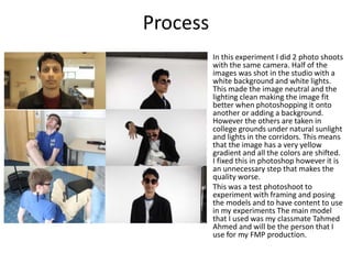
Experiments
Patrick Colman
Process
In this experiment I did 2 photo shoots
with the same camera. Half of the
images was shot in the studio with a
white background and white lights.
This made the image neutral and the
lighting clean making the image fit
better when photoshopping it onto
another or adding a background.
However the others are taken in
college grounds under natural sunlight
and lights in the corridors. This means
that the image has a very yellow
gradient and all the colors are shifted.
I fixed this in photoshop however it is
an unnecessary step that makes the
quality worse.
This was a test photoshoot to
experiment with framing and posing
the models and to have content to use
in my experiments The main model
that I used was my classmate Tahmed
Ahmed and will be the person that I
use for my FMP production.
Reflection
When I was conducting this test photoshoot I wanted to make sure that I covered as
much as I could and make use of the 60 minutes I had in the studio. Many of the
photos that I took are good enough to even use in my FMP. However I experimented
with a number of different angles and poses that allowed me to be prepared for when
I do the photo shoot for the final work. I need to make sure that I get all of the photos
that I need so that I can start working on the pre-production but if I need to get more
photos and I don’t need to do any retakes.
I leaned in this experiment that the white screen works perfectly for the effects that I
will apply to my work. The lighting is very important and I found that if the lights are
facing the models head on the shadows do not look as good as when they are from
the side. This is because I use the shadows to make the comic effect. I found that if the
person is wearing makeup or clothing that has a gradient
Process
I created this experiment poster by following a
tutorial video that showed how to make a vintage
looking fading style poster with brushes I
downloaded from a free plugin website adding
different fading brushes.
(https://www.youtube.com/watch?v=5YiOOjLuECQ)
using this tutorial I began working on a similar
photo that I took in the studio with the white
screen. Taking the photos in the studio compared to
in a corridor and how much it affects the quality of
the photo. I used custom brushes to make the
Smokey pixelated effect.
To make the fading effect I used a downloaded
brush that creates a low pillion effect on a Smokey
low opacity fade. This makes it look like the model
is disappearing or there is a Smokey effect
emanating from him. The billing block was a free
royalty free placeholder and the reviews are from a
test poster and are not real. The text is in a foehn
language (Japanese) as I am not sure what I will call
my series and it makes the poster more mysterious.
Reflection
When making this poster I found that I could download many new brushes and tool from plugins on the
internet for free. This came in handy when following the tutorial and making this poster and added
specific features. This will be very useful when making my print work and having more tools available to
me. Furthermore this experiment showed me that the billing block on a poster is not needed for my
work as it does not suit my project. It will instead be replaced by a different form of graphic with a date
of release rather than the credits.
Another thing is that I will be using the model that I used to make this poster in my final product. This is
because he fits the role of the main character really well and he was very good to work with. I realised
when making this poster that I would want to spend a large amount of time on the posters as they
where initially an after thought but now I realise would take up a large amount of my project and time
that I spend on it should be adjusted.
This experiment showed me that using a portrait photo of a model is very effective at portraying a
dramatic tone on a poster. This experiment was to look at minimalistic style posters and I feel that this
poster works well and I will try to replicate similar posters in my FMP. In the form of minimalistic
posters that have little to no background detail and most of the detail located in the model and
foreground. The model (Tahmed Ahmed) worked very well with the dramatic poses and style of the
poster and I plan on using him as my lead character in my FMP for this reason. The clothing that is
stereotypical of an undercover police officer works well with Tahmed as he looks good in this style of
clothing and owns a large amount of this style of clothes.
Process
https://www.youtube.com/watch?v=IHBP
0hsc6-E
In this experiment I used am image form the
experimental photoshoot to make a poster/
graphic of Tahmed Ahmed with a prop guitar.
I followed the tutorial above on how to make
models look like they are drawn and in a
comic book style. After following the tutorial
I added a glow effect to one of the squares
of the guitar parodying Guitar Hero. This was
simple to do with some glow layers and a
curves edge that I learned how to use. Finally
I added some partial effects so that it looked
even more like a glowing button. The
background of this image was left the same
and I should have removed it before making
the effects and add the detail to the layers.
The comic book effect is made by using 4
layered effects in this order (Shadows and
Highlights, Poster Edges, Poster size and
colour hearthstone.
Reflection
This experiment turned out to be a crucial part of my project. This is for two reasons, the first
being the effect of the comic book character on the image. This was created from a tutorial and
turned out well, this fitted perfectly with the superhero themed series that I had researched and
looked very effective. The effect was easy to add to an image and took only 15 to 20 minutes to
get it to a high standard. This meant that I could stylise many of the images that I used and would
make a police drama more original and stand out from the over saturated genre.
The second aspect is the fact that after using the comic book affect photoshop work adding props
to an image or model looks much more effective and believable. This will allow me to be more
ambitious with the props used in the photos and graphics of my project as I can seamlessly add in
unrealistic or props that would be out of my budget into the image, lowering the production
costs.
This poster further solidified the fact that a portrait poster will work much better than a
landscape. This is because of my focus on the characters and the foreground in all of the posters.
The comedic side of this graphic has made me decide that there should be an element of comedy
in my products and the bright light coming from the guitar works very effectively and I would like
to replicate it in a later poster.
Process
Today I made the box that my
sleeve holding the discs will sit. I
measured the dimensions of a
similar designed box for a series
and made a template in Photoshop
compensating for the fact that my
design has one more disc than the
one used. The box will be made
out of cardboard (possibly 2 layers
if it is not thick enough to support
having the sleeve inside).
I created the template for the
sleeve using photoshop. I created
one pixel wide box at the exact
measurements that I had taken
from an existing box set. To ensure
it was precise I manually entered in
all the dimensions of the box and
printed out on an A3 piece of
printing paper with crudely added
markers on each side to test it.
Reflection
This experiment was important for my project as I needed to ensure
that I was creating work to the exact dimensions that I needed, so that
when I printed out the work it would not be stretched or distorted
when fitted around the product. It also allowed me to think about
how the graphics will work with each other and see how much space I
had for each side of the box / sleeve. My initial template for the sleeve
was using 10 pixel wide lines which I found to be too inaccurate as
when folding the box it would be vital to be very accurate.
When I printed out the template I discovered that it was extremely
flimsy and that it would not support or protect the sleeve that would
sit inside of it. This leads me to print it out on cardboard and possibly
gluing another layer of cardboard to add more strength and stability to
the cover. However, I was unable to test this as I ran out of
experimental time and began work on production.

4. production experiments(1) (3)

  • 1.
  • 2.
    Process In this experimentI did 2 photo shoots with the same camera. Half of the images was shot in the studio with a white background and white lights. This made the image neutral and the lighting clean making the image fit better when photoshopping it onto another or adding a background. However the others are taken in college grounds under natural sunlight and lights in the corridors. This means that the image has a very yellow gradient and all the colors are shifted. I fixed this in photoshop however it is an unnecessary step that makes the quality worse. This was a test photoshoot to experiment with framing and posing the models and to have content to use in my experiments The main model that I used was my classmate Tahmed Ahmed and will be the person that I use for my FMP production.
  • 3.
    Reflection When I wasconducting this test photoshoot I wanted to make sure that I covered as much as I could and make use of the 60 minutes I had in the studio. Many of the photos that I took are good enough to even use in my FMP. However I experimented with a number of different angles and poses that allowed me to be prepared for when I do the photo shoot for the final work. I need to make sure that I get all of the photos that I need so that I can start working on the pre-production but if I need to get more photos and I don’t need to do any retakes. I leaned in this experiment that the white screen works perfectly for the effects that I will apply to my work. The lighting is very important and I found that if the lights are facing the models head on the shadows do not look as good as when they are from the side. This is because I use the shadows to make the comic effect. I found that if the person is wearing makeup or clothing that has a gradient
  • 4.
    Process I created thisexperiment poster by following a tutorial video that showed how to make a vintage looking fading style poster with brushes I downloaded from a free plugin website adding different fading brushes. (https://www.youtube.com/watch?v=5YiOOjLuECQ) using this tutorial I began working on a similar photo that I took in the studio with the white screen. Taking the photos in the studio compared to in a corridor and how much it affects the quality of the photo. I used custom brushes to make the Smokey pixelated effect. To make the fading effect I used a downloaded brush that creates a low pillion effect on a Smokey low opacity fade. This makes it look like the model is disappearing or there is a Smokey effect emanating from him. The billing block was a free royalty free placeholder and the reviews are from a test poster and are not real. The text is in a foehn language (Japanese) as I am not sure what I will call my series and it makes the poster more mysterious.
  • 5.
    Reflection When making thisposter I found that I could download many new brushes and tool from plugins on the internet for free. This came in handy when following the tutorial and making this poster and added specific features. This will be very useful when making my print work and having more tools available to me. Furthermore this experiment showed me that the billing block on a poster is not needed for my work as it does not suit my project. It will instead be replaced by a different form of graphic with a date of release rather than the credits. Another thing is that I will be using the model that I used to make this poster in my final product. This is because he fits the role of the main character really well and he was very good to work with. I realised when making this poster that I would want to spend a large amount of time on the posters as they where initially an after thought but now I realise would take up a large amount of my project and time that I spend on it should be adjusted. This experiment showed me that using a portrait photo of a model is very effective at portraying a dramatic tone on a poster. This experiment was to look at minimalistic style posters and I feel that this poster works well and I will try to replicate similar posters in my FMP. In the form of minimalistic posters that have little to no background detail and most of the detail located in the model and foreground. The model (Tahmed Ahmed) worked very well with the dramatic poses and style of the poster and I plan on using him as my lead character in my FMP for this reason. The clothing that is stereotypical of an undercover police officer works well with Tahmed as he looks good in this style of clothing and owns a large amount of this style of clothes.
  • 6.
    Process https://www.youtube.com/watch?v=IHBP 0hsc6-E In this experimentI used am image form the experimental photoshoot to make a poster/ graphic of Tahmed Ahmed with a prop guitar. I followed the tutorial above on how to make models look like they are drawn and in a comic book style. After following the tutorial I added a glow effect to one of the squares of the guitar parodying Guitar Hero. This was simple to do with some glow layers and a curves edge that I learned how to use. Finally I added some partial effects so that it looked even more like a glowing button. The background of this image was left the same and I should have removed it before making the effects and add the detail to the layers. The comic book effect is made by using 4 layered effects in this order (Shadows and Highlights, Poster Edges, Poster size and colour hearthstone.
  • 7.
    Reflection This experiment turnedout to be a crucial part of my project. This is for two reasons, the first being the effect of the comic book character on the image. This was created from a tutorial and turned out well, this fitted perfectly with the superhero themed series that I had researched and looked very effective. The effect was easy to add to an image and took only 15 to 20 minutes to get it to a high standard. This meant that I could stylise many of the images that I used and would make a police drama more original and stand out from the over saturated genre. The second aspect is the fact that after using the comic book affect photoshop work adding props to an image or model looks much more effective and believable. This will allow me to be more ambitious with the props used in the photos and graphics of my project as I can seamlessly add in unrealistic or props that would be out of my budget into the image, lowering the production costs. This poster further solidified the fact that a portrait poster will work much better than a landscape. This is because of my focus on the characters and the foreground in all of the posters. The comedic side of this graphic has made me decide that there should be an element of comedy in my products and the bright light coming from the guitar works very effectively and I would like to replicate it in a later poster.
  • 8.
    Process Today I madethe box that my sleeve holding the discs will sit. I measured the dimensions of a similar designed box for a series and made a template in Photoshop compensating for the fact that my design has one more disc than the one used. The box will be made out of cardboard (possibly 2 layers if it is not thick enough to support having the sleeve inside). I created the template for the sleeve using photoshop. I created one pixel wide box at the exact measurements that I had taken from an existing box set. To ensure it was precise I manually entered in all the dimensions of the box and printed out on an A3 piece of printing paper with crudely added markers on each side to test it.
  • 9.
    Reflection This experiment wasimportant for my project as I needed to ensure that I was creating work to the exact dimensions that I needed, so that when I printed out the work it would not be stretched or distorted when fitted around the product. It also allowed me to think about how the graphics will work with each other and see how much space I had for each side of the box / sleeve. My initial template for the sleeve was using 10 pixel wide lines which I found to be too inaccurate as when folding the box it would be vital to be very accurate. When I printed out the template I discovered that it was extremely flimsy and that it would not support or protect the sleeve that would sit inside of it. This leads me to print it out on cardboard and possibly gluing another layer of cardboard to add more strength and stability to the cover. However, I was unable to test this as I ran out of experimental time and began work on production.

Editor's Notes

  • #3 Discuss the tools and processes used in your experiments
  • #5 Discuss the tools and processes used in your experiments
  • #7 Discuss the tools and processes used in your experiments
  • #9 Discuss the tools and processes used in your experiments