SlideShare a Scribd company logo
Digi-Pack Analysis of a 4
Panel CD
By Shaun Ogier
2245
Moby 18 - 4 Panel CD
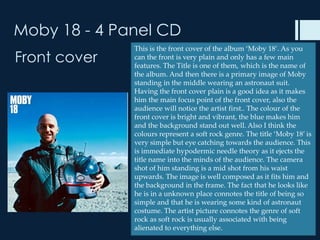
              This is the front cover of the album ‘Moby 18’. As you
Front cover   can the front is very plain and only has a few main
              features. The Title is one of them, which is the name of
              the album. And then there is a primary image of Moby
              standing in the middle wearing an astronaut suit.
              Having the front cover plain is a good idea as it makes
              him the main focus point of the front cover, also the
              audience will notice the artist first.. The colour of the
              front cover is bright and vibrant, the blue makes him
              and the background stand out well. Also I think the
              colours represent a soft rock genre. The title ‘Moby 18’ is
              very simple but eye catching towards the audience. This
              is immediate hypodermic needle theory as it ejects the
              title name into the minds of the audience. The camera
              shot of him standing is a mid shot from his waist
              upwards. The image is well composed as it fits him and
              the background in the frame. The fact that he looks like
              he is in a unknown place connotes the title of being so
              simple and that he is wearing some kind of astronaut
              costume. The artist picture connotes the genre of soft
              rock as soft rock is usually associated with being
              alienated to everything else.
Moby 18 - 4 Panel CD
Back cover       On the back cover we have the same pose
                 image as the front, but what’s hard to tell at
                 first is that its not the same image it’s a
                 different one. His face expression is different
                 creating a different mood to the back cover.
                 This is also creating a narrative between the
                 panels. On the top right of the cover we have
                 the tracklist in a medium sized front probably
                 size 12. the colour scheme has stayed the
                 same from the front, this looks nice as it
                 makes the album cover flow more
                 aesthetically. In this picture he is not smiling
                 this could tell us something about his music
                 or the journey he has been through. On the
                 back we have a barcode to scan when
                 purchased. But not much advertising or
                 institutional information. This may be
                 because it makes the back panel more
                 attractive with less information.
Moby 18 - 4 Panel CD
Inside Left
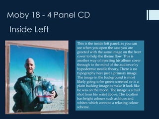
                This is the inside left panel, as you can
                see when you open the case you are
                greeted with the same image on the front
                cover to help the theme flow. This is
                another way of injecting his album cover
                through to the mind of the audience by
                hypodermic needle theory. There is no
                typography here just a primary image.
                The image in the background is most
                likely going to be green screened or is a
                plain backing image to make it look like
                he was on the moon. The image is a mid
                shot from his waist above. The location
                has bright colours such as blues and
                whites which connote a relaxing colour
                scheme.
Moby 18 - 4 Panel CD
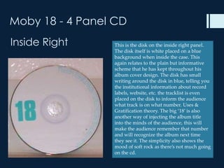
Inside Right     This is the disk on the inside right panel.
                 The disk itself is white placed on a blue
                 background when inside the case. This
                 again relates to the plain but informative
                 scheme that he has kept throughout his
                 album cover design. The disk has small
                 writing around the disk in blue, telling you
                 the institutional information about record
                 labels, website, etc. the tracklist is even
                 placed on the disk to inform the audience
                 what track is on what number. Uses &
                 Gratification theory. The big ‘18’ is also
                 another way of injecting the album title
                 into the minds of the audience, this will
                 make the audience remember that number
                 and will recognize the album next time
                 they see it. The simplicity also shows the
                 mood of soft rock as there’s not much going
                 on the cd.
Emilia Big Big World - 4 Panel CD
Front cover         This is the front cover to the single ‘Big big
                    world’ by Emilia. From the front cover we
                    can see that the image is in black and
                    white. This is a really good idea to
                    incorporate into my own design as it
                    reflects a lot of emotions and moods,
                    which will benefit our genre. The black
                    and white contrasts are very detailed and
                    show depth within the image. The shallow
                    depth-of-field as the main artist is in focus
                    whereas the background in out of focus
                    make Emilia the main focus point. There is
                    also not that much typography on the
                    front cover, only the title and artist name.
                    the simplicity of this cover as well
                    connotes the soft rock genre as most soft
                    rock covers are fairly plain. The camera
                    shot of her face is a close up, having a close
                    up for the front cover is a good way of
                    promoting yourself as its direct address
                    towards the audience.
Emilia Big Big World - 4 Panel CD
Back cover           The back cover has a different primary image
                     to the front, but the colour scheme is still the
                     same allowing the album panels to match
                     with each other and flow. The back cover of
                     this album has a lot more going on than the
                     album cover by ‘Moby’ on the back of this
                     one we have the tracklist in a black font
                     which stands out well against the white/sepia
                     background. The sepia background also
                     connotes a soft rock genre. From the sides to
                     the bottom of the back panel there is
                     institutional information and logos,
                     informing the buyer. There is also a barcode
                     to scan the item. The title of the single is
                     again printed on the back panel to inject the
                     name into the minds of the audience and
                     make it stick. The different pose she is doing
                     on the back suggests there is a narrative
                     going on as she travels around new york. Her
                     clothes represent a soft rock theme as well.
                     Such as her black coat, hat and shoes all
                     represent that theme.
Emilia Big Big World - 4 Panel CD
Inside Left         This is the inside left panel which again isn't
                    much but is a new primary image which
                    catches the audiences attention when being
                    opened. Once again the title and the artists
                    name is printed again even though its very
                    simple and straight forward. This is a good
                    way of promoting an artist and there new
                    music as it informs the consumer of the
                    album information Uses & Gratification
                    theory. The background image is in black
                    and white/ sepia this colour theme has been
                    used throughout the 4 panels to keep a flow
                    and connotes the soft rock genre. Her
                    clothes have changed to a more comfy
                    relaxed costume instead of her trench coat
                    she was wearing on the front. This could
                    suggest that once you listen to her music
                    you can release you emotions and feel more
                    comfortable with yourself. Her dress also
                    connotes her feminine side rather than her
                    dominant side when she is wearing her coat.
Emilia Big Big World - 4 Panel CD
Inside Right
                    The CD is placed on a transparent cover
                    with the same image on the front cover.
                    The CD itself has the image on the front
                    cover as well printed on the disk with the
                    track list along side her face. The cd is also
                    simple as there are no The title is at the
                    top of the disk again injecting the name
                    into the minds of the audience to help
                    them remember it. On the left side of the
                    disk there is also institutional information
                    and logos of company’s that have helped
                    produce the single. Again the point of
                    having her face on the cd is to inform the
                    audience of her and to help promote her.
Damien Rice 9 - 4 Panel CD
Front cover
                 This is the front cover of the Damien Rice
                 album. The front cover colour scheme is
                 mellow and has a beige colour to it. There
                 is only one primary image on the front.
                 The one primary image also shows the
                 cover simplicity to the front and suits the
                 soft rock genre. The album name ‘Damien
                 rice 9’ is also simply placed at the bottom
                 right. Having the album cover plain is a
                 good idea as it will look more interesting
                 and easier to view. Also having such a
                 mellow colour scheme will relate to our
                 chosen genre and help us design our front
                 cover. The design of the primary image
                 we can also relate our design as it looks
                 quite crazy but fits into a small shape.
                 Which can represent a ‘Mad World’.
Damien Rice 9 - 4 Panel CD
Back cover

                  Just as the front cover the back cover is
                  very plain not much to see. The back just
                  has the tracklist and a primary image, this
                  means its easier viewing for the buyer.
                  There is also barcode on the bottom of the
                  CD cover. The colour scheme also goes
                  round the whole case creating a flow
                  which makes it more appealing to the
                  audience and creates a narrative. The
                  colour scheme also suits the genre of soft
                  rock. I would say its missing quite a bit
                  such as promotional information such as
                  puffs or institutional information, as
                  without this its harder for them to promote
                  themselves. The primary image is of
                  different characters which could be part of
                  the narrative created on each panel.
Damien Rice 9 - 4 Panel CD
Inside Left
                 The inside left cover is also plain with
                 just Damien rice’s name and a primary
                 image of some kind of character.
                 Throughout Damien rice’s album cover
                 all of his panels have been very plain.
                 This may be intriguing for some people
                 as it creates a narrative and an enigma.
                 The colour scheme also creates a calm
                 atmosphere and maybe tells you
                 something about the artist or about the
                 songs on the album. The primary image
                 once again is small and simple like all of
                 the other cd covers I have gone through
                 backing up the fact that soft rock genre
                 cd covers are plain and simple, but also
                 impacting towards the audience as they
                 inform the minds of the audience.
                 Hypodermic needle theory
Damien Rice 9 - 4 Panel CD
Inside Right
                This is the CD of the case which
                unexpectedly is very colorful and has a
                lot going on the cd. Meaning its not
                simple and connotes craziness and a
                completely different narrative. On the
                CD itself it has the name of the artist
                and album name, this is obviously here
                to remind the user of the artist and
                album to help it stick into the minds of
                the audience again (hypodermic). The
                primary image on the cd is the same as
                the one on the front cover reminding
                the buyer of the artists intentions. The
                plastic casing for the album cover is
                transparent and has a plain backing
                with the same colour scheme to keep
                the flow going.

More Related Content

What's hot

Digipak analysis
Digipak analysis Digipak analysis
Digipak analysis
sophie harris
 
Electronic Rock Album Covers
Electronic Rock Album CoversElectronic Rock Album Covers
Electronic Rock Album CoversKateBracher
 
Analyse magazine adverts or digipak
Analyse magazine adverts or digipakAnalyse magazine adverts or digipak
Analyse magazine adverts or digipak
shayward99
 
Indie-Rock CD covers
Indie-Rock CD coversIndie-Rock CD covers
Indie-Rock CD coversmarinasoph
 
Album cover analysis
Album cover analysisAlbum cover analysis
Album cover analysis
louisa09
 
Cd cover analysis media studies
Cd cover analysis media studiesCd cover analysis media studies
Cd cover analysis media studiesmaden171
 
Cd album front and back cover analysis
Cd album  front and back cover analysisCd album  front and back cover analysis
Cd album front and back cover analysisshahnaziee
 
Digipak Analysis X3
Digipak Analysis X3Digipak Analysis X3
Digipak Analysis X3
VictoriaCowburn
 
Digipak (Album Cover) Analysis
Digipak (Album Cover) Analysis Digipak (Album Cover) Analysis
Digipak (Album Cover) Analysis
hlr1993
 
Wojciech digipak and magazine advert analysis final (2)
Wojciech digipak and magazine advert analysis final (2)Wojciech digipak and magazine advert analysis final (2)
Wojciech digipak and magazine advert analysis final (2)
wojstarrr123
 
Wojciech digipak and magazine advert analysis final (1)
Wojciech digipak and magazine advert analysis final (1)Wojciech digipak and magazine advert analysis final (1)
Wojciech digipak and magazine advert analysis final (1)
wojstarrr123
 
DigiPak Analysis
DigiPak AnalysisDigiPak Analysis
DigiPak Analysis
Jess Greenfield
 
Digipack cover research and planning
Digipack cover research and planningDigipack cover research and planning
Digipack cover research and planningSabrina Sakhai
 
Digi Pack Analysis
Digi Pack AnalysisDigi Pack Analysis
Digi Pack Analysistaylapowell
 
Album cover annotations
Album cover annotationsAlbum cover annotations
Album cover annotationsZackAttack14
 
Cd cover annotations
Cd cover annotationsCd cover annotations
Cd cover annotations
LukeDamagnez
 
Album cover analysis
Album cover analysisAlbum cover analysis
Album cover analysis
louisaoconnor97
 
Analysis Of DVD Covers
Analysis Of DVD CoversAnalysis Of DVD Covers
Analysis Of DVD CoversAdil AbbAs
 

What's hot (20)

Digipak analysis
Digipak analysis Digipak analysis
Digipak analysis
 
Electronic Rock Album Covers
Electronic Rock Album CoversElectronic Rock Album Covers
Electronic Rock Album Covers
 
Analyse magazine adverts or digipak
Analyse magazine adverts or digipakAnalyse magazine adverts or digipak
Analyse magazine adverts or digipak
 
Indie-Rock CD covers
Indie-Rock CD coversIndie-Rock CD covers
Indie-Rock CD covers
 
Album cover analysis
Album cover analysisAlbum cover analysis
Album cover analysis
 
Cd cover analysis media studies
Cd cover analysis media studiesCd cover analysis media studies
Cd cover analysis media studies
 
Lana del ray
Lana del rayLana del ray
Lana del ray
 
Cd album front and back cover analysis
Cd album  front and back cover analysisCd album  front and back cover analysis
Cd album front and back cover analysis
 
Digipak Analysis X3
Digipak Analysis X3Digipak Analysis X3
Digipak Analysis X3
 
Digipak (Album Cover) Analysis
Digipak (Album Cover) Analysis Digipak (Album Cover) Analysis
Digipak (Album Cover) Analysis
 
Wojciech digipak and magazine advert analysis final (2)
Wojciech digipak and magazine advert analysis final (2)Wojciech digipak and magazine advert analysis final (2)
Wojciech digipak and magazine advert analysis final (2)
 
Wojciech digipak and magazine advert analysis final (1)
Wojciech digipak and magazine advert analysis final (1)Wojciech digipak and magazine advert analysis final (1)
Wojciech digipak and magazine advert analysis final (1)
 
Digipak analysis ½
Digipak analysis ½Digipak analysis ½
Digipak analysis ½
 
DigiPak Analysis
DigiPak AnalysisDigiPak Analysis
DigiPak Analysis
 
Digipack cover research and planning
Digipack cover research and planningDigipack cover research and planning
Digipack cover research and planning
 
Digi Pack Analysis
Digi Pack AnalysisDigi Pack Analysis
Digi Pack Analysis
 
Album cover annotations
Album cover annotationsAlbum cover annotations
Album cover annotations
 
Cd cover annotations
Cd cover annotationsCd cover annotations
Cd cover annotations
 
Album cover analysis
Album cover analysisAlbum cover analysis
Album cover analysis
 
Analysis Of DVD Covers
Analysis Of DVD CoversAnalysis Of DVD Covers
Analysis Of DVD Covers
 

Viewers also liked

How to write a grant application
How to write a grant applicationHow to write a grant application
How to write a grant applicationdsylvester749
 
Final questionnaire for music video and ancillaries
Final questionnaire for music video and ancillariesFinal questionnaire for music video and ancillaries
Final questionnaire for music video and ancillariessao95
 
Install
InstallInstall
Installmimdal
 
Piet mondriaan
Piet mondriaanPiet mondriaan
Piet mondriaanDavyDeFacq
 
Cd panels - questionnaire results
Cd panels - questionnaire resultsCd panels - questionnaire results
Cd panels - questionnaire resultssao95
 
Story boards slide
Story boards slideStory boards slide
Story boards slidesao95
 
Story boards slide
Story boards slideStory boards slide
Story boards slidesao95
 
Magazine advert planning and production
Magazine advert planning and productionMagazine advert planning and production
Magazine advert planning and productionsao95
 
Magazine slide
Magazine slideMagazine slide
Magazine slidesao95
 
Caso huatuco
Caso huatucoCaso huatuco
Caso huatuco
Frank Huerta
 
DBD smart trade association การเสริมสร้างและบริหารเครือข่ายสู่ความสำเร็จ
 DBD smart trade association การเสริมสร้างและบริหารเครือข่ายสู่ความสำเร็จ DBD smart trade association การเสริมสร้างและบริหารเครือข่ายสู่ความสำเร็จ
DBD smart trade association การเสริมสร้างและบริหารเครือข่ายสู่ความสำเร็จ
Weera Chearanaipanit
 
How we made our cd pane
How we made our cd paneHow we made our cd pane
How we made our cd panesao95
 
Questionnaire magazine advert and analysis
Questionnaire magazine advert and analysisQuestionnaire magazine advert and analysis
Questionnaire magazine advert and analysissao95
 
Piet mondriaan (simpel)
Piet mondriaan (simpel)Piet mondriaan (simpel)
Piet mondriaan (simpel)DavyDeFacq
 
Graph analysis final
Graph analysis finalGraph analysis final
Graph analysis finalsao95
 
миний хобби
миний хоббиминий хобби
миний хоббиZuzu Zuzaka
 
SME marketing 4.0 khonkaen and Thailand 4.0
SME marketing 4.0 khonkaen and Thailand 4.0 SME marketing 4.0 khonkaen and Thailand 4.0
SME marketing 4.0 khonkaen and Thailand 4.0
Weera Chearanaipanit
 
SME marketing 4.0 khonkaen and Thailand 4.0
SME marketing 4.0 khonkaen and Thailand 4.0SME marketing 4.0 khonkaen and Thailand 4.0
SME marketing 4.0 khonkaen and Thailand 4.0
Weera Chearanaipanit
 
Industrial 4.0 For OTOP SME Startup
Industrial 4.0 For OTOP SME StartupIndustrial 4.0 For OTOP SME Startup
Industrial 4.0 For OTOP SME Startup
Weera Chearanaipanit
 

Viewers also liked (19)

How to write a grant application
How to write a grant applicationHow to write a grant application
How to write a grant application
 
Final questionnaire for music video and ancillaries
Final questionnaire for music video and ancillariesFinal questionnaire for music video and ancillaries
Final questionnaire for music video and ancillaries
 
Install
InstallInstall
Install
 
Piet mondriaan
Piet mondriaanPiet mondriaan
Piet mondriaan
 
Cd panels - questionnaire results
Cd panels - questionnaire resultsCd panels - questionnaire results
Cd panels - questionnaire results
 
Story boards slide
Story boards slideStory boards slide
Story boards slide
 
Story boards slide
Story boards slideStory boards slide
Story boards slide
 
Magazine advert planning and production
Magazine advert planning and productionMagazine advert planning and production
Magazine advert planning and production
 
Magazine slide
Magazine slideMagazine slide
Magazine slide
 
Caso huatuco
Caso huatucoCaso huatuco
Caso huatuco
 
DBD smart trade association การเสริมสร้างและบริหารเครือข่ายสู่ความสำเร็จ
 DBD smart trade association การเสริมสร้างและบริหารเครือข่ายสู่ความสำเร็จ DBD smart trade association การเสริมสร้างและบริหารเครือข่ายสู่ความสำเร็จ
DBD smart trade association การเสริมสร้างและบริหารเครือข่ายสู่ความสำเร็จ
 
How we made our cd pane
How we made our cd paneHow we made our cd pane
How we made our cd pane
 
Questionnaire magazine advert and analysis
Questionnaire magazine advert and analysisQuestionnaire magazine advert and analysis
Questionnaire magazine advert and analysis
 
Piet mondriaan (simpel)
Piet mondriaan (simpel)Piet mondriaan (simpel)
Piet mondriaan (simpel)
 
Graph analysis final
Graph analysis finalGraph analysis final
Graph analysis final
 
миний хобби
миний хоббиминий хобби
миний хобби
 
SME marketing 4.0 khonkaen and Thailand 4.0
SME marketing 4.0 khonkaen and Thailand 4.0 SME marketing 4.0 khonkaen and Thailand 4.0
SME marketing 4.0 khonkaen and Thailand 4.0
 
SME marketing 4.0 khonkaen and Thailand 4.0
SME marketing 4.0 khonkaen and Thailand 4.0SME marketing 4.0 khonkaen and Thailand 4.0
SME marketing 4.0 khonkaen and Thailand 4.0
 
Industrial 4.0 For OTOP SME Startup
Industrial 4.0 For OTOP SME StartupIndustrial 4.0 For OTOP SME Startup
Industrial 4.0 For OTOP SME Startup
 

Similar to 4 cd panel slide

Album covers and digipaks
Album covers and digipaksAlbum covers and digipaks
Album covers and digipaks
jennypinchbeck
 
The 1975 analysis
The 1975 analysisThe 1975 analysis
The 1975 analysis
izzyhumphriss
 
Task 14- Digipacks™
Task 14- Digipacks™Task 14- Digipacks™
Task 14- Digipacks™
Michael Linfoot
 
Digipack analysis
Digipack analysisDigipack analysis
Digipack analysis
joehall1206
 
Digipaks
DigipaksDigipaks
Digipaks
vickilennon
 
Digipak Analysis
Digipak AnalysisDigipak Analysis
Digipak Analysis
MollyTurner17
 
Digipak Analysis
Digipak AnalysisDigipak Analysis
Digipak Analysis
Megan Dent
 
Digipak Analysis
Digipak AnalysisDigipak Analysis
Digipak Analysis
Megan Dent
 
Dvd textual analysis
Dvd textual analysisDvd textual analysis
Dvd textual analysisguest1c9bed
 
Cd covers
Cd coversCd covers
Cd coversphewett
 
Digipaks
DigipaksDigipaks
The 1975 digipak analysis
The 1975 digipak analysisThe 1975 digipak analysis
The 1975 digipak analysis
amyflint5477
 
A2 Media Coursework - Research - DigiPak Analysis 6X
A2 Media Coursework - Research - DigiPak Analysis 6XA2 Media Coursework - Research - DigiPak Analysis 6X
A2 Media Coursework - Research - DigiPak Analysis 6X
TAwojobi
 
Media Studies, Digipack Research
Media Studies, Digipack ResearchMedia Studies, Digipack Research
Media Studies, Digipack Research
Lauren Phillips
 
Digipacks
DigipacksDigipacks
Digipacks
Amelia Ofiarska
 
Digipak analysis
Digipak analysisDigipak analysis
Digipak analysis
MediaEdWright
 
Digipack analysis no1 improved
Digipack analysis no1 improvedDigipack analysis no1 improved
Digipack analysis no1 improved
DrSips
 

Similar to 4 cd panel slide (20)

Album covers and digipaks
Album covers and digipaksAlbum covers and digipaks
Album covers and digipaks
 
The 1975 analysis
The 1975 analysisThe 1975 analysis
The 1975 analysis
 
Task 14- Digipacks™
Task 14- Digipacks™Task 14- Digipacks™
Task 14- Digipacks™
 
Digipack analysis
Digipack analysisDigipack analysis
Digipack analysis
 
Digipak Research
Digipak Research Digipak Research
Digipak Research
 
Digipaks
DigipaksDigipaks
Digipaks
 
Digipak Analysis
Digipak AnalysisDigipak Analysis
Digipak Analysis
 
Digipak Analysis
Digipak AnalysisDigipak Analysis
Digipak Analysis
 
Digipak Analysis
Digipak AnalysisDigipak Analysis
Digipak Analysis
 
Dvd textual analysis
Dvd textual analysisDvd textual analysis
Dvd textual analysis
 
Cd covers
Cd coversCd covers
Cd covers
 
Album analysis
Album analysisAlbum analysis
Album analysis
 
Digipaks
DigipaksDigipaks
Digipaks
 
The 1975 digipak analysis
The 1975 digipak analysisThe 1975 digipak analysis
The 1975 digipak analysis
 
Digipak
Digipak Digipak
Digipak
 
A2 Media Coursework - Research - DigiPak Analysis 6X
A2 Media Coursework - Research - DigiPak Analysis 6XA2 Media Coursework - Research - DigiPak Analysis 6X
A2 Media Coursework - Research - DigiPak Analysis 6X
 
Media Studies, Digipack Research
Media Studies, Digipack ResearchMedia Studies, Digipack Research
Media Studies, Digipack Research
 
Digipacks
DigipacksDigipacks
Digipacks
 
Digipak analysis
Digipak analysisDigipak analysis
Digipak analysis
 
Digipack analysis no1 improved
Digipack analysis no1 improvedDigipack analysis no1 improved
Digipack analysis no1 improved
 

4 cd panel slide

  • 1. Digi-Pack Analysis of a 4 Panel CD By Shaun Ogier 2245
  • 2. Moby 18 - 4 Panel CD This is the front cover of the album ‘Moby 18’. As you Front cover can the front is very plain and only has a few main features. The Title is one of them, which is the name of the album. And then there is a primary image of Moby standing in the middle wearing an astronaut suit. Having the front cover plain is a good idea as it makes him the main focus point of the front cover, also the audience will notice the artist first.. The colour of the front cover is bright and vibrant, the blue makes him and the background stand out well. Also I think the colours represent a soft rock genre. The title ‘Moby 18’ is very simple but eye catching towards the audience. This is immediate hypodermic needle theory as it ejects the title name into the minds of the audience. The camera shot of him standing is a mid shot from his waist upwards. The image is well composed as it fits him and the background in the frame. The fact that he looks like he is in a unknown place connotes the title of being so simple and that he is wearing some kind of astronaut costume. The artist picture connotes the genre of soft rock as soft rock is usually associated with being alienated to everything else.
  • 3. Moby 18 - 4 Panel CD Back cover On the back cover we have the same pose image as the front, but what’s hard to tell at first is that its not the same image it’s a different one. His face expression is different creating a different mood to the back cover. This is also creating a narrative between the panels. On the top right of the cover we have the tracklist in a medium sized front probably size 12. the colour scheme has stayed the same from the front, this looks nice as it makes the album cover flow more aesthetically. In this picture he is not smiling this could tell us something about his music or the journey he has been through. On the back we have a barcode to scan when purchased. But not much advertising or institutional information. This may be because it makes the back panel more attractive with less information.
  • 4. Moby 18 - 4 Panel CD Inside Left This is the inside left panel, as you can see when you open the case you are greeted with the same image on the front cover to help the theme flow. This is another way of injecting his album cover through to the mind of the audience by hypodermic needle theory. There is no typography here just a primary image. The image in the background is most likely going to be green screened or is a plain backing image to make it look like he was on the moon. The image is a mid shot from his waist above. The location has bright colours such as blues and whites which connote a relaxing colour scheme.
  • 5. Moby 18 - 4 Panel CD Inside Right This is the disk on the inside right panel. The disk itself is white placed on a blue background when inside the case. This again relates to the plain but informative scheme that he has kept throughout his album cover design. The disk has small writing around the disk in blue, telling you the institutional information about record labels, website, etc. the tracklist is even placed on the disk to inform the audience what track is on what number. Uses & Gratification theory. The big ‘18’ is also another way of injecting the album title into the minds of the audience, this will make the audience remember that number and will recognize the album next time they see it. The simplicity also shows the mood of soft rock as there’s not much going on the cd.
  • 6. Emilia Big Big World - 4 Panel CD Front cover This is the front cover to the single ‘Big big world’ by Emilia. From the front cover we can see that the image is in black and white. This is a really good idea to incorporate into my own design as it reflects a lot of emotions and moods, which will benefit our genre. The black and white contrasts are very detailed and show depth within the image. The shallow depth-of-field as the main artist is in focus whereas the background in out of focus make Emilia the main focus point. There is also not that much typography on the front cover, only the title and artist name. the simplicity of this cover as well connotes the soft rock genre as most soft rock covers are fairly plain. The camera shot of her face is a close up, having a close up for the front cover is a good way of promoting yourself as its direct address towards the audience.
  • 7. Emilia Big Big World - 4 Panel CD Back cover The back cover has a different primary image to the front, but the colour scheme is still the same allowing the album panels to match with each other and flow. The back cover of this album has a lot more going on than the album cover by ‘Moby’ on the back of this one we have the tracklist in a black font which stands out well against the white/sepia background. The sepia background also connotes a soft rock genre. From the sides to the bottom of the back panel there is institutional information and logos, informing the buyer. There is also a barcode to scan the item. The title of the single is again printed on the back panel to inject the name into the minds of the audience and make it stick. The different pose she is doing on the back suggests there is a narrative going on as she travels around new york. Her clothes represent a soft rock theme as well. Such as her black coat, hat and shoes all represent that theme.
  • 8. Emilia Big Big World - 4 Panel CD Inside Left This is the inside left panel which again isn't much but is a new primary image which catches the audiences attention when being opened. Once again the title and the artists name is printed again even though its very simple and straight forward. This is a good way of promoting an artist and there new music as it informs the consumer of the album information Uses & Gratification theory. The background image is in black and white/ sepia this colour theme has been used throughout the 4 panels to keep a flow and connotes the soft rock genre. Her clothes have changed to a more comfy relaxed costume instead of her trench coat she was wearing on the front. This could suggest that once you listen to her music you can release you emotions and feel more comfortable with yourself. Her dress also connotes her feminine side rather than her dominant side when she is wearing her coat.
  • 9. Emilia Big Big World - 4 Panel CD Inside Right The CD is placed on a transparent cover with the same image on the front cover. The CD itself has the image on the front cover as well printed on the disk with the track list along side her face. The cd is also simple as there are no The title is at the top of the disk again injecting the name into the minds of the audience to help them remember it. On the left side of the disk there is also institutional information and logos of company’s that have helped produce the single. Again the point of having her face on the cd is to inform the audience of her and to help promote her.
  • 10. Damien Rice 9 - 4 Panel CD Front cover This is the front cover of the Damien Rice album. The front cover colour scheme is mellow and has a beige colour to it. There is only one primary image on the front. The one primary image also shows the cover simplicity to the front and suits the soft rock genre. The album name ‘Damien rice 9’ is also simply placed at the bottom right. Having the album cover plain is a good idea as it will look more interesting and easier to view. Also having such a mellow colour scheme will relate to our chosen genre and help us design our front cover. The design of the primary image we can also relate our design as it looks quite crazy but fits into a small shape. Which can represent a ‘Mad World’.
  • 11. Damien Rice 9 - 4 Panel CD Back cover Just as the front cover the back cover is very plain not much to see. The back just has the tracklist and a primary image, this means its easier viewing for the buyer. There is also barcode on the bottom of the CD cover. The colour scheme also goes round the whole case creating a flow which makes it more appealing to the audience and creates a narrative. The colour scheme also suits the genre of soft rock. I would say its missing quite a bit such as promotional information such as puffs or institutional information, as without this its harder for them to promote themselves. The primary image is of different characters which could be part of the narrative created on each panel.
  • 12. Damien Rice 9 - 4 Panel CD Inside Left The inside left cover is also plain with just Damien rice’s name and a primary image of some kind of character. Throughout Damien rice’s album cover all of his panels have been very plain. This may be intriguing for some people as it creates a narrative and an enigma. The colour scheme also creates a calm atmosphere and maybe tells you something about the artist or about the songs on the album. The primary image once again is small and simple like all of the other cd covers I have gone through backing up the fact that soft rock genre cd covers are plain and simple, but also impacting towards the audience as they inform the minds of the audience. Hypodermic needle theory
  • 13. Damien Rice 9 - 4 Panel CD Inside Right This is the CD of the case which unexpectedly is very colorful and has a lot going on the cd. Meaning its not simple and connotes craziness and a completely different narrative. On the CD itself it has the name of the artist and album name, this is obviously here to remind the user of the artist and album to help it stick into the minds of the audience again (hypodermic). The primary image on the cd is the same as the one on the front cover reminding the buyer of the artists intentions. The plastic casing for the album cover is transparent and has a plain backing with the same colour scheme to keep the flow going.