

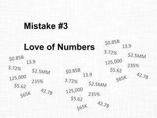
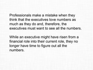


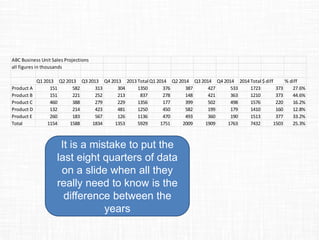

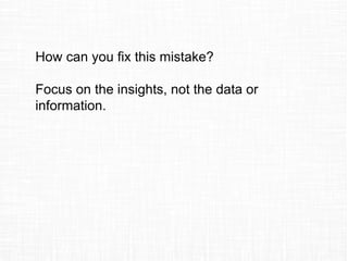


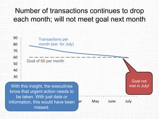


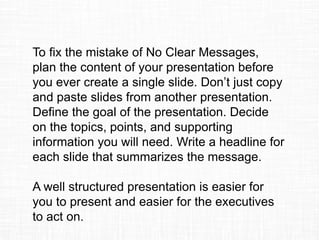
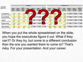
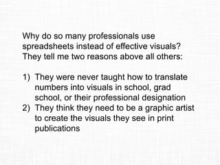

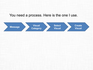
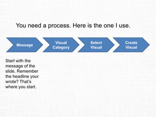


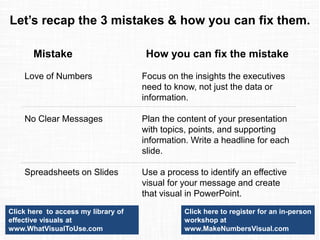

Professionals often make three big mistakes when presenting financial or operational data to executives. The first mistake is including spreadsheets on slides instead of using effective visuals. Spreadsheets are for calculations, not communication. The second mistake is not having clear messages in the presentation. Presentations should be well-structured to take executives from the current situation to the desired outcome. The third mistake is thinking executives love numbers as much as the presenters. Presentations should focus on insights executives can use, not just data. To avoid these mistakes, presenters should use visuals instead of spreadsheets, structure presentations clearly around a main message, and focus on insights rather than numbers alone.


![SMOKE - The Convenient Truth [1st place Worlds Best Presentation Contest] by ...](https://cdn.slidesharecdn.com/ss_thumbnails/smoke-theconvenienttruth-ep-101028211434-phpapp01-thumbnail.jpg?width=640&height=640&fit=bounds)


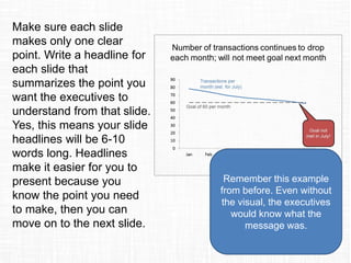
![5tipsforpresentingtoexecutives 120813124313 Phpapp02[1]](https://cdn.slidesharecdn.com/ss_thumbnails/5tipsforpresentingtoexecutives120813124313phpapp021-13460809273611-phpapp02-120827102306-phpapp02-thumbnail.jpg?width=640&height=640&fit=bounds)


