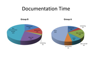
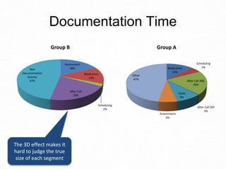
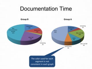
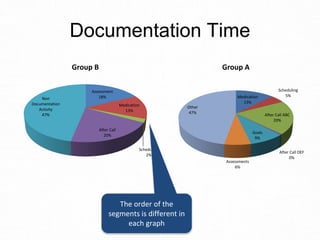
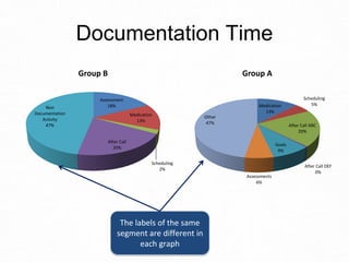
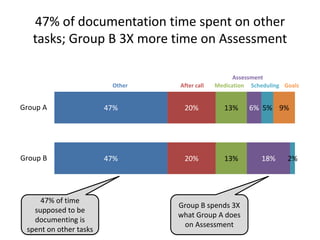
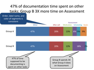
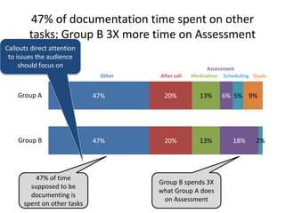
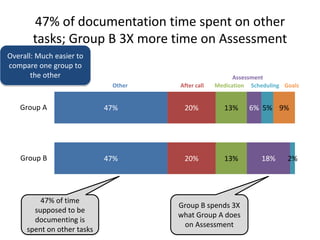
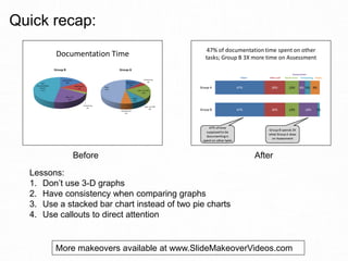
Slide Makeover
Video Podcast #79:
Comparing groups broken
into segments
Based on the ideas in
“Present It So They Get It”
by Dave Paradi
www.PresentItSoTheyGetIt.com
When you want to compare the
breakdown of a total amount into
segments between multiple
groups, here is what presenters
typically use …
Assessment
18%
Medication
13%
Scheduling
2%
After Call
20%
Non
Documentation
Activity
47%
Group B
Medication
13%
Scheduling
5%
After Call ABC
20%
After Call DEF
0%
Goals
9%
Assessments
6%
Other
47%
Group A
Documentation Time
Here’s why the audience
will find it difficult to
compare the two groups
using this visual
Assessment
18%
Medication
13%
Scheduling
2%
After Call
20%
Non
Documentation
Activity
47%
Group B
Medication
13%
Scheduling
5%
After Call ABC
20%
After Call DEF
0%
Goals
9%
Assessments
6%
Other
47%
Group A
Documentation Time
The 3D effect makes it
hard to judge the true
size of each segment
Assessment
18%
Medication
13%
Scheduling
2%
After Call
20%
Non
Documentation
Activity
47%
Group B
Medication
13%
Scheduling
5%
After Call ABC
20%
After Call DEF
0%
Goals
9%
Assessments
6%
Other
47%
Group A
Documentation Time
The color used for each
segment is not
consistent in each graph
Assessment
18%
Medication
13%
Scheduling
2%
After Call
20%
Non
Documentation
Activity
47%
Group B
Medication
13%
Scheduling
5%
After Call ABC
20%
After Call DEF
0%
Goals
9%
Assessments
6%
Other
47%
Group A
Documentation Time
The order of the
segments is different in
each graph
Assessment
18%
Medication
13%
Scheduling
2%
After Call
20%
Non
Documentation
Activity
47%
Group B
Medication
13%
Scheduling
5%
After Call ABC
20%
After Call DEF
0%
Goals
9%
Assessments
6%
Other
47%
Group A
Documentation Time
The labels of the same
segment are different in
each graph
As a result, the audience can’t
figure out what the message is
because they can’t really compare
the two groups accurately.
Instead, use a stacked bar graph,
like this …
47% of documentation time spent on other
tasks; Group B 3X more time on Assessment
47%
47%
20%
20%
13%
13%
6%
18%
5%
2%
9%Group A
Group B
Other After call Medication
Assessment
Scheduling Goals
47% of time
supposed to be
documenting is
spent on other tasks
Group B spends 3X
what Group A does
on Assessment
Order, label name, and
color of segments is
consistent
47% of documentation time spent on other
tasks; Group B 3X more time on Assessment
47%
47%
20%
20%
13%
13%
6%
18%
5%
2%
9%Group A
Group B
Other After call Medication
Assessment
Scheduling Goals
47% of time
supposed to be
documenting is
spent on other tasks
Group B spends 3X
what Group A does
on Assessment
Callouts direct attention
to issues the audience
should focus on
47% of documentation time spent on other
tasks; Group B 3X more time on Assessment
47%
47%
20%
20%
13%
13%
6%
18%
5%
2%
9%Group A
Group B
Other After call Medication
Assessment
Scheduling Goals
47% of time
supposed to be
documenting is
spent on other tasks
Group B spends 3X
what Group A does
on Assessment
Overall: Much easier to
compare one group to
the other
What lessons can we learn about
comparing the breakdown of
multiple groups into segments?
Lesson #1:
Don’t use 3-D graphs. The third
dimension distorts our
interpretation of the size or
position of items, making accurate
comparison impossible.
Lesson #2:
When comparing graphs, make
sure that the order, color, and text
labels are consistent in each
graph.
Lesson #3:
A stacked bar chart is a better
choice to compare segments
within a total amount. This type of
graph places the information to be
compared close to each other. It is
a standard graph in Excel or
PowerPoint.
Lesson #4:
Use callouts to direct the viewer’s
attention to the important points
they should be noticing in the
graph. It ensures they come to the
conclusion you want them to.
Before After
Lessons:
1. Don’t use 3-D graphs
2. Have consistency when comparing graphs
3. Use a stacked bar chart instead of two pie charts
4. Use callouts to direct attention
Quick recap:
More makeovers available at www.SlideMakeoverVideos.com
If you would like me to help
your team create presentations
that have a clear message with
focused content and effective
visuals, get in touch:
P: 905-510-4911
E: Dave@ThinkOutsideTheSlide.com
W: www.ThinkOutsideTheSlide.com

Slide Makeover #79: Comparing groups broken into segments