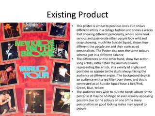
Thank you for sharing your perspective. Here is what I've gathered:
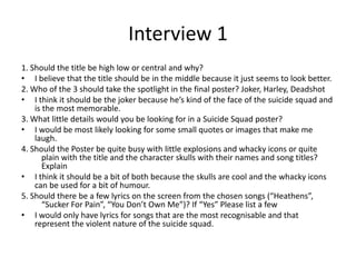
- Central title placement looks most professional
- Harley Quinn is a major character so she should take spotlight
- Color scheme and character expression are important details
- A balance of skulls/icons and space looks best aesthetically
This gives me good insight into prioritizing key elements that appeal to audiences like yourself who appreciate the characters, storytelling and artistic design of the Suicide Squad works. I appreciate you taking the time to provide your feedback.