Initial Plans
Luke Headland
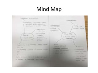
Mind Map
Video Game Idea – Audience
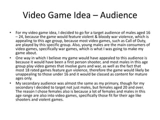
• For my video game idea, I decided to go for a target audience of males aged 16
– 24, because the game would feature violent & bloody war violence, which is
appealing to this age group, because most video games, such as Call of Duty,
are played by this specific group. Also, young males are the main consumers of
video games, specifically war games, which is what I was going to make my
game about.
• One way in which I believe my game would have appealed to this audience is
because it would have been a first person shooter, and most males in this age
group play video games that involve guns and war, as well as the fact that
most 18 rated games feature gun violence, therefore the game would likely be
unappealing to those under 16 and it would be classed as content for mature
ages only.
• My secondary audience was almost the same as my primary, though for my
secondary I decided to target not just males, but females aged 20 and over.
The reason I chose females also is because a lot of females and males in this
age range are also into video games, specifically those fit for their age like
shooters and violent games.
Podcast Idea - Audience
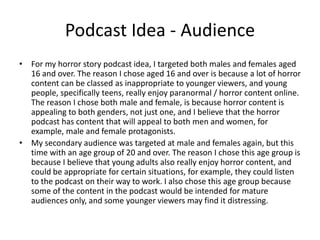
• For my horror story podcast idea, I targeted both males and females aged
16 and over. The reason I chose aged 16 and over is because a lot of horror
content can be classed as inappropriate to younger viewers, and young
people, specifically teens, really enjoy paranormal / horror content online.
The reason I chose both male and female, is because horror content is
appealing to both genders, not just one, and I believe that the horror
podcast has content that will appeal to both men and women, for
example, male and female protagonists.
• My secondary audience was targeted at male and females again, but this
time with an age group of 20 and over. The reason I chose this age group is
because I believe that young adults also really enjoy horror content, and
could be appropriate for certain situations, for example, they could listen
to the podcast on their way to work. I also chose this age group because
some of the content in the podcast would be intended for mature
audiences only, and some younger viewers may find it distressing.
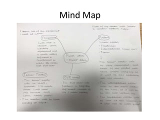
Mind Map
Final Idea – Audience
• For my audience, I targeted males & females aged 18 – 30. The reason why I
chose to target this specific age group is because my project is a horror movie,
and it would be classed as inappropriate for anyone younger than 18. My
project features content such as horror and violence, which is what a lot of
people in this age group like to see in horror movies. Another reason why I
chose this age group is because young people are usually the main consumers
when it comes to horror films, as people who are older are sometimes not as
interested / engaged.
• The reason I targeted males and females is because horror films are appealing
to both genders, as well as the fact that there is content in horror films that
appeals to both genders, such as suspense and thrilling scenes.
• My secondary audience is targeted towards males aged 40 and above,
because I feel that people in this age group still enjoy horror films, just not as
much as young people. I also chose males because I feel that they are the
main consumer of horror movies because the content is more appealing to
them, for example, action, suspense and gory scenes.
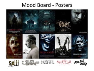
Mood Board - Posters
Mood board Colour Schemes, Effects & Target Audience
• With the specific images I have chosen, there is an overall recurring colour scheme with most of the
posters. In this case the colour is blue. The colour blue is portrayed in a very sinister way in these posters to
add to the atmosphere, and to emphasize that these films contain horror / terror themes, as the colour
blue is usually associated with ghosts, darkness and coldness. The titles / logos that I have chosen also
follow a similar pattern. The logos are very grungy looking, and look like they have been made out of rotting
materials such as metal or wood. This once again points to the genre of the film, and highlights the type of
content in the film. For example, the Hostel film logo looks very dirty and rotted, which contrasts to the
films violent and torturous theme. Another trait that these posters and logos have in common is a lot of
them have been coated with grungy / dirty overlays. Scratches, concrete and smoke are just a few of the
ways in which the images are given a dirty / grungy look. When these materials are mixed in with the dark,
unnatural colours, it gives the overall image a darker and sinister tone, which is one effect that I am hoping
to achieve in my products, therefor I will be using similar materials. Upon first glance, it is easy to see that
these posters are that of the horror genre, because of their overall dark and grungy tone. These posters will
certainly stand out to those who are fans of the horror genre and have seen similar designs for other horror
films. I am hoping that my final products will be easily recognisable amongst the horror community and my
target audience as a horror film, because of the techniques, styles and materials I will be using that are
similar to those on my mood board.
• Particular compositions and layouts will be used in my own products, for example a lot of the images
feature a character in the centre frame of the image, as well as some others that may be slightly off centre.
These are the most common formats when it comes to horror movie posters, and I believe that creating my
products in a similar composition will help attract my target audience and the general horror community
easier, as the posters should be easily recognisable, especially when they are also mixed with the dark
colour schemes and grungy overlays.
Mood Board Analysis – Poster Layout & Styles
• The posters that I have chosen for my mood board all feature interesting styles
/ layouts that I hope to implement into my final posters. A lot of these posters
feature people, and are portrayed in a disturbing way, for example, there is a
poster where a man is wearing another man's face, and a face is mixed in with
different images to give it a ghostly / distorted effect. These images are not
excessively explicit, yet they do cause an unsettling feeling when seen. I
believe using these particular techniques will engage my target audience, as
they will be familiar with these styles of posters and recognise them as to be in
the horror genre. A lot of the posters also feel very empty, as a lot of them
only feature one main image, which gives the effect of hopelessness and
despair upon the viewer, which is something that I would like to implement
into my own work. Furthermore, these posters are at an appropriate standard
for companies such as the MPAA and BBFC, that determine if advertisement
content such as movie posters, are appropriate for the general public and do
not break their guidelines.
• I feel that with my own personal experience in Photoshop and editing I will be
able to achieve the layout and styles that I am hoping to go for with my
products, as well as making sure that they are as detailed and a high quality as
possible. I also feel that with the help of my mood board, I will reach the styles
and layouts that I would like to use with my own products, as always have
other options If I decide to change my mind during production.
Mood Board Analysis
Is there any repetition in the images you have collected? Repeated
colours/images styles/fonts/tone/mood
• One thing that a lot of the images (posters) I have chosen have in common is simplicity.
A lot of these posters are very simple and basic, which I believe makes them stand out
more, leaving you asking questions about the film. Each of the posters also follow a
similar colour pallet, and don’t really have a variety of different colours, as they stick
with one primary colour, but with different tones and shading. Some of the posters,
preferably the Saw posters, are not visually scary, more so creepy. The posters also
don’t really give much to say about the film literally, but can be conveying it
metaphorically. I feel that this is a more effective way of engaging an audience, rather
than obnoxiously highlighting information about the film like a lot of movie posters do.
This is why I chose these specific posters for my mood board, as they leave the
audience asking questions. A long the bottom of the posters, I added different logos
from different horror films. Each one of these logos follow a similar pattern, and are
very grungy, dark and rotten. I think the style of a film’s logo can tell you a lot about the
film, for example, if the title is rotten like, grungy and bloody, this highlights that the
film is likely going to be a gory horror film.
How will your mood board influence your final product?
• A lot of the styles / image patterns that are used in these posters and logos is what I
would like to implement into my final project. As for my posters, I am going for
simplicity, but I would like to try and strike my audience, making them ask questions
about the film by using creepy imagery, a gripping tagline and logo.
Mood Board 2 - Trailer
Mood Board 2 Analysis
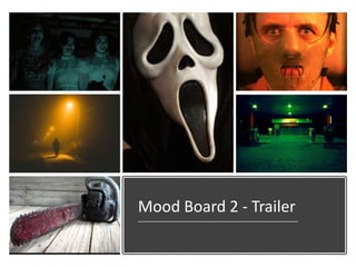
• The most common / popular horror movie icons are scary masks, as well as particular props, such as a
kitchen knife or chainsaw. These are traits that I am going to use for my product. As I am unsure what
my mask will be, I chose two very interesting masks for my mood board that are very popular in the
horror genre. I would like my own mask to be similar and create iconism like these two masks do, so I
will be using an existing mask that is known in the horror community. I feel like this will appeal to my
target audience as they will be able to recognise where the mask is from, and other people in the
horror community may be interested in the mask, which should make them want to watch the film. The
two masks I chose are very sinister / evil looking. The Scream mask has very hollow, black eyes as well
as the mouth, which portrays a sense of emptiness and hopelessness when it is seen. The Hannibal
mask I feel is similar. It appears very angry and mean looking. One thing that these two masks have in
common is that they are not very scary looking, but are made scary buy the people who wear them. I
hope to achieve these effects with the mask I use for my trailer and posters. I may go for an innocent
looking mask, or I may go for an evil looking mask, much like the two in my mood board.
• I also chose various lighting images for my mood board. I believe that dark lighting is very important
and will be implemented into my trailer. I also think that the masks look more sinister when partnered
with the dark toned light. For my project, as most of it is going to be filmed at night, I will be using the
lighting to my advantage which should make the mask I use look a lot more scary and evil looking. One
lighting technique that I think works best for horror movies is a green and blue colour pallet. I feel like
the lighting really impacts the atmosphere of the scene, and also highlights the mood and tone of the
film. I feel like green works best for horror movies as well as blue, and I hope to implement these
colour pallets into my trailer. I also chose to add an image of a chainsaw to the mood board, as I hope
to use a prop like that for my trailer, as I believe that the chainsaw is iconic in the horror franchise, and
will appeal to the fans of gory styled horror movies.
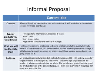
Informal Proposal
Current Idea
Concept A horror film of my own design, plot and marketing. It will be similar to the posters
seen on my mood board page.
Type of
products you
would make
• Three posters: international, theatrical & teaser
• A DVD cover
• Short teaser trailer
• Pages of the script for the film – 3 or 4 pages
What you will
need to make
them
I will need my camera, photoshop and some photography lights. Luckily I already
have all of these materials, so I won't need to borrow any equipment from college. I
will also need a model for one of my posters, and I have already planned who I am
going to use for it.
Audience My product is primarily targeted at males & females aged 18 – 30, and my secondary
target audience is males aged 40 and above. I chose this age range because my
product is a horror movie suitable for adults. The social status group I have targeted
my product towards is the balanced group, as I think that everyone in this group can
enjoy and watch the film.
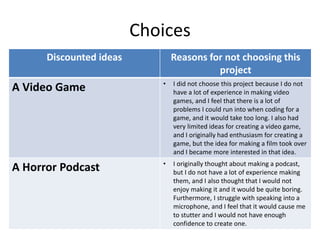
Choices
Discounted ideas Reasons for not choosing this
project
A Video Game • I did not choose this project because I do not
have a lot of experience in making video
games, and I feel that there is a lot of
problems I could run into when coding for a
game, and it would take too long. I also had
very limited ideas for creating a video game,
and I originally had enthusiasm for creating a
game, but the idea for making a film took over
and I became more interested in that idea.
A Horror Podcast • I originally thought about making a podcast,
but I do not have a lot of experience making
them, and I also thought that I would not
enjoy making it and it would be quite boring.
Furthermore, I struggle with speaking into a
microphone, and I feel that it would cause me
to stutter and I would not have enough
confidence to create one.

1. fmp initial plans

  • 1.
  • 2.
  • 3.
    Video Game Idea– Audience • For my video game idea, I decided to go for a target audience of males aged 16 – 24, because the game would feature violent & bloody war violence, which is appealing to this age group, because most video games, such as Call of Duty, are played by this specific group. Also, young males are the main consumers of video games, specifically war games, which is what I was going to make my game about. • One way in which I believe my game would have appealed to this audience is because it would have been a first person shooter, and most males in this age group play video games that involve guns and war, as well as the fact that most 18 rated games feature gun violence, therefore the game would likely be unappealing to those under 16 and it would be classed as content for mature ages only. • My secondary audience was almost the same as my primary, though for my secondary I decided to target not just males, but females aged 20 and over. The reason I chose females also is because a lot of females and males in this age range are also into video games, specifically those fit for their age like shooters and violent games.
  • 4.
    Podcast Idea -Audience • For my horror story podcast idea, I targeted both males and females aged 16 and over. The reason I chose aged 16 and over is because a lot of horror content can be classed as inappropriate to younger viewers, and young people, specifically teens, really enjoy paranormal / horror content online. The reason I chose both male and female, is because horror content is appealing to both genders, not just one, and I believe that the horror podcast has content that will appeal to both men and women, for example, male and female protagonists. • My secondary audience was targeted at male and females again, but this time with an age group of 20 and over. The reason I chose this age group is because I believe that young adults also really enjoy horror content, and could be appropriate for certain situations, for example, they could listen to the podcast on their way to work. I also chose this age group because some of the content in the podcast would be intended for mature audiences only, and some younger viewers may find it distressing.
  • 5.
  • 6.
    Final Idea –Audience • For my audience, I targeted males & females aged 18 – 30. The reason why I chose to target this specific age group is because my project is a horror movie, and it would be classed as inappropriate for anyone younger than 18. My project features content such as horror and violence, which is what a lot of people in this age group like to see in horror movies. Another reason why I chose this age group is because young people are usually the main consumers when it comes to horror films, as people who are older are sometimes not as interested / engaged. • The reason I targeted males and females is because horror films are appealing to both genders, as well as the fact that there is content in horror films that appeals to both genders, such as suspense and thrilling scenes. • My secondary audience is targeted towards males aged 40 and above, because I feel that people in this age group still enjoy horror films, just not as much as young people. I also chose males because I feel that they are the main consumer of horror movies because the content is more appealing to them, for example, action, suspense and gory scenes.
  • 7.
    Mood Board -Posters
  • 8.
    Mood board ColourSchemes, Effects & Target Audience • With the specific images I have chosen, there is an overall recurring colour scheme with most of the posters. In this case the colour is blue. The colour blue is portrayed in a very sinister way in these posters to add to the atmosphere, and to emphasize that these films contain horror / terror themes, as the colour blue is usually associated with ghosts, darkness and coldness. The titles / logos that I have chosen also follow a similar pattern. The logos are very grungy looking, and look like they have been made out of rotting materials such as metal or wood. This once again points to the genre of the film, and highlights the type of content in the film. For example, the Hostel film logo looks very dirty and rotted, which contrasts to the films violent and torturous theme. Another trait that these posters and logos have in common is a lot of them have been coated with grungy / dirty overlays. Scratches, concrete and smoke are just a few of the ways in which the images are given a dirty / grungy look. When these materials are mixed in with the dark, unnatural colours, it gives the overall image a darker and sinister tone, which is one effect that I am hoping to achieve in my products, therefor I will be using similar materials. Upon first glance, it is easy to see that these posters are that of the horror genre, because of their overall dark and grungy tone. These posters will certainly stand out to those who are fans of the horror genre and have seen similar designs for other horror films. I am hoping that my final products will be easily recognisable amongst the horror community and my target audience as a horror film, because of the techniques, styles and materials I will be using that are similar to those on my mood board. • Particular compositions and layouts will be used in my own products, for example a lot of the images feature a character in the centre frame of the image, as well as some others that may be slightly off centre. These are the most common formats when it comes to horror movie posters, and I believe that creating my products in a similar composition will help attract my target audience and the general horror community easier, as the posters should be easily recognisable, especially when they are also mixed with the dark colour schemes and grungy overlays.
  • 9.
    Mood Board Analysis– Poster Layout & Styles • The posters that I have chosen for my mood board all feature interesting styles / layouts that I hope to implement into my final posters. A lot of these posters feature people, and are portrayed in a disturbing way, for example, there is a poster where a man is wearing another man's face, and a face is mixed in with different images to give it a ghostly / distorted effect. These images are not excessively explicit, yet they do cause an unsettling feeling when seen. I believe using these particular techniques will engage my target audience, as they will be familiar with these styles of posters and recognise them as to be in the horror genre. A lot of the posters also feel very empty, as a lot of them only feature one main image, which gives the effect of hopelessness and despair upon the viewer, which is something that I would like to implement into my own work. Furthermore, these posters are at an appropriate standard for companies such as the MPAA and BBFC, that determine if advertisement content such as movie posters, are appropriate for the general public and do not break their guidelines. • I feel that with my own personal experience in Photoshop and editing I will be able to achieve the layout and styles that I am hoping to go for with my products, as well as making sure that they are as detailed and a high quality as possible. I also feel that with the help of my mood board, I will reach the styles and layouts that I would like to use with my own products, as always have other options If I decide to change my mind during production.
  • 10.
    Mood Board Analysis Isthere any repetition in the images you have collected? Repeated colours/images styles/fonts/tone/mood • One thing that a lot of the images (posters) I have chosen have in common is simplicity. A lot of these posters are very simple and basic, which I believe makes them stand out more, leaving you asking questions about the film. Each of the posters also follow a similar colour pallet, and don’t really have a variety of different colours, as they stick with one primary colour, but with different tones and shading. Some of the posters, preferably the Saw posters, are not visually scary, more so creepy. The posters also don’t really give much to say about the film literally, but can be conveying it metaphorically. I feel that this is a more effective way of engaging an audience, rather than obnoxiously highlighting information about the film like a lot of movie posters do. This is why I chose these specific posters for my mood board, as they leave the audience asking questions. A long the bottom of the posters, I added different logos from different horror films. Each one of these logos follow a similar pattern, and are very grungy, dark and rotten. I think the style of a film’s logo can tell you a lot about the film, for example, if the title is rotten like, grungy and bloody, this highlights that the film is likely going to be a gory horror film. How will your mood board influence your final product? • A lot of the styles / image patterns that are used in these posters and logos is what I would like to implement into my final project. As for my posters, I am going for simplicity, but I would like to try and strike my audience, making them ask questions about the film by using creepy imagery, a gripping tagline and logo.
  • 11.
    Mood Board 2- Trailer
  • 12.
    Mood Board 2Analysis • The most common / popular horror movie icons are scary masks, as well as particular props, such as a kitchen knife or chainsaw. These are traits that I am going to use for my product. As I am unsure what my mask will be, I chose two very interesting masks for my mood board that are very popular in the horror genre. I would like my own mask to be similar and create iconism like these two masks do, so I will be using an existing mask that is known in the horror community. I feel like this will appeal to my target audience as they will be able to recognise where the mask is from, and other people in the horror community may be interested in the mask, which should make them want to watch the film. The two masks I chose are very sinister / evil looking. The Scream mask has very hollow, black eyes as well as the mouth, which portrays a sense of emptiness and hopelessness when it is seen. The Hannibal mask I feel is similar. It appears very angry and mean looking. One thing that these two masks have in common is that they are not very scary looking, but are made scary buy the people who wear them. I hope to achieve these effects with the mask I use for my trailer and posters. I may go for an innocent looking mask, or I may go for an evil looking mask, much like the two in my mood board. • I also chose various lighting images for my mood board. I believe that dark lighting is very important and will be implemented into my trailer. I also think that the masks look more sinister when partnered with the dark toned light. For my project, as most of it is going to be filmed at night, I will be using the lighting to my advantage which should make the mask I use look a lot more scary and evil looking. One lighting technique that I think works best for horror movies is a green and blue colour pallet. I feel like the lighting really impacts the atmosphere of the scene, and also highlights the mood and tone of the film. I feel like green works best for horror movies as well as blue, and I hope to implement these colour pallets into my trailer. I also chose to add an image of a chainsaw to the mood board, as I hope to use a prop like that for my trailer, as I believe that the chainsaw is iconic in the horror franchise, and will appeal to the fans of gory styled horror movies.
  • 13.
    Informal Proposal Current Idea ConceptA horror film of my own design, plot and marketing. It will be similar to the posters seen on my mood board page. Type of products you would make • Three posters: international, theatrical & teaser • A DVD cover • Short teaser trailer • Pages of the script for the film – 3 or 4 pages What you will need to make them I will need my camera, photoshop and some photography lights. Luckily I already have all of these materials, so I won't need to borrow any equipment from college. I will also need a model for one of my posters, and I have already planned who I am going to use for it. Audience My product is primarily targeted at males & females aged 18 – 30, and my secondary target audience is males aged 40 and above. I chose this age range because my product is a horror movie suitable for adults. The social status group I have targeted my product towards is the balanced group, as I think that everyone in this group can enjoy and watch the film.
  • 14.
    Choices Discounted ideas Reasonsfor not choosing this project A Video Game • I did not choose this project because I do not have a lot of experience in making video games, and I feel that there is a lot of problems I could run into when coding for a game, and it would take too long. I also had very limited ideas for creating a video game, and I originally had enthusiasm for creating a game, but the idea for making a film took over and I became more interested in that idea. A Horror Podcast • I originally thought about making a podcast, but I do not have a lot of experience making them, and I also thought that I would not enjoy making it and it would be quite boring. Furthermore, I struggle with speaking into a microphone, and I feel that it would cause me to stutter and I would not have enough confidence to create one.

Editor's Notes

  • #3 Bubbl.us or hand drawn-scanned using college printers exploring 3 potential ideas
  • #6 Bubbl.us or hand drawn-scanned using college printers exploring your final idea
  • #8 Collection of images related to your product/inspirational/visually interesting At least 15 needed
  • #14 For your idea, write a brief, informal proposal. Ensure you proof read and check spelling etc For the audience section consider age/gender/psychographic/geodemographic/social grade etc
  • #15 Discuss the other two ideas from your initial mind map and reasons for why you didn’t choose them