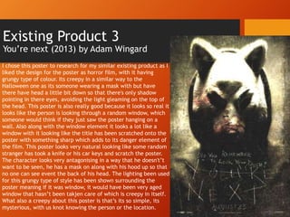
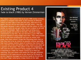
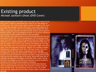
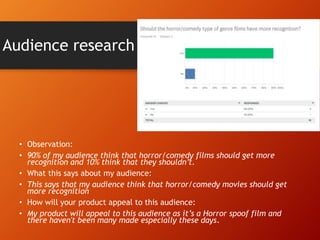
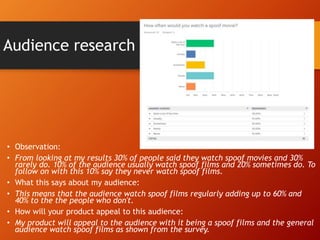
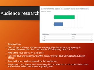
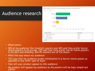
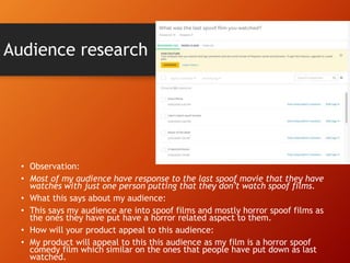
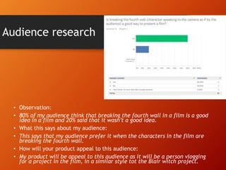
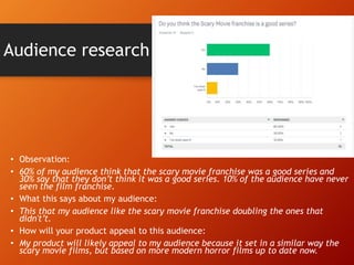
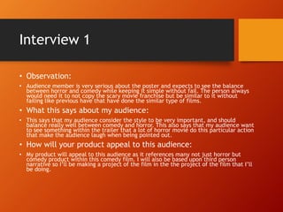
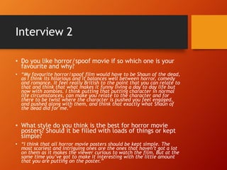
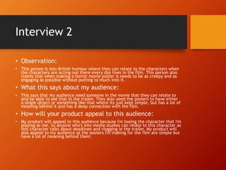
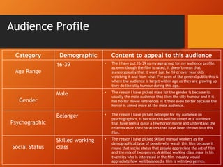
Research
George wetton
Existing Product
Halloween (2018) by David Gordon Green
The reason I chose this as the poster for my research a similar
existing product is because I really like the design. For one of my
character posters possibly my jigsaw one I will have full headshot
and then have it where if you turn up the brightness up of the
poster the eyes will be lit red. i thought this would be a brilliant
eater egg to add to one of my additional posters. I love this poster
also because you can see how aged the mask is showing the that it
has been a long time since the mask has been worn and also links
in with the actor as the actor who is played him is a is the same
actor from the original so would be old like the mask as well. The
uses of colours for fonts and other elements have a been done
really well here with them keeping the original title as simple
white basic colour is a connotation that the hasn’t changed much
since the original and is still creepy as ever. I also like how under
it the date is in a orange font with it symbolising Halloween and
pumpkins, that makes the date and the title linked together. The
angle of Michael Myers is also very creepy almost like he’s either
looking down on someone or deep in though which is even worse. I
think with the lighting is brilliant as well as with it obviously being
horror film there's a lot of darkness surrounding Michael Myers
showing not only how dark the film is but how dark his mind is if
he is thinking of something.
When the brightness of the
poster is turned up.
In this poster of the Halloween movie that came out in
2018, it shows that when the brightness of image is turned
up you will be able to see more features of the mask and
the face. This is something similar to what I want to do for
my main poster because I think it’s a really clever idea of
showing off how the Easter eggs are portrayed in such a
hidden talent. I was thinking that I would do something
similar with the Billy the Puppet doll, as I think with me be
able to change the color of his eyes on Adobe Photoshop
using the exposure panel. I think this will be effective as it
shows a certain level of skill and attention, along with
increasing the chances of reaching a wider audience, with
them being able to spot what’s on the poster and appreciate
a lot more. I also think this style of poster is effective as it
the amount of effort there has been put into this poster
with the brightness being turned up being it original lighting
as they would have used professional lighting. So its shows
hows much they have cred about this image and darkened it
so that it would look scary for anyone looking at it.
Existing Product 2
Shaun of the dead (2004) by Edgar Wright
The reason I chose this as a similar existing product as its
something as to what I want to do for my poster. I love the
design as it looks like it’s a poster within a posters self, as if
the zombies are carrying the poster in the poster. Also if
noticeable the September for the release date had been
indented slightly to the right, where the zombies hands are
like the date is trying to stay away from the zombies. The
uses of red represent the the film really well, with the
color red being linked to the color of blood. Within the
costume as well that Shaun is wearing, (the guy in the
middle) you can see that he is wearing a white shirt that
suit the top background colour, and the red tie and name
tag to represent the meaning of the color red in the poster.
You can tell that this movie is a comedy film because
because of the flowers that Shaun Iis holding with the bat.
The characters posture is straight and looking down looking
very professional with the spotlight on them making them
be the first thig you see when looking at the poster. With
the zombies it’s the opposite effect there're a darker color
being a lot more grungy representing that they are the
antagonists. Along with them being a darker color it makes
a lot harder to tell that they are in the poster. So when you
do notice it, you feel that it very effective in a clever way.
Existing Product 3
You’re next (2013) by Adam Wingard
I chose this poster to research for my similar existing product as I
liked the design for the poster as horror film, with it having
grungy type of colour. Its creepy in a similar way to the
Halloween one as its someone wearing a mask with but have
there have head a little bit down so that there's only shadow
pointing in there eyes, avoiding the light gleaming on the top of
the head. This poster is also really good because it looks so real it
looks like the person is looking through a random window, which
someone would think if they just saw the poster hanging on a
wall. Also along with the window element it looks a lot like a
window with it looking like the title has been scratched onto the
poster with something sharp which adds to its danger element of
the film. This poster looks very natural looking like some random
stranger has took a knife or his car keys and scratch the poster.
The character looks very antagonising in a way that he doesn't’t
want to be seen, he has a mask on along with his hood up so that
no one can see event the back of his head. The lighting been used
for this grungy type of style has been shown surrounding the
poster meaning if it was window, it would have been very aged
window that hasn’t been takjen care of which is creepy in itself.
What also a creepy about this poster is that’s its so simple, its
mysterious, with us knot knowing the person or the location.
Existing Product 4
fade to black (1980) by Vernon Zimmerman
The reason I have picked this as my pre-1990 similar existing
product to compare with mine. Is the contrast of different
colours on each side of face and the area, with one of my
poster the nun will be have black and half white. I also like
this poster because it uses of colour with the colour of title, is
similar to a pink sky you get when the sun is about to set and
it becomes midnight. Night is often seen as being scary
because people are scared of the dark, this gives creepy
connotations to the film. You can tell this is a pre-1990 film
because instead of using images back then. They used artwork
for it to look more professional and save on money with
props. Also there weren't things like Photoshop back then so
that they had to be as creative as possible without spending
that much money. Another piece of evidence that shows that
it is a old film is the cast billing is really massive and takes up
a quarter of the poster. This poster is also very engaging as
well with the main character being engaged with the film he
is watching so I make the viewer curious as to what he's
watching. Also just shown with hands the films got different
elements of the supernatural as just shown by his hands as
ancient Egyptian bandaged up mummy hands on his left and
then dark finger nailed grey creepy hands on the right.
Existing product
Michael Jackson's Ghost (DVD Cover)
While the back cover of this DVD cover is not quite what I want but the
front cover is similar to something that I want for my final design for
my DVD cover. The white border within outside the image is nice touch
as it looks like old paper with the DVD cover cover being made out of
paper this a nice touch. Also it’s very skillfully been edited with there
being a comparison between the dead Michael Jackson and the ghost of
Michael Jackson. Also in the background there is a fog which represents
and unknown location possibly heaven if they are ghosts.
With this DVD cover there is also a lot more writing about the cast and
the synopsis of the film. This is something that I am not going to have
much on my DVD cover, with it not going into that much depth on mine
unlike this one. Another problem that ill avoid unlike this DVD cover is
that the poster of the cover is over layered with looking aas if its had
too many filters over it to not portray a serious dark image, and with a
music cover this especially important. Despite not including a lengthy
billing block or lengthy bio of the film I will have include a lot more
technical details that like rating, companies and any copyright
infringements. Along with other details of DVD cover. This DVD cover
however has only included the rating on the spine, along with the DVD
code and the the company logo on the spine. Along with three line of
copyright infringement the bottom of the DVD cover, which I will go
into much more depth on my DVD cover because I want to include to
include as much DVD technical qualities as possible.
The last thing this DVD cover has done has included advertisement
which is advertising the soundtrack that had also recently come out
when this DVD cover, this something I wont do as not a lot of DVD
covers do this, along with the fact that I haven't made a soundtrack for
this DVD.
Research Analysis
• What common features do the researched products have?
• The main common features that most of my products have is the head shot that being presented in each
individual poster. They are all also with the exception of Shaun of the dead have only one person in each poster
which is something similar to what I want to do with my posters. I like that posters a very minimum like that and
only keep one or two characters in the poster.
• Another common feature of looking at these posters is that characters face is slightly different once side
compared to the other side. I think this is really effective as its shows two sides to the character that may not be
apparent in the film or have been apparent in the film.
• What aspects of the research will you include within your on work?
• The main aspect I will include within my work is the hidden Easter egg than with the Halloween (2018) poster,
where if the brightness is turned up it shows you something better in the brighter light. This is a really effective
idea ideas as its shows how much time and passion that the people put into designing their poster.
• I also want the grungy style that has been presented in the you're next poster that I analysed, as I think this is
very effective, being professionally layered with colours that work and not to over layered.
• The darkness surrounding the character in the Halloween poster and the fade to black poster is a simplistic
feature that I want to include in one of my character posters, because including professional photography its one
of the main elements of the the poster, which is the surrounding.
Questionnaire
Analysis
George wetton
Audience research
• Observation:
• More people think horror movies should just be teased and not fast
paced with 80% saying teased and 20% saying fast-paced.
• What this says about my audience:
• This says that my audience prefer teaser trailer ather than fast-paced
trailers.
• How will your product appeal to this audience:
• My product will appeal my target audience as its just a teaser trailer
and will not feature many scenes
Audience research
• Observation:
• That my audience prefer horror movie movie posters that have minimalism
than ones that are packed with things in the film, with 90% responding to
minimalism and only 10% anting it to have loads of things on it.
• What this says about my audience:
• This says that my audience prefer horror movie posters that have
minimalism as opposed to to ones that have loads of things on it.
• How will your product appeal to this audience:
• My product will appeal to this audience because all my posters will be kept
simple but have small added elements such as Easter eggs.
Audience research
• Observation:
• 50% was given to the nun (the conjuring series) and 50% to jigsaw (saw
series) on who was the scariest.
• What this says about my audience:
• These results are both equal, meaning that my audience think that these
two characters are equally scary.
• How will your product appeal to this audience:
• My product will appeal to this audience as it features both characters
Jigsaw and Valek (the nun).
Audience research
• Observation:
• 90% of my audience think that horror/comedy films should get more
recognition and 10% think that they shouldn’t.
• What this says about my audience:
• This says that my audience think that horror/comedy movies should get
more recognition
• How will your product appeal to this audience:
• My product will appeal to this audience as it’s a Horror spoof film and
there haven't been many made especially these days.
Audience research
• Observation:
• From looking at my results 30% of people said they watch spoof movies and 30%
rarely do. 10% of the audience usually watch spoof films and 20% sometimes do. To
follow on with this 10% say they never watch spoof films.
• What this says about my audience:
• This means that the audience watch spoof films regularly adding up to 60% and
40% to the the people who don't.
• How will your product appeal to this audience:
• My product will appeal to the audience with it being a spoof films and the general
audience watch spoof films as shown from the survey.
Audience research
• Observation:
• 70% of the audience claim that a horror film based on a true story is
scarier than one that isn't, with only 30% thinking that it isn't.
• What this says about my audience:
• This say that my audience prefer horror movies that are based on a true
story.
• How will your product appeal to this audience:
• My product isn't based on a true story but is based on a old superstition that
some claim to be true about a ghostly nun.
Audience research
• Observation:
• 50% of my audience like simplistic posters and 40% said they prefer horror
movie posters to be grungy. 10% said that they prefer horror movie posters
to be dark and shadowy, and 0% wanted non of the above.
• What this says about my audience:
• This says that my audience prefer minimalism in a horror movie poster as
opposed to any other type of style.
• How will your product appeal to this audience:
• My product will appeal my audience as the posters will be kept simple but
stylish.
Audience research
• Observation:
• Most of my audience have response to the last spoof movie that they have
watches with just one person putting that they don’t watch spoof films.
• What this says about my audience:
• This says my audience are into spoof films and mostly horror spoof films as
the ones they have put have a horror related aspect to them.
• How will your product appeal to this audience:
• My product will appeal to this this audience as my film is a horror spoof
comedy film which similar on the ones that people have put down as last
watched.
Audience research
• Observation:
• 80% of my audience think that breaking the fourth wall in a film is a good
idea in a film and 20% said that it wasn’t a good idea.
• What this says about my audience:
• This says that my audience prefer it when the characters in the film are
breaking the fourth wall.
• How will your product appeal to this audience:
• My product will be appeal to this audience as it will be a person vlogging
for a project in the film, in a similar style tot the Blair witch project.
Audience research
• Observation:
• 60% of my audience think that the scary movie franchise was a good series and
30% say that they don’t think it was a good series. 10% of the audience have never
seen the film franchise.
• What this says about my audience:
• This that my audience like the scary movie franchise doubling the ones that
didn't’t.
• How will your product appeal to this audience:
• My product will likely appeal to my audience because it set in a similar way the
scary movie films, but based on more modern horror films up to date now.
Interviews
Interview 1
• Do you like horror/spoof movie if so which one is your favourite
and why?
• “My favourite horror/spoof comedy film would have to be any from the scary movie
franchise as I cant think of another franchise that's done better at it. It include a
numerous amount of cameos from horror movies and the jokes have been told in a
very clever way which a audience member would be thinking when having actually
watched a horror film.”
• What style do you think is the best for horror movie posters? Should
it be filled with loads of things or kept simple?
• “I think that when doing a horror movie it should be kept simple, and to try to just
tease them with just the poster without giving away many spoilers. I think just a
particular object that has some relation to the film is effective for any poster not just
a horror movie one. When doing a horror comedy type of poster you’ve got to keep
the style dark and grungy but keep the image comedic without having too much in it.
Scary movie 4 poster is a perfect example as it balances upon being funny, horror and
simple.”
Interview 1
• Observation:
• Audience member is very serious about the poster and expects to see the balance
between horror and comedy while keeping it simple without fail. The person always
would need it to not copy the scary movie franchise but be similar to it without
failing like previous have that have done the similar type of films.
• What this says about my audience:
• This says that my audience consider the style to be very important, and should
balance really well between comedy and horror. This also says that my audience want
to see something within the trailer that a lot of horror movie do this particular action
that make the audience laugh when being pointed out.
• How will your product appeal to this audience:
• My product will appeal to this audience as it references many not just horror but
comedy product within this comedy film. I will also be based upon third person
narrative so I’ll be making a project of the film in the the project of the film that I’ll
be doing.
Interview 2
• Do you like horror/spoof movie if so which one is your
favourite and why?
• “My favourite horror/spoof film would have to be Shaun of the dead,
as I think its hilarious and it balances well between horror, comedy
and romance. It feel really British to the point that you can relate to
that and think that what makes it funny living a day to day life but
now with zombies. I think putting that putting character in normal
life circumstances, can make you relate to the character and for
there to be twist where the character is pushed you feel engaged,
and pushed along with them, and think that exactly what Shaun of
the dead did for me.”
• What style do you think is the best for horror movie
posters? Should it be filled with loads of things or kept
simple?
• “I think that all horror movie posters should be kept simple. The
most scariest and intriguing ones are the ones that haven’t got a lot
on them as it makes the viewer curious to watch the film. But at the
same time you’ve got to make it interesting with the little amount
that you are putting on the poster.”
Interview 2
• Observation:
• This person Is into British humour where they can relate to the characters when
the characters are acting out there every day lives in the film. This person also
claims that when making a horror movie poster is needs to be as creepy and as
engaging as possible without putting to much into it.
• What this says about my audience:
• This says that my audience need someone in the movie that they can relate to
and be able to see that in the trailer. They also need the posters to have either
a single object or something like that where its just kept simple, but has a lot of
meaning behind it and has a deep connection with the film.
• How will your product appeal to this audience:
• My product will appeal to this audience because I'm basing the character that I'm
playing as me. So anyone who's into media studies can relate to this character as
this character talks about deadlines and vlogging in the trailer. My product will
also appeal to my audience as the posters I'm making for the film are simple but
have a lot of meaning behind them.
Audience Profile
Category Demographic Content to appeal to this audience
Age Range
16-39 • The I have put 16-39 as my age group for my audience profile,
as even though the film is rated, it doesn't mean that
stereotypically that it wont just be 18 or over year olds
watching it and from what I’ve seen of the general public this is
where the audience is target within age as they are growing up
they do like silly humour during this age.
Gender
Male • The reason I have picked male for the gender is because its
usually the male audience that likes the silly humour and if it
has horror movie references in it then even better because the
horror is aimed more at the male audience.
Psychographic
Belonger • The reason I have picked belonger for my audience on
psychographics, is because this will be aimed at a audience
that have seen a quite a few horror movie and understand the
references or the characters that have been thrown into this
film.
Social Status
Skilled working
class
• The reason I have picked skilled manual workers as the
demographical type of people who watch this film because it
round that social status that people appreciate the art of film
and the mix of two genres. A skilled working class male in his
twenties who is interested in the film industry would
appreciate how well balanced a film is with two genres.
Research Evaluation
Research Evaluation
• Product Research
• Strengths
• Looking at different styles and colours schemes that have worked before.
• The end you pick out which colours worked the most and think about what worked the most.
• Weaknesses
• Takes a lot research as there a lot posters different to the ones that you're creating.
• Wasting time researching a poster that isn’t similar to yours.
• Questionnaires
• Strengths
• Gather up a second opinion
• Think about different possibilities for your project when thinking of questions to ask them.
• Weaknesses
• Various people will have different opinions which cant be cant be counted as the overall worldwide opinion.
• Time management: wait for responses.
• Interviews
• Strengths
• More in-depth into what could be done, unlike the survey which is often just a multiple choice yes or no.
• You're chance to get down what other think you're project should be done like.
• Weaknesses
• You're only getting a second opinions as opposed to the survey where you're getting various different opinions. So this wont be very good as they
might not have much knowledge to what the being interviewed on.
• Person you're interviewing might not have the knowledge of what a horror/comedy movie poster should look like.
Research Evaluation
• What sort of a response did you get?
I got a good response from the people doing my survey as it was mostly yes that something worked and gave out various
spoof films that they watched, giving you ideas of what could be a popular spoof film and what was not. I think this
helped also develop my understanding of what type of audience watch these films. It also helped me realise the
differences between the interviews and the surveys, as each one focuses on different points. With Survey Monkey you
would be asking ten questions, and they would be a a simple yes and no answer. However with interviews it requires
less of you as you’re only asking two questions and then the person you’re interviewing gets their turn to say there
opinion. Personally I prefer interviews as the answers are much more in-depth then the simple yes or no answers you
get in surveys. I also like this method more because you really learn what an audience member really wants in a full
explanation even If it’s just one.
• How did you distribute your survey?
• Survey Monkey – This is a website which provides surveys to the public audience for anyone who can access the internet.
Survey Monkey is where they get the chance to be able to speak their mind in a anomalous way. It also helps businesses
decide what the public audience by distributing questions at anyone they want to target at.
• Give an advantage and a disadvantage
• Advantage:
• No opinions clash it’s not a forum
• Free to use.
• Easy to send to people.
• Disadvantage:
• Anyone older than me may not know how to use it.
• People might not want to do the survey as it’s optional.
• Email it across to a lot of people to get a proper answer.

2. FMP Research

  • 1.
  • 2.
    Existing Product Halloween (2018)by David Gordon Green The reason I chose this as the poster for my research a similar existing product is because I really like the design. For one of my character posters possibly my jigsaw one I will have full headshot and then have it where if you turn up the brightness up of the poster the eyes will be lit red. i thought this would be a brilliant eater egg to add to one of my additional posters. I love this poster also because you can see how aged the mask is showing the that it has been a long time since the mask has been worn and also links in with the actor as the actor who is played him is a is the same actor from the original so would be old like the mask as well. The uses of colours for fonts and other elements have a been done really well here with them keeping the original title as simple white basic colour is a connotation that the hasn’t changed much since the original and is still creepy as ever. I also like how under it the date is in a orange font with it symbolising Halloween and pumpkins, that makes the date and the title linked together. The angle of Michael Myers is also very creepy almost like he’s either looking down on someone or deep in though which is even worse. I think with the lighting is brilliant as well as with it obviously being horror film there's a lot of darkness surrounding Michael Myers showing not only how dark the film is but how dark his mind is if he is thinking of something.
  • 3.
    When the brightnessof the poster is turned up. In this poster of the Halloween movie that came out in 2018, it shows that when the brightness of image is turned up you will be able to see more features of the mask and the face. This is something similar to what I want to do for my main poster because I think it’s a really clever idea of showing off how the Easter eggs are portrayed in such a hidden talent. I was thinking that I would do something similar with the Billy the Puppet doll, as I think with me be able to change the color of his eyes on Adobe Photoshop using the exposure panel. I think this will be effective as it shows a certain level of skill and attention, along with increasing the chances of reaching a wider audience, with them being able to spot what’s on the poster and appreciate a lot more. I also think this style of poster is effective as it the amount of effort there has been put into this poster with the brightness being turned up being it original lighting as they would have used professional lighting. So its shows hows much they have cred about this image and darkened it so that it would look scary for anyone looking at it.
  • 4.
    Existing Product 2 Shaunof the dead (2004) by Edgar Wright The reason I chose this as a similar existing product as its something as to what I want to do for my poster. I love the design as it looks like it’s a poster within a posters self, as if the zombies are carrying the poster in the poster. Also if noticeable the September for the release date had been indented slightly to the right, where the zombies hands are like the date is trying to stay away from the zombies. The uses of red represent the the film really well, with the color red being linked to the color of blood. Within the costume as well that Shaun is wearing, (the guy in the middle) you can see that he is wearing a white shirt that suit the top background colour, and the red tie and name tag to represent the meaning of the color red in the poster. You can tell that this movie is a comedy film because because of the flowers that Shaun Iis holding with the bat. The characters posture is straight and looking down looking very professional with the spotlight on them making them be the first thig you see when looking at the poster. With the zombies it’s the opposite effect there're a darker color being a lot more grungy representing that they are the antagonists. Along with them being a darker color it makes a lot harder to tell that they are in the poster. So when you do notice it, you feel that it very effective in a clever way.
  • 5.
    Existing Product 3 You’renext (2013) by Adam Wingard I chose this poster to research for my similar existing product as I liked the design for the poster as horror film, with it having grungy type of colour. Its creepy in a similar way to the Halloween one as its someone wearing a mask with but have there have head a little bit down so that there's only shadow pointing in there eyes, avoiding the light gleaming on the top of the head. This poster is also really good because it looks so real it looks like the person is looking through a random window, which someone would think if they just saw the poster hanging on a wall. Also along with the window element it looks a lot like a window with it looking like the title has been scratched onto the poster with something sharp which adds to its danger element of the film. This poster looks very natural looking like some random stranger has took a knife or his car keys and scratch the poster. The character looks very antagonising in a way that he doesn't’t want to be seen, he has a mask on along with his hood up so that no one can see event the back of his head. The lighting been used for this grungy type of style has been shown surrounding the poster meaning if it was window, it would have been very aged window that hasn’t been takjen care of which is creepy in itself. What also a creepy about this poster is that’s its so simple, its mysterious, with us knot knowing the person or the location.
  • 6.
    Existing Product 4 fadeto black (1980) by Vernon Zimmerman The reason I have picked this as my pre-1990 similar existing product to compare with mine. Is the contrast of different colours on each side of face and the area, with one of my poster the nun will be have black and half white. I also like this poster because it uses of colour with the colour of title, is similar to a pink sky you get when the sun is about to set and it becomes midnight. Night is often seen as being scary because people are scared of the dark, this gives creepy connotations to the film. You can tell this is a pre-1990 film because instead of using images back then. They used artwork for it to look more professional and save on money with props. Also there weren't things like Photoshop back then so that they had to be as creative as possible without spending that much money. Another piece of evidence that shows that it is a old film is the cast billing is really massive and takes up a quarter of the poster. This poster is also very engaging as well with the main character being engaged with the film he is watching so I make the viewer curious as to what he's watching. Also just shown with hands the films got different elements of the supernatural as just shown by his hands as ancient Egyptian bandaged up mummy hands on his left and then dark finger nailed grey creepy hands on the right.
  • 7.
    Existing product Michael Jackson'sGhost (DVD Cover) While the back cover of this DVD cover is not quite what I want but the front cover is similar to something that I want for my final design for my DVD cover. The white border within outside the image is nice touch as it looks like old paper with the DVD cover cover being made out of paper this a nice touch. Also it’s very skillfully been edited with there being a comparison between the dead Michael Jackson and the ghost of Michael Jackson. Also in the background there is a fog which represents and unknown location possibly heaven if they are ghosts. With this DVD cover there is also a lot more writing about the cast and the synopsis of the film. This is something that I am not going to have much on my DVD cover, with it not going into that much depth on mine unlike this one. Another problem that ill avoid unlike this DVD cover is that the poster of the cover is over layered with looking aas if its had too many filters over it to not portray a serious dark image, and with a music cover this especially important. Despite not including a lengthy billing block or lengthy bio of the film I will have include a lot more technical details that like rating, companies and any copyright infringements. Along with other details of DVD cover. This DVD cover however has only included the rating on the spine, along with the DVD code and the the company logo on the spine. Along with three line of copyright infringement the bottom of the DVD cover, which I will go into much more depth on my DVD cover because I want to include to include as much DVD technical qualities as possible. The last thing this DVD cover has done has included advertisement which is advertising the soundtrack that had also recently come out when this DVD cover, this something I wont do as not a lot of DVD covers do this, along with the fact that I haven't made a soundtrack for this DVD.
  • 8.
    Research Analysis • Whatcommon features do the researched products have? • The main common features that most of my products have is the head shot that being presented in each individual poster. They are all also with the exception of Shaun of the dead have only one person in each poster which is something similar to what I want to do with my posters. I like that posters a very minimum like that and only keep one or two characters in the poster. • Another common feature of looking at these posters is that characters face is slightly different once side compared to the other side. I think this is really effective as its shows two sides to the character that may not be apparent in the film or have been apparent in the film. • What aspects of the research will you include within your on work? • The main aspect I will include within my work is the hidden Easter egg than with the Halloween (2018) poster, where if the brightness is turned up it shows you something better in the brighter light. This is a really effective idea ideas as its shows how much time and passion that the people put into designing their poster. • I also want the grungy style that has been presented in the you're next poster that I analysed, as I think this is very effective, being professionally layered with colours that work and not to over layered. • The darkness surrounding the character in the Halloween poster and the fade to black poster is a simplistic feature that I want to include in one of my character posters, because including professional photography its one of the main elements of the the poster, which is the surrounding.
  • 9.
  • 10.
    Audience research • Observation: •More people think horror movies should just be teased and not fast paced with 80% saying teased and 20% saying fast-paced. • What this says about my audience: • This says that my audience prefer teaser trailer ather than fast-paced trailers. • How will your product appeal to this audience: • My product will appeal my target audience as its just a teaser trailer and will not feature many scenes
  • 11.
    Audience research • Observation: •That my audience prefer horror movie movie posters that have minimalism than ones that are packed with things in the film, with 90% responding to minimalism and only 10% anting it to have loads of things on it. • What this says about my audience: • This says that my audience prefer horror movie posters that have minimalism as opposed to to ones that have loads of things on it. • How will your product appeal to this audience: • My product will appeal to this audience because all my posters will be kept simple but have small added elements such as Easter eggs.
  • 12.
    Audience research • Observation: •50% was given to the nun (the conjuring series) and 50% to jigsaw (saw series) on who was the scariest. • What this says about my audience: • These results are both equal, meaning that my audience think that these two characters are equally scary. • How will your product appeal to this audience: • My product will appeal to this audience as it features both characters Jigsaw and Valek (the nun).
  • 13.
    Audience research • Observation: •90% of my audience think that horror/comedy films should get more recognition and 10% think that they shouldn’t. • What this says about my audience: • This says that my audience think that horror/comedy movies should get more recognition • How will your product appeal to this audience: • My product will appeal to this audience as it’s a Horror spoof film and there haven't been many made especially these days.
  • 14.
    Audience research • Observation: •From looking at my results 30% of people said they watch spoof movies and 30% rarely do. 10% of the audience usually watch spoof films and 20% sometimes do. To follow on with this 10% say they never watch spoof films. • What this says about my audience: • This means that the audience watch spoof films regularly adding up to 60% and 40% to the the people who don't. • How will your product appeal to this audience: • My product will appeal to the audience with it being a spoof films and the general audience watch spoof films as shown from the survey.
  • 15.
    Audience research • Observation: •70% of the audience claim that a horror film based on a true story is scarier than one that isn't, with only 30% thinking that it isn't. • What this says about my audience: • This say that my audience prefer horror movies that are based on a true story. • How will your product appeal to this audience: • My product isn't based on a true story but is based on a old superstition that some claim to be true about a ghostly nun.
  • 16.
    Audience research • Observation: •50% of my audience like simplistic posters and 40% said they prefer horror movie posters to be grungy. 10% said that they prefer horror movie posters to be dark and shadowy, and 0% wanted non of the above. • What this says about my audience: • This says that my audience prefer minimalism in a horror movie poster as opposed to any other type of style. • How will your product appeal to this audience: • My product will appeal my audience as the posters will be kept simple but stylish.
  • 17.
    Audience research • Observation: •Most of my audience have response to the last spoof movie that they have watches with just one person putting that they don’t watch spoof films. • What this says about my audience: • This says my audience are into spoof films and mostly horror spoof films as the ones they have put have a horror related aspect to them. • How will your product appeal to this audience: • My product will appeal to this this audience as my film is a horror spoof comedy film which similar on the ones that people have put down as last watched.
  • 18.
    Audience research • Observation: •80% of my audience think that breaking the fourth wall in a film is a good idea in a film and 20% said that it wasn’t a good idea. • What this says about my audience: • This says that my audience prefer it when the characters in the film are breaking the fourth wall. • How will your product appeal to this audience: • My product will be appeal to this audience as it will be a person vlogging for a project in the film, in a similar style tot the Blair witch project.
  • 19.
    Audience research • Observation: •60% of my audience think that the scary movie franchise was a good series and 30% say that they don’t think it was a good series. 10% of the audience have never seen the film franchise. • What this says about my audience: • This that my audience like the scary movie franchise doubling the ones that didn't’t. • How will your product appeal to this audience: • My product will likely appeal to my audience because it set in a similar way the scary movie films, but based on more modern horror films up to date now.
  • 20.
  • 21.
    Interview 1 • Doyou like horror/spoof movie if so which one is your favourite and why? • “My favourite horror/spoof comedy film would have to be any from the scary movie franchise as I cant think of another franchise that's done better at it. It include a numerous amount of cameos from horror movies and the jokes have been told in a very clever way which a audience member would be thinking when having actually watched a horror film.” • What style do you think is the best for horror movie posters? Should it be filled with loads of things or kept simple? • “I think that when doing a horror movie it should be kept simple, and to try to just tease them with just the poster without giving away many spoilers. I think just a particular object that has some relation to the film is effective for any poster not just a horror movie one. When doing a horror comedy type of poster you’ve got to keep the style dark and grungy but keep the image comedic without having too much in it. Scary movie 4 poster is a perfect example as it balances upon being funny, horror and simple.”
  • 22.
    Interview 1 • Observation: •Audience member is very serious about the poster and expects to see the balance between horror and comedy while keeping it simple without fail. The person always would need it to not copy the scary movie franchise but be similar to it without failing like previous have that have done the similar type of films. • What this says about my audience: • This says that my audience consider the style to be very important, and should balance really well between comedy and horror. This also says that my audience want to see something within the trailer that a lot of horror movie do this particular action that make the audience laugh when being pointed out. • How will your product appeal to this audience: • My product will appeal to this audience as it references many not just horror but comedy product within this comedy film. I will also be based upon third person narrative so I’ll be making a project of the film in the the project of the film that I’ll be doing.
  • 23.
    Interview 2 • Doyou like horror/spoof movie if so which one is your favourite and why? • “My favourite horror/spoof film would have to be Shaun of the dead, as I think its hilarious and it balances well between horror, comedy and romance. It feel really British to the point that you can relate to that and think that what makes it funny living a day to day life but now with zombies. I think putting that putting character in normal life circumstances, can make you relate to the character and for there to be twist where the character is pushed you feel engaged, and pushed along with them, and think that exactly what Shaun of the dead did for me.” • What style do you think is the best for horror movie posters? Should it be filled with loads of things or kept simple? • “I think that all horror movie posters should be kept simple. The most scariest and intriguing ones are the ones that haven’t got a lot on them as it makes the viewer curious to watch the film. But at the same time you’ve got to make it interesting with the little amount that you are putting on the poster.”
  • 24.
    Interview 2 • Observation: •This person Is into British humour where they can relate to the characters when the characters are acting out there every day lives in the film. This person also claims that when making a horror movie poster is needs to be as creepy and as engaging as possible without putting to much into it. • What this says about my audience: • This says that my audience need someone in the movie that they can relate to and be able to see that in the trailer. They also need the posters to have either a single object or something like that where its just kept simple, but has a lot of meaning behind it and has a deep connection with the film. • How will your product appeal to this audience: • My product will appeal to this audience because I'm basing the character that I'm playing as me. So anyone who's into media studies can relate to this character as this character talks about deadlines and vlogging in the trailer. My product will also appeal to my audience as the posters I'm making for the film are simple but have a lot of meaning behind them.
  • 25.
    Audience Profile Category DemographicContent to appeal to this audience Age Range 16-39 • The I have put 16-39 as my age group for my audience profile, as even though the film is rated, it doesn't mean that stereotypically that it wont just be 18 or over year olds watching it and from what I’ve seen of the general public this is where the audience is target within age as they are growing up they do like silly humour during this age. Gender Male • The reason I have picked male for the gender is because its usually the male audience that likes the silly humour and if it has horror movie references in it then even better because the horror is aimed more at the male audience. Psychographic Belonger • The reason I have picked belonger for my audience on psychographics, is because this will be aimed at a audience that have seen a quite a few horror movie and understand the references or the characters that have been thrown into this film. Social Status Skilled working class • The reason I have picked skilled manual workers as the demographical type of people who watch this film because it round that social status that people appreciate the art of film and the mix of two genres. A skilled working class male in his twenties who is interested in the film industry would appreciate how well balanced a film is with two genres.
  • 26.
  • 27.
    Research Evaluation • ProductResearch • Strengths • Looking at different styles and colours schemes that have worked before. • The end you pick out which colours worked the most and think about what worked the most. • Weaknesses • Takes a lot research as there a lot posters different to the ones that you're creating. • Wasting time researching a poster that isn’t similar to yours. • Questionnaires • Strengths • Gather up a second opinion • Think about different possibilities for your project when thinking of questions to ask them. • Weaknesses • Various people will have different opinions which cant be cant be counted as the overall worldwide opinion. • Time management: wait for responses. • Interviews • Strengths • More in-depth into what could be done, unlike the survey which is often just a multiple choice yes or no. • You're chance to get down what other think you're project should be done like. • Weaknesses • You're only getting a second opinions as opposed to the survey where you're getting various different opinions. So this wont be very good as they might not have much knowledge to what the being interviewed on. • Person you're interviewing might not have the knowledge of what a horror/comedy movie poster should look like.
  • 28.
    Research Evaluation • Whatsort of a response did you get? I got a good response from the people doing my survey as it was mostly yes that something worked and gave out various spoof films that they watched, giving you ideas of what could be a popular spoof film and what was not. I think this helped also develop my understanding of what type of audience watch these films. It also helped me realise the differences between the interviews and the surveys, as each one focuses on different points. With Survey Monkey you would be asking ten questions, and they would be a a simple yes and no answer. However with interviews it requires less of you as you’re only asking two questions and then the person you’re interviewing gets their turn to say there opinion. Personally I prefer interviews as the answers are much more in-depth then the simple yes or no answers you get in surveys. I also like this method more because you really learn what an audience member really wants in a full explanation even If it’s just one. • How did you distribute your survey? • Survey Monkey – This is a website which provides surveys to the public audience for anyone who can access the internet. Survey Monkey is where they get the chance to be able to speak their mind in a anomalous way. It also helps businesses decide what the public audience by distributing questions at anyone they want to target at. • Give an advantage and a disadvantage • Advantage: • No opinions clash it’s not a forum • Free to use. • Easy to send to people. • Disadvantage: • Anyone older than me may not know how to use it. • People might not want to do the survey as it’s optional. • Email it across to a lot of people to get a proper answer.

Editor's Notes

  • #3 Choose a recent product similar to your own and annotate it Type of image- studio/location, angle, effects, post-production Use of lighting/composition/mise en scene/costume/props/location/colours/fonts etc. Audience appeal- how does it make its audience want to buy/watch/play it?
  • #5 Choose a recent product similar to your own and annotate it Type of image- studio/location, angle, effects, post-production Use of lighting/composition/mise en scene/costume/props/location/colours/fonts etc. Audience appeal- how does it make its audience want to buy/watch/play it?
  • #6 Choose a recent product similar to your own and annotate it Type of image- studio/location, angle, effects, post-production Use of lighting/composition/mise en scene/costume/props/location/colours/fonts etc. Audience appeal- how does it make its audience want to buy/watch/play it?
  • #7 Choose a historical product (pre-1990) similar to your own and annotate it Type of image- studio/location, angle, effects, post-production Use of lighting/composition/mise en scene/costume/props/location/colours/fonts etc. Audience appeal- how does it make its audience want to buy/watch/play it?
  • #28 Discuss the existing product research, surveys and interviews
  • #29 Discuss the responses you got from your survey Discuss distributing your evaluation digitally