Download to read offline
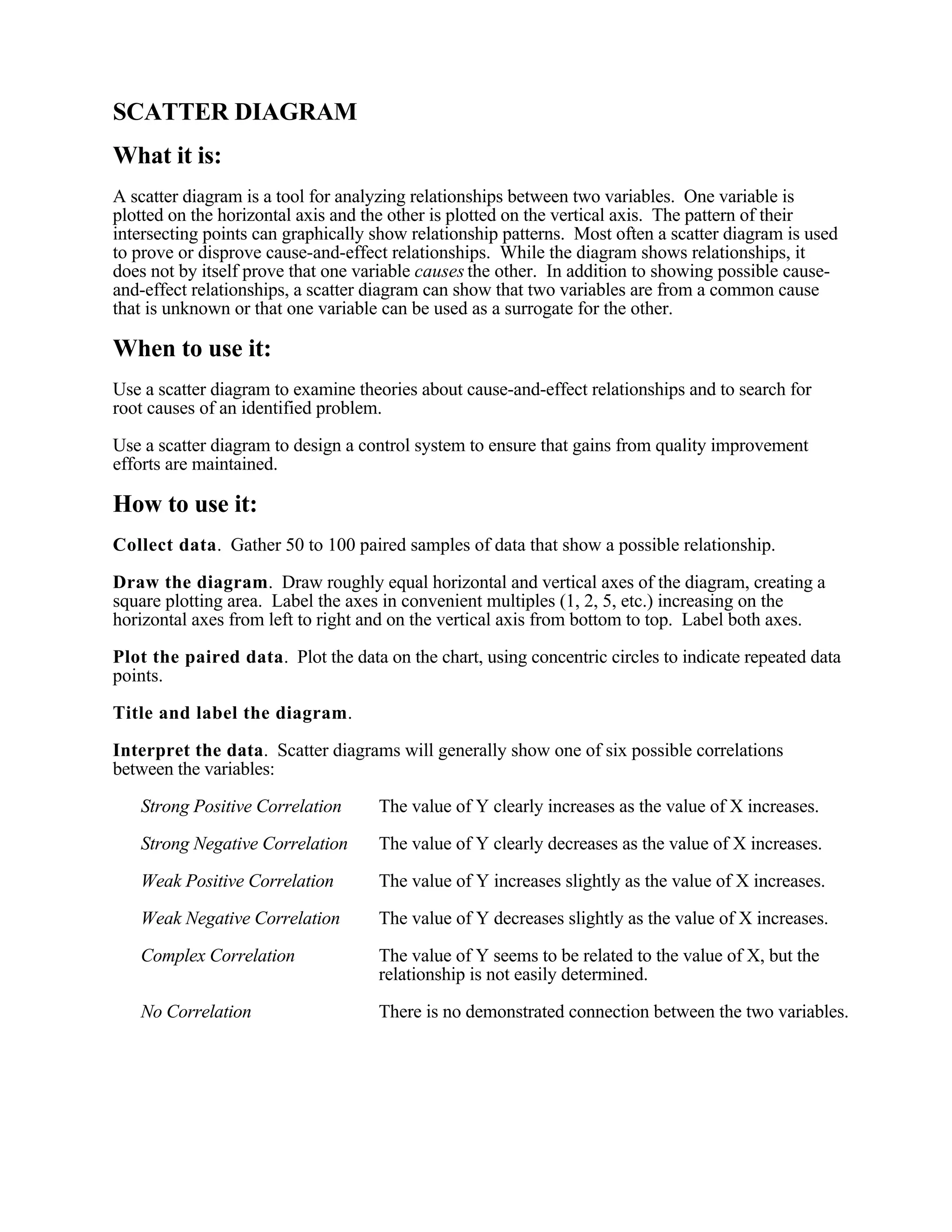
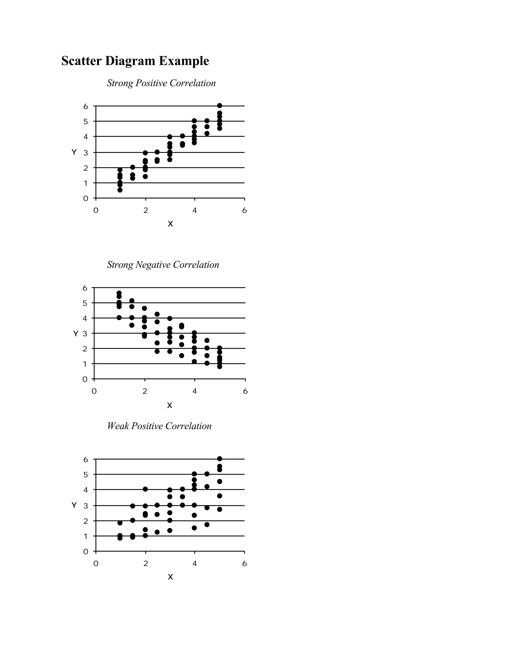
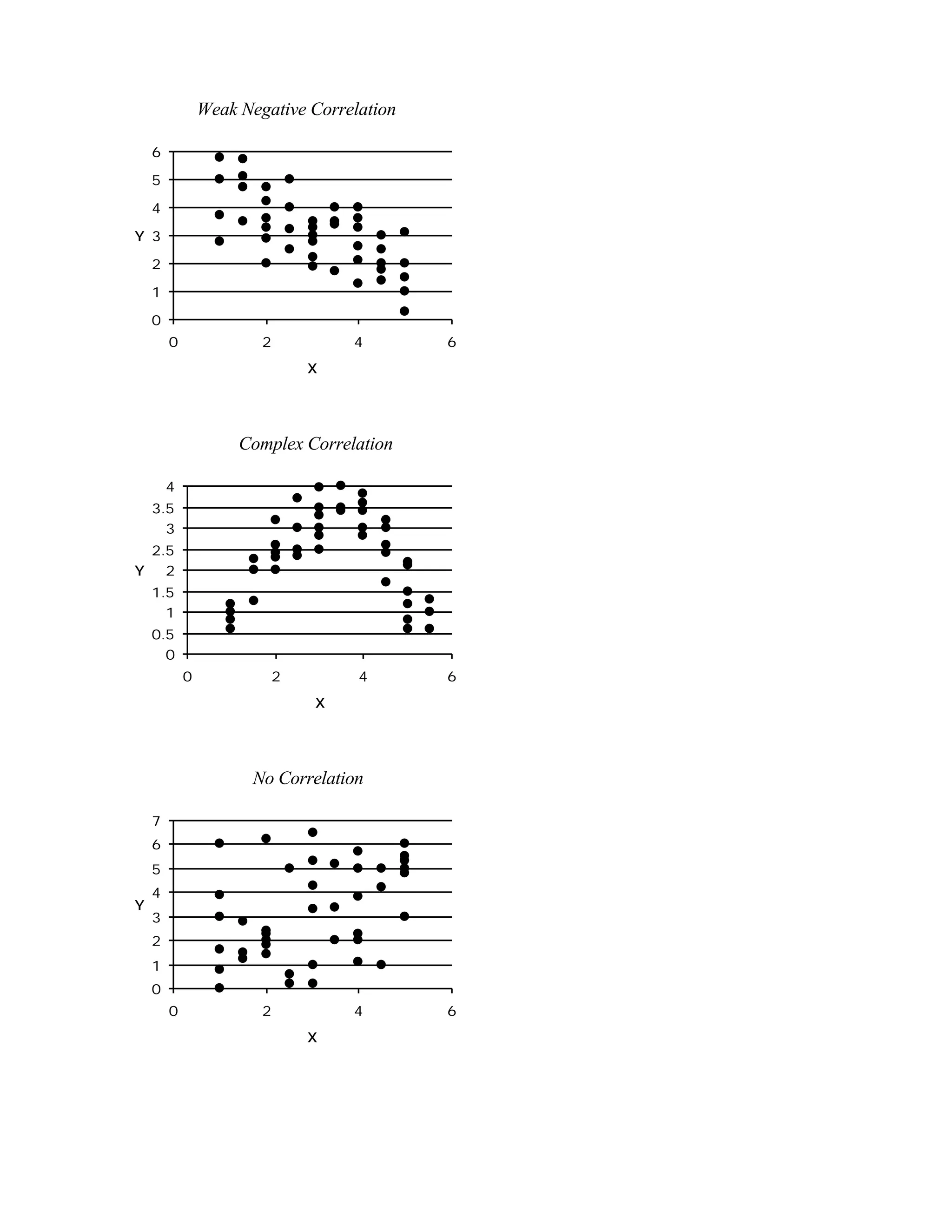

A scatter diagram is a tool used to analyze the relationship between two variables by plotting one on the horizontal axis and the other on the vertical axis. The pattern of intersecting points can show possible causal relationships or common causes, though the diagram alone does not prove causation. Scatter diagrams are used to examine theories and identify problems, and to design control systems to maintain quality improvements. Data is collected, plotted, labeled, and interpreted to assess the strength and direction of correlation between the variables.