Download to read offline


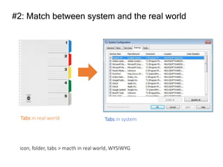


The document discusses heuristic evaluation methods for usability, emphasizing the importance of user interface design principles, such as visibility of system status and match between system and the real world. It outlines ten usability heuristics, including user control, error prevention, recognition rather than recall, and the necessity for help documentation. The final analysis includes expert recommendations based on the severity of identified usability issues in the PLN mobile application interface.


