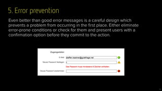
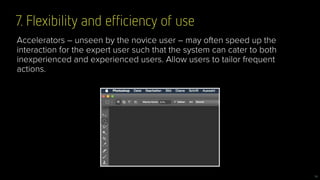
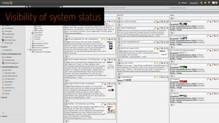
Heuristic UX Evaluation
www.flickr.com/photos/pedrovezini/4933885107
@steffenk71
Steffen Kastner
UX Researcher
gutefrage.net
Today’s Takeaway
3
Heuristic evaluation is NOT
a replacement for talking to your users!
So what is it then?
4
A heuristic technique is any approach to problem solving,
learning, or discovery that employs a practical methodology
not guaranteed to be optimal or perfect, but sufficient for the
immediate goals. Wikipedia
Some things never change …
5
• Strive for consistency
• Cater to universal usability
• Offer informative feedback
• Design task flows to yield closure
• Prevent errors
• Permit easy reversal of actions
• Make users feel they are in control
• Minimize short-term memory load
• Consistency and standards
• Visibility of system status
• Match between system and real world
• User control and freedom
• Error prevention
• Recognition rather than recall
• Flexibility and efficiency of use
• Aesthetic and minimalist design
• Help users recognize, diagnose and
recover from errors.
• Provide online documentation and help
Shneiderman (1987)
Nielsen and Molich (1990)
Some things never change …
6
• Strive for consistency
• Cater to universal usability
• Offer informative feedback
• Design task flows to yield closure
• Prevent errors
• Permit easy reversal of actions
• Make users feel they are in control
• Minimize short-term memory load
• Consistency and standards
• Visibility of system status
• Match between system and real world
• User control and freedom
• Error prevention
• Recognition rather than recall
• Flexibility and efficiency of use
• Aesthetic and minimalist design
• Help users recognize, diagnose and
recover from errors.
• Provide online documentation and help
Shneiderman (1987)
Nielsen and Molich (1990)
Some things never change …
7
?
Read this!
8
Nielsen’s & Molich’s 10 Interaction Design Principles a.k.a.
»10 Usability Heuristics for User Interface Design«
9
www.nngroup.com/articles/ten-usability-heuristics/
1. Visibility of system status
10


The system should always keep users informed about what is going on,
through appropriate feedback within reasonable time.
2. Match between system and the real world
11


The system should speak the users' language, with words, phrases and
concepts familiar to the user, rather than system-oriented terms. Follow
real-world conventions, making information appear in a natural and
logical order.
3. User control and freedom
12
Users often choose system functions by mistake and will need a clearly
marked "emergency exit" to leave the unwanted state without having to
go through an extended dialogue. Support undo and redo.
4. Consistency and standards
13
Users should not have to wonder whether different words, situations, or
actions mean the same thing. Follow platform conventions.
5. Error prevention
14
Even better than good error messages is a careful design which
prevents a problem from occurring in the first place. Either eliminate
error-prone conditions or check for them and present users with a
confirmation option before they commit to the action.
6. Recognition rather than recall
15
Minimize the user's memory load by making objects, actions, and
options visible. The user should not have to remember information from
one part of the dialogue to another. Instructions for use of the system
should be visible or easily retrievable whenever appropriate.
7. Flexibility and efficiency of use
16
Accelerators – unseen by the novice user – may often speed up the
interaction for the expert user such that the system can cater to both
inexperienced and experienced users. Allow users to tailor frequent
actions.
8. Aesthetic and minimalist design
17
Dialogues should not contain information which is irrelevant or rarely
needed. Every extra unit of information in a dialogue competes with the
relevant units of information and diminishes their relative visibility.
9. Help users recognize, diagnose, and recover from errors
18
Error messages should be expressed in plain language (no codes),
precisely indicate the problem, and constructively suggest a solution.
10. Help and documentation
19
Even though it is better if the system can be used without
documentation, it may be necessary to provide help and documentation.
Any such information should be easy to search, focused on the user's
task, list concrete steps to be carried out, and not be too large.
Visibility of system status
fabric.io
Visibility of system status
User control and freedom
Match between system and real world
Use Heuristics/UX checklists to …
27
• … to identify the big flaws of your product, prototype, wireframe, … !
• … get an idea where to start your UX-fixing!
• … avoid show-stoppers in usability tests!
• … sharpen the »user’s eye« of your team!
• … streamline your UX process!
DO NOT use Heuristics/UX checklists to …
28
… have an excuse for not doing usability testing!
29
30
Readability Check Tools
www.leichtlesbar.ch
read-able.com
http://bit.ly/1Bjp34F
Deutsche UX-Checkliste:
Questions?
Thank you!

Heuristic ux-evaluation

  • 1.
  • 2.
  • 3.
    Today’s Takeaway 3 Heuristic evaluationis NOT a replacement for talking to your users!
  • 4.
    So what isit then? 4 A heuristic technique is any approach to problem solving, learning, or discovery that employs a practical methodology not guaranteed to be optimal or perfect, but sufficient for the immediate goals. Wikipedia
  • 5.
    Some things neverchange … 5 • Strive for consistency • Cater to universal usability • Offer informative feedback • Design task flows to yield closure • Prevent errors • Permit easy reversal of actions • Make users feel they are in control • Minimize short-term memory load • Consistency and standards • Visibility of system status • Match between system and real world • User control and freedom • Error prevention • Recognition rather than recall • Flexibility and efficiency of use • Aesthetic and minimalist design • Help users recognize, diagnose and recover from errors. • Provide online documentation and help Shneiderman (1987) Nielsen and Molich (1990)
  • 6.
    Some things neverchange … 6 • Strive for consistency • Cater to universal usability • Offer informative feedback • Design task flows to yield closure • Prevent errors • Permit easy reversal of actions • Make users feel they are in control • Minimize short-term memory load • Consistency and standards • Visibility of system status • Match between system and real world • User control and freedom • Error prevention • Recognition rather than recall • Flexibility and efficiency of use • Aesthetic and minimalist design • Help users recognize, diagnose and recover from errors. • Provide online documentation and help Shneiderman (1987) Nielsen and Molich (1990)
  • 7.
    Some things neverchange … 7 ?
  • 8.
  • 9.
    Nielsen’s & Molich’s10 Interaction Design Principles a.k.a. »10 Usability Heuristics for User Interface Design« 9 www.nngroup.com/articles/ten-usability-heuristics/
  • 10.
    1. Visibility ofsystem status 10 
 The system should always keep users informed about what is going on, through appropriate feedback within reasonable time.
  • 11.
    2. Match betweensystem and the real world 11 
 The system should speak the users' language, with words, phrases and concepts familiar to the user, rather than system-oriented terms. Follow real-world conventions, making information appear in a natural and logical order.
  • 12.
    3. User controland freedom 12 Users often choose system functions by mistake and will need a clearly marked "emergency exit" to leave the unwanted state without having to go through an extended dialogue. Support undo and redo.
  • 13.
    4. Consistency andstandards 13 Users should not have to wonder whether different words, situations, or actions mean the same thing. Follow platform conventions.
  • 14.
    5. Error prevention 14 Evenbetter than good error messages is a careful design which prevents a problem from occurring in the first place. Either eliminate error-prone conditions or check for them and present users with a confirmation option before they commit to the action.
  • 15.
    6. Recognition ratherthan recall 15 Minimize the user's memory load by making objects, actions, and options visible. The user should not have to remember information from one part of the dialogue to another. Instructions for use of the system should be visible or easily retrievable whenever appropriate.
  • 16.
    7. Flexibility andefficiency of use 16 Accelerators – unseen by the novice user – may often speed up the interaction for the expert user such that the system can cater to both inexperienced and experienced users. Allow users to tailor frequent actions.
  • 17.
    8. Aesthetic andminimalist design 17 Dialogues should not contain information which is irrelevant or rarely needed. Every extra unit of information in a dialogue competes with the relevant units of information and diminishes their relative visibility.
  • 18.
    9. Help usersrecognize, diagnose, and recover from errors 18 Error messages should be expressed in plain language (no codes), precisely indicate the problem, and constructively suggest a solution.
  • 19.
    10. Help anddocumentation 19 Even though it is better if the system can be used without documentation, it may be necessary to provide help and documentation. Any such information should be easy to search, focused on the user's task, list concrete steps to be carried out, and not be too large.
  • 20.
  • 21.
    Visibility of systemstatus fabric.io
  • 22.
  • 23.
  • 24.
    Visibility of systemstatus User control and freedom Match between system and real world
  • 27.
    Use Heuristics/UX checkliststo … 27 • … to identify the big flaws of your product, prototype, wireframe, … ! • … get an idea where to start your UX-fixing! • … avoid show-stoppers in usability tests! • … sharpen the »user’s eye« of your team! • … streamline your UX process!
  • 28.
    DO NOT useHeuristics/UX checklists to … 28 … have an excuse for not doing usability testing!
  • 29.
  • 30.
  • 33.
  • 34.
  • 35.