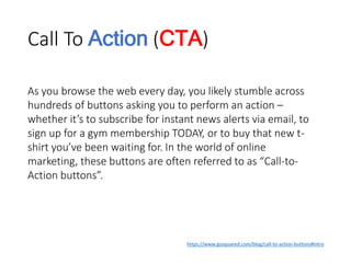
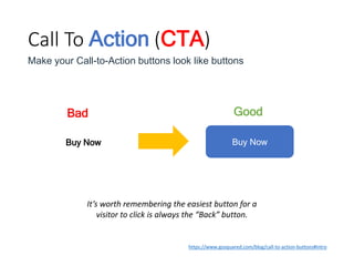
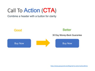
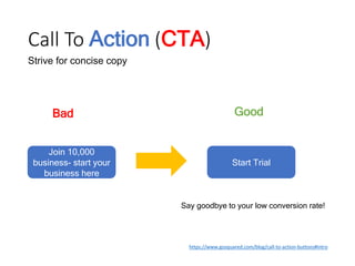
Downloaded 19 times


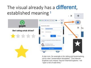
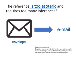
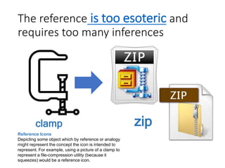
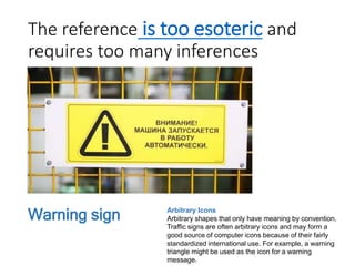
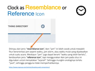
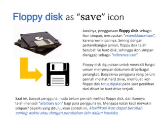
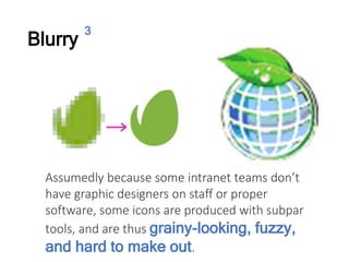
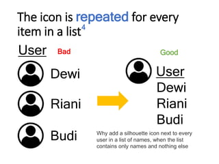
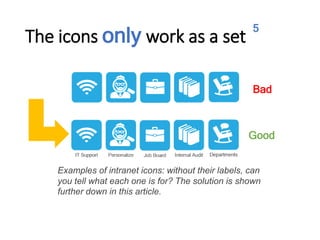
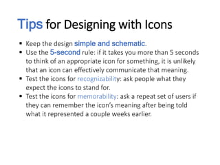
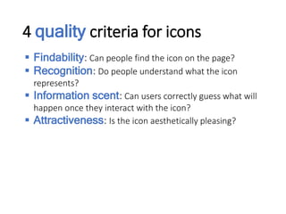
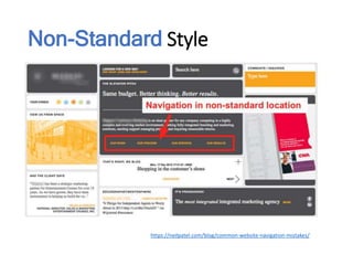
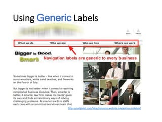
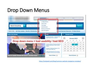

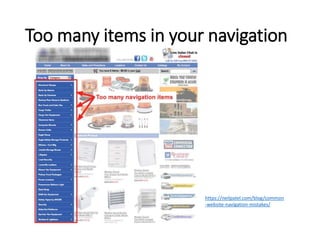
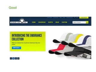


The document discusses good and bad design practices for icons and web navigation. For icons, it provides examples of bad icons such as those that use visuals with different established meanings, references that are too obscure, blurry images, and icons that only work as a set. It then discusses design tips for icons including keeping them simple, testing for recognizability and memorability, and meeting criteria for findability, recognition, information scent, and attractiveness. For web navigation, it cautions against non-standard styles, generic labels, overuse of drop down menus, and including too many items. Overall it emphasizes the importance of usability testing and providing clear, intuitive interfaces.


![Rangkuman bab 3 teknologi, informasi, dan komunikasi [autosaved]](https://cdn.slidesharecdn.com/ss_thumbnails/rangkumanbab3teknologiinformasidankomunikasiautosaved-220211021147-thumbnail.jpg?width=640&height=640&fit=bounds)


