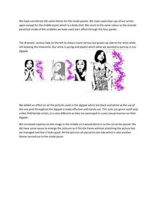
1. We have carried out the same theme for the inside panels. We have used close ups of our artists
again except for the middle panel which is a body shot. We stuck to the same colour as the outside
panel but inside of the scribbles we have used stars effect through the four panels.
The dramatic, serious look on the left to show a more serious but grown up side to the artist while
still keeping the innocence. Our artist is young and playful which what we wanted to portray in our
digipak.
We added an effect on all the pictures used in the digipak which are black and white so the use of
the one pink throughout the digipak is really effective and stands out. This suits our genre synth pop
unlike RnB female artists, it is very different as they are portrayed in a very sexual manner on their
digipak.
We increased capacity on the image in the middle so it would blend in so the cd can be placed. We
did have some issues to enlarge the pictures so it fits the frame without stretching the picture but
we managed and feel it looks good. All the pictures all placed to one side which is also another
theme carried out in the inside panel.