1. Digipak Analysis – Lil Wayne
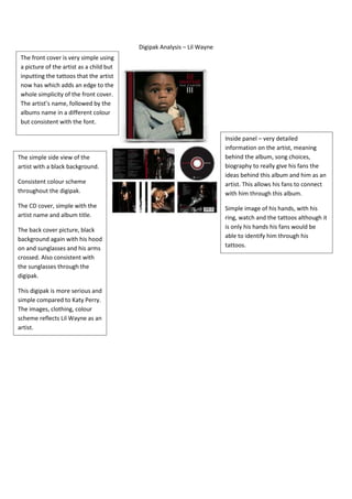
The front cover is very simple using
a picture of the artist as a child but
inputting the tattoos that the artist
now has which adds an edge to the
whole simplicity of the front cover.
The artist’s name, followed by the
albums name in a different colour
but consistent with the font.
Inside panel – very detailed
information on the artist, meaning
The simple side view of the behind the album, song choices,
artist with a black background. biography to really give his fans the
ideas behind this album and him as an
Consistent colour scheme artist. This allows his fans to connect
throughout the digipak. with him through this album.
The CD cover, simple with the Simple image of his hands, with his
artist name and album title. ring, watch and the tattoos although it
The back cover picture, black is only his hands his fans would be
background again with his hood able to identify him through his
on and sunglasses and his arms tattoos.
crossed. Also consistent with
the sunglasses through the
digipak.
This digipak is more serious and
simple compared to Katy Perry.
The images, clothing, colour
scheme reflects Lil Wayne as an
artist.