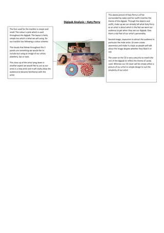
1. This above picture of Katy Perry is of her
surrounded by cakes and her outfit matches the
theme of the digipak. Through the objects and
Digipak Analysis – Katy Perry
outfit, make up we can already tell what Katy Perry
as an artist is about which is the feel we want our
The font used for the tracklist is simple and
audience to get when they see our digipak. Give
small. The colour is pink which is used
them a real feel of our artist’s personality.
throughout the digipak. The layout is fairly
simple too which is what we will using for Second image, voyeurism to attract the audience in
our tracklist too following a colour scheme. particular the male artist. Or even create
awareness and make it a topic as people will talk
The clouds that follow throughout the 3
about the image despite whether they liked it or
panels are something we would like to
not.
include but using an image of our artists
jewellery, lips or eyes. The cover on the CD is very colourful to match the
rest of the digipak to reflect the theme of candy
This close up of the artist lying down is
used. Whereas our CD cover will be simple either a
another aspect we would like to use as our
picture of our artist or simple design to suit the
artist is a new artist and it will really allow the
simplicity of our artist.
audience to become familiarise with the
artist.