1. Evaluation for Foundation Portfolio
I have finished constructing my products that will be suitable for my target audience, in order to be
able to do that I had to do a lot of research and planned. I will be analysing what I have done
throughout this project and the stages I went through to get my product to its final standard and
also what I have learnt and how I put my skills to use.
In what ways does your media product use; develop pr challenge forms and conventions
of real media products?
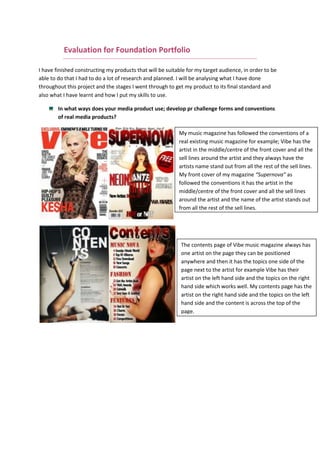
My music magazine has followed the conventions of a
real existing music magazine for example; Vibe has the
artist in the middle/centre of the front cover and all the
sell lines around the artist and they always have the
artists name stand out from all the rest of the sell lines.
My front cover of my magazine “Supernova” as
followed the conventions it has the artist in the
middle/centre of the front cover and all the sell lines
around the artist and the name of the artist stands out
from all the rest of the sell lines.
The contents page of Vibe music magazine always has
one artist on the page they can be positioned
anywhere and then it has the topics one side of the
page next to the artist for example Vibe has their
artist on the left hand side and the topics on the right
hand side which works well. My contents page has the
artist on the right hand side and the topics on the left
hand side and the content is across the top of the
page.
2. The double page spread of Vibe has as an introduction to the artist featuring their
magazine it gives them a brief explanation of what they should expect in the article and
the double page spread it also has images of the artist that features in the article. The
images are along the top and the article is separated in the middle to give it a structured
layout. My double page spread also has images across the top, of the artist featured and
also the layout is structured its split into two to not be blocky and put the read of from
reading it.
This front cover of Blender inspired my image
and layout of my music magazine front cover,
the image used on my front cover is in the
middle of the cover and also has space
around the image as like this front cover of
Blender. This suggests how important the
image is and clearly shows the contrast
between the main image and the background
and this inspired me which is why I placed
the image in the middle centre.
These contents page of Blender and
Vibe inspired my contents page,
their use of image and the writing
being on one side is clear and the
image stands out. I put my image on
the right hand side and the
information on the left hand side
because that’s where the eye goes
to the left hand side.
3. My inspiration on my poses and outfit came from Neon Hitch who is also my artist on the
three pieces, she is a unique artist and is fierce with her outfits and wants to stand out from
the crowd. I chose her to be my artist because she will inspire my audience as she came
from a poor background and made it to the top with her music career and now she is living
her dreams, this will show my readers that you can be anything you want to be if you work
hard for it and believe.
Here are two of her music videos that I love to listen to and inspired my work:
http://www.youtube.com/watch?v=ltOR2VzDZFM – This music video inspired my double
page spread, as this shows her innocent side and her love life. In the interview she talks
about her love life and how her music is inspired by her past.
http://www.youtube.com/watch?v=CEJXo01zzmo – This music video inspired my poses and
outfit as she is fearless, sexy and feisty in this music video.
How does your media product represent particular social groups?
My front cover represents age 17-23 and gender as the image is of a young female model which
attracts females to the magazine as they see a young beautiful model which they inspire to be like.
My contents represents the gender again as it uses the colours red and black, red symbolises love
and sexy, black also symbolises sexy and most females want to find love and look sexy as it makes
them feel good. My double page spread represents gender as there is 4 images of a young female
model posing confidently which represents the female gender as they all want to look confident in
everything they do and be independent. This is a typical representation because now a day’s
teenage girls and young female adults want to look sexy and slim so more magazines are publishing
beautiful slim models on their front covers or generally in the magazine to inspire females to look as
good as the models.
What kind of media institution might distribute your media product and why?
Vibe media will own and distribute my magazine because vibe media owns the well known RnB
magazine Vibe, I chose vibe media because it has successful sold millions of copies of Vibe and have
made the magazine successful. They also have their own website for people to look at worldwide,
this would help my magazine as their website could promote “Supernova” and then it would
distribute and my magazine would get high sell and because vibe media has its own website my
target audience is ages between 16-24 years, they love using the internet so they website would be
helpful with promoting my magazine to my target audience.
4. Who would be the audience for your media product?
My target audience is females the ages between 16-24 years old, my audience will be confident and
independent and are always willing to take any opportunity in life to experience different things, and
they always want to have fun. My audience will also be into RnB music of course but they so love
fashion, they are fashionable and adopt trends to suit their figures and stand out from the crowd
they want to be their own person and be unique in every way possible. My audience also love to
make themselves looking good, sexy and maintaining her body looking healthy and fit. They love
going out with friends and having a good time, they love to dance.
My magazine is suitable to my audience because it expresses the dreams of the female artist
through the name of my magazine “Supernova” it means a star that suddenly increases greatly in
brightness which reflects on the RnB artist everyday they increases in brightness and they are the
stars to my audience and my audience will be inspired to be like the artists on the magazine.
How did you attract/address your audience?
To attract my audience I used a female artist because my audience are females and they can relate
to the artist and because she looks good and fit they would be attracted to her more because young
adults want to look like famous artist or inspire to be beautiful women like the ones they see on
magazine. With my model she will attract the female audience because she is beautiful and the
female audience would want to be like her and learn more about her to inspire to be like her. Also
the colours stand out they are bright and eye catching which will get the audience attention and
draw them towards the magazine, the artist name “Neon Hitch” also stands out which will draw the
reader’s attention to the image of the artist and want to read her article inside the magazine.
The reader will like my magazine because it has everything they need to read about not just music
but fashion, as you know females love fashion and always want to update with their looks and
always need to look good. They also will get the gossip on the music world (artists, songs, tours,
albums, etc).
5. I also did a questionnaire to ask my target audience what they prefer to see in the magazine which
will let me know what will make my magazine successful.
What have you learnt about technologies from the process of constructing this product?
I have gained and learnt many skills from the beginning of this project I have been able to use
Photoshop in different ways and learnt different editing techniques to improve my products. Before
this project I didn’t know how to blur/gradient your images on Photoshop but I learnt how to use it, I
have used the gradient tool in my double page spread for my images to blur together so it would not
look so blocky and unprofessional. Before this project I did have a few skills from my last project with
using Photoshop I knew how to add drop shadow, outer glow effects on the masthead but in this
project I learnt how to add two colour effects into the masthead to stand out more and be different
and unique from other magazines. I also learnt how to use Picmonkey to edit the different effects on
my image; I learnt how the effects on the image can match with the brand identity of the magazine. I
didn’t know how to use blogger before and never had one, and I learnt that it’s not just a site where
I place all my work onto but it represents me and my style of work, and what sort of person I am. By
design my blog you can not only see my work but also my style and my blog describes me.
Looking back at your preliminary task, what do you feel you have learnt in the progression
from it to the full product?
6. Since my preliminary task I have become better in most areas such as the layout of my magazine
front cover, my preliminary for my front cover was poorly laid out, the image of the model was not
filling the cover. The image did not related to the magazine colour scheme but for my music
magazine my model related to the colour scheme as she was wearing black outfit but with red
lipstick to be linked with the masthead. Also the sell lines stood out more in my music magazine then
the preliminary task.
From this project I have learnt that images can related to the magazine itself, for example the
model/image on the front cover links with the masthead or sell lines. I learnt that everything that is
placed on a magazine helps the magazines success by either attracting the audience to the magazine
or for the readership to be entertained by the magazine and not bored.
All of my research and planning has helped me construct the perfect music magazine front cover,
contents and double page spread for my target audience. Throughout my research and planning I
have got new ideas to put create my music magazine, I did change my mind a few times with the
genre of my magazine first I was doing pop and then I thought I would do a better job at RnB as I
know more RnB singers and I had a lot more ideas for RnB music magazine. I learnt a lot of different
editing techniques, last year I used Photoshop to make a perfume advert and I knew how to use the
editing tools, but this year I improved on my editing skills and my final pieces are up to a high
standard of skill and editing.