1. KEY CONVENTIONS FOR MY GENRE OF MUSIC
Front Cover
Masthead Images
The pictures in comparison without looking at the rest of the magazine are
very different and are used in a different ways. The Vibe magazine has placed
a reconcilable face in a close up picture, with the pose and props he is showing
it gives a sense of professionalism and a cool attitude towards the music
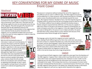
Here I've shown the masthead of my magazine and the
genre. My magazine however I decided to have a mid shot towards long shot
masthead of the vibe magazine in comparison to show just
including a pose of a person from the feet up including a prop for which he sits
how conventional I have made mine. They both start off
on. This shows a different tone of address and with his emotions shows a
with being roughly the same size and spread across the top
realistic and genre represented look. With the us of the prop of a speaker it
of the magazine. They both also give off a masculine and
adds more realism to the genre and shows the audience something they can
bold look with the big capitalized names for the
relate to the genre and artist or the magazine. In the vibe magazine they have
masthead, this gives a representation to the magazine that
also used an editing skill on the picture to turn it black and white, this works
more male than female would be interested in the
well with there colour scheme where as mine I left the same because of the
magazine. For my masthead Included a box out around
conventional colour theme through-out the magazine.
it, this is the same for many magazines in order to make the
masthead stand out. Language
Left/Right Third The language used on the both the magazine are quite roughly the
With the left third being the place of same, leading off with different genres for there main artist cover story shows
information I made sure mine had plenty of this more so than it is, however they both use a cocky and sarcastic tone in parts
exclusive information so that the audience (as shown), and the stand language in others like you would expect from this
where drawn to it for the purpose of it being age group. As ironically possible as it is they have again also
the left or right third. In this case compared kept the same colour scheme within there text as well,
to VIBE magazine I would personally mine is this goes to follow within my magazine as well yet uses
more appealing and audience aimed. white in the text bit shown due to the image being behind.
Although there right third is not packed with
information they have expanded and bolded
Layout
the texts for only the 3 pull quotes which The overall layout of both magazine is kept roughly the same apart from the blandness of
helps to continue making it look appeal. The the VIBE magazine. It appears that in vibes certain issue they did not insert much text or
colour scheme of both the left and right colour which mean more appeal towards the artist. However on mine I made it so the
thirds are ironically the same and both keep image was put into the background so the information such as artist names are more
an appealing look although my own is space noticeable to the reader. This to shows that mine has a more purpose of content rather
more together and kept closer to the picture than look. As being told that the barcode is a conventional asset on the front cover, seeing
to look more ordered and appealing to the the VIBE magazine shows that this is not always true, along with having no information
audience. about the magazine its self such as a tag line which represents the magazine.
2. Contents
Heading
For the contents page the layout starts with the Subscription Box
heading, this is the same for both my magazine
and the Vibe magazine which our genre relates Unfortunately I was unable to show an image of a subscription box due
to. Both of the texts are in a capitalised bold font to lack of images of VIBEs on Google images. Usually the subscription is
which catches the readers eyes to navigate them conventionally placed within the contents or in some magazines can be
and also shows a masculine look which is the found on the back and even the front cover. The subscription box is
aimed target audience. Unlike Vibe my magazine always a power convention to have in a magazine as it’s the main asset
uses a subheading underneath the heading to with promotes there magazine to the reader directly. This gives most
reinstate the magazine and inform the date. magazines the popularity and appeal rate which they have.
Images
Images are another key convention
through out the hole of the music
Contents magazines, as you can see in mine I
used small mid shot images linked to
The contents is clearly the main part of the contents page(s) which certain content pages. However Vibe
means they are very conventional to the music magazines. There are have decided in there issue to give a
put there in order to inform the reader of news in the magazine so long shot to mid shot of Obama
they are appealed to certain things before getting bored through the which cause a more appeal towards
magazine. This helps select a wide range of audiences because certain the one image and in this case adds
topics would appeal to certain people. The convention thing about the importance because of the person.
contents is to have the page number around the information to give
the reader a navigational hint around the magazine. Cover Story
The Cover is also another key convention needed and magazine and can
also be found in different places on different magazines, in my I placed it in
the contents to give a difference of look from the contents and to stand
out after they know the contents of the magazine. Vibe usually put the
cover story on the page which I have also done. The image with the cover
story also gives the reader a better idea of the artist straight away and
what the topic might be about. Being on the front cover and more
information about it in the contents will make people look more into the
topic and the will persuade them to read the story.
3. Image of Artist Double Page Spread Main Pull Quote
The image of the double page spread is the The main pull quotes are normally seen above or around the artist on the
main part to leading to the audience into double page spread. This is firstly so it is seen straight after looking at the
reading the article about the artist. To do image and then is used to tell the audience a brief summary on what the
this the artist is always conventionally put article is about. In Vibes case they used a quote from Usher himself which
into a certain position and pose along with would make the reader feel like they are being directly spoken to. Mine
props and a costume which would represent however is a normal statement pull quote which just tells the main summary
themselves and then attract the audience of the artists article, this can be seen as a more formal and professional
which then relate themselves the artist. approach to informing the audience of the article. Using direct speech from
Using certain props also helps to give a the artist such as in VIBE is a good convention to stick to because it keeps
meaning and emotion to the artist, this can the reader appealed by the feel of direct speech, this means the audience
also be created by the pose and position of feels more personal about the replies or statements the artists make.
the person or what they are doing at the
time of the photo. Using a light effect from
one side of the photo has been used in both
my magazine and theirs which is used to
show an angle of shadow and then enables
the audience to focus on the lighted areas.
Both he stances pulled in the magazines
represent their seriousness and profess-
ionalism on the genre of music, this helps The Article
the audience to take them serious and read
their article. The article its self is where the information n
Props the artist needs to be at its best to attract
The props used in the image are the the audience. Using conventional elements
main reason for the representation such as a kicker to start the article and
of a person along with the look and inputted interviews on the artist helps to
position in he picture. Conventional keep the audience appealed and interested
props such as music equipment and in the artist and genre. Using quotes within
branded clothing have been used in the article from the artist also helps to keep
mine and VIBEs which shows a he audience informed and appealed. I was
certain style and personality of an unable to find a VIBE article section but
artist such as Ushers watch which looking through others they show to keep
shows his background of ‘Bling’ and the same general conventions which have
richness. such as the main pull quote and a kicker.