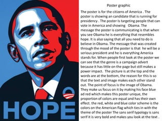
1. Poster graphic
The poster is for the citizens of America . The
poster is showing an candidate that is running for
presidency . The poster Is targeting people that can
vote in America and showing Obama. The
message the poster is communicating is that when
you see Obama he is everything that resembles
hope. It is also saying that all you need to do is
believe in Obama. The message that was created
through the mood of the poster is that he will be a
serious president and he is everything America
stands for. When people first look at the poster we
can see that the genre is a campaign advert
because it has little on the page but still makes a
power impact. The picture is at the top and the
words are at the bottom, the reason for this is so
that the text and image makes each other stand
out. The point of focus is the image of Obama.
They make us focus on it by making his face blue
ad red which makes this poster unique, the
proportion of colors are equal and has their own
effect. the red, white and blue color scheme is the
colors on the American flag which ties in with the
theme of the poster The sans serif typology is sans
serif it is very bold and makes you look at the text .
2. Web graphic
The target audience of the web campaign is
anyone that wants to learn about mental illness
also the client is anyone that wants to take away
the stigma around mental illness and promote this
campaign. The website is made to take away the
stigma around mental illness and to educate people
about it. The text that is used through out the
website is the sans serif text. The colour theme is
white and pink both of these colour themes make
each other stand out on the white background
makes all of the things on the page stand out. The
navigation system on the website is takes you
directly on to the page you are looking for also
the search engine that is on the website helps
people find what they are looking for easier. The
grid structure allows people to put more on the
page and to include a lot of imagery and text the
grid system is structured and organised. The
website is very interactive with the use of
hyperlinks, comments and videos this makes the
website even more interesting. The imagery is
mostly of people that can help and support people
with mental illness. It also shows people with
mental illness to show that people that have mental
illnesses are normal people too and they do not
need to be treated differently.
3. Motion based graphic
The audio includes a voice over and also
music is used as well. Every time you see a
cut it is used in the TV campaign it is on beat
with the audio. The cutting and transformation
is very fast pace but they include a lot of
information but it is very clear as well. The
point of focus is the print products the women
are holding up in the motion based campaign.
The background of campaign is black so that
the print stands out. The print uses sans serif
which makes everything stand out and makes
more of a statement. The point of focus of
everything on the motion base campaign is the
image on the poster the women is holding up.
The message of the campaign is to show the
objectification of women in the media the
atmosphere they create is very serious and
makes the consumer listen. The voice over
that is talking through out the campaign is a
women's voice this shows us that women are
trying to stand up for the wrong doings the
media is doing for them. We also see that
women are just used in the TV campaign
about objectifying women to show that they
do not approve of what is going on and the
campaign is about women so they only used
women