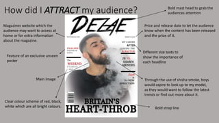
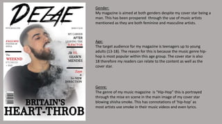
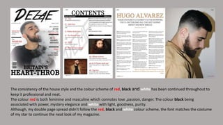
AS MEDIA EVALUATION
Q5: How did you attract/address your audience?
How did I ATTRACT my audience? Bold mast head to grab the
audiences attention
Clear colour scheme of red, black,
white which are all bright colours.
Through the use of shisha smoke, boys
would aspire to look up to my model,
as they would want to follow the latest
trends or find out more about it.
Magazines website which the
audience may want to access at
home or for extra information
about the magazine.
Price and release date to let the audience
know when the content has been released
and the price of it.
Different size texts to
show the importance of
each headline
Feature of an exclusive unseen
poster
Main image
Bold strap line
How did you ADDRESS your audience?
When planning and creating my product , I made sure my audience would feel addressed to
through the images, font types, font size and colour.
The use of the vibrant colours red, black and white was one way I tried to attract my
magazine to my audience. The reality of using this colour scheme is to make it more
appealing and consistent throughout.
Although my model did not have direct mode address with my audience, the message that
he was implying was a “rebellious teenager”. This is evident from the mise en scene of the
shisha smoke that is been blown away.
My media product tells the reader that to be successful you need to be confident, happy,
and rebellious at times.
My front cover is used to aspire all the mainstreamers who are seeking to better themselves
and be like my star.
Gender:
My magazine is aimed at both genders despite my cover star being a
man. This has been prospered through the use of music artists
mentioned as they are both feminine and masculine artists.
Age:
The target audience for my magazine is teenagers up to young
adults (13-18). The reason for this is because the music genre hip-
hop is most popular within this age group. The cover star is also
18 therefore my readers can relate to the content as well as the
cover star.
Genre:
The genre of my music magazine is “Hip-Hop” this is portrayed
through the mise en scene in the main image of my cover star
blowing shisha smoke. This has connotations of ‘hip-hop’ as
most artists use smoke in their music videos and even lyrics.
The word “heart-throb” draws the
female readers in because it is referring
to someone as charming and handsome
which makes the female readers wanting
to know more about this ‘heart-throb’.
The fact that it is part of the strap line
appeals to the audience as this person
who is labelled as a heart-throb is a big
deal, this is also supported by the bold
black font.
The red italics of the word
“EXCLUSIVE” connotes how special
this poster inside this magazine is, it
is an item which is published by only
one source. This is almost tempting
the readers to want to see this
‘EXCLUSIVE’ poster by needing to buy
it.
The use of the play phrase “& his NEW
DIRECTION”, mimicking Zayn’s
departure from One Direction lures
the readers in as it funny and
entertaining.
The heading is in the centre at
the top of the page in black bold
font attracting the audience
immediately to let them know
what the page is about.
The white font against a black background
makes it stand out and emphasise on the
“MAIN FEATURES”. This draws the reader
into looking at the contents page as well
as through the pages for each feature.
The use of images takes the
audiences attention off the writing
as too much writing might put them
off. Also, it gives them an insight of
what the magazine includes inside
by helping them understand.
The pull quote which has been
taken from the interview is
used to grab the audiences
attention. It has been chosen as
it supports the rhetorical
question in the headline which
says “and new lover?”
The headline which matches the
cover stars costume is purposely
used to maintain consistency.
The italic flirty font at the
bottom saying “and new lover?”
is used to highlight the potential
love that might be there which
will be mentioned in the
interview.
The use of the image lets the
reader know who is this celebrity
who won the X-Factor.
The consistency of the house style and the colour scheme of red, black and white has been continued throughout to
keep it professional and neat.
The colour red is both feminine and masculine which connotes love ,passion, danger. The colour black being
associated with power, mystery elegance and white with light, goodness, purity.
Although, my double page spread didn’t follow the red, black and white colour scheme, the font matches the costume
of my star to continue the neat look of my magazine.

As media evaluation 5

  • 1.
    AS MEDIA EVALUATION Q5:How did you attract/address your audience?
  • 2.
    How did IATTRACT my audience? Bold mast head to grab the audiences attention Clear colour scheme of red, black, white which are all bright colours. Through the use of shisha smoke, boys would aspire to look up to my model, as they would want to follow the latest trends or find out more about it. Magazines website which the audience may want to access at home or for extra information about the magazine. Price and release date to let the audience know when the content has been released and the price of it. Different size texts to show the importance of each headline Feature of an exclusive unseen poster Main image Bold strap line
  • 3.
    How did youADDRESS your audience? When planning and creating my product , I made sure my audience would feel addressed to through the images, font types, font size and colour. The use of the vibrant colours red, black and white was one way I tried to attract my magazine to my audience. The reality of using this colour scheme is to make it more appealing and consistent throughout. Although my model did not have direct mode address with my audience, the message that he was implying was a “rebellious teenager”. This is evident from the mise en scene of the shisha smoke that is been blown away. My media product tells the reader that to be successful you need to be confident, happy, and rebellious at times. My front cover is used to aspire all the mainstreamers who are seeking to better themselves and be like my star.
  • 4.
    Gender: My magazine isaimed at both genders despite my cover star being a man. This has been prospered through the use of music artists mentioned as they are both feminine and masculine artists. Age: The target audience for my magazine is teenagers up to young adults (13-18). The reason for this is because the music genre hip- hop is most popular within this age group. The cover star is also 18 therefore my readers can relate to the content as well as the cover star. Genre: The genre of my music magazine is “Hip-Hop” this is portrayed through the mise en scene in the main image of my cover star blowing shisha smoke. This has connotations of ‘hip-hop’ as most artists use smoke in their music videos and even lyrics.
  • 5.
    The word “heart-throb”draws the female readers in because it is referring to someone as charming and handsome which makes the female readers wanting to know more about this ‘heart-throb’. The fact that it is part of the strap line appeals to the audience as this person who is labelled as a heart-throb is a big deal, this is also supported by the bold black font. The red italics of the word “EXCLUSIVE” connotes how special this poster inside this magazine is, it is an item which is published by only one source. This is almost tempting the readers to want to see this ‘EXCLUSIVE’ poster by needing to buy it. The use of the play phrase “& his NEW DIRECTION”, mimicking Zayn’s departure from One Direction lures the readers in as it funny and entertaining.
  • 6.
    The heading isin the centre at the top of the page in black bold font attracting the audience immediately to let them know what the page is about. The white font against a black background makes it stand out and emphasise on the “MAIN FEATURES”. This draws the reader into looking at the contents page as well as through the pages for each feature. The use of images takes the audiences attention off the writing as too much writing might put them off. Also, it gives them an insight of what the magazine includes inside by helping them understand.
  • 7.
    The pull quotewhich has been taken from the interview is used to grab the audiences attention. It has been chosen as it supports the rhetorical question in the headline which says “and new lover?” The headline which matches the cover stars costume is purposely used to maintain consistency. The italic flirty font at the bottom saying “and new lover?” is used to highlight the potential love that might be there which will be mentioned in the interview. The use of the image lets the reader know who is this celebrity who won the X-Factor.
  • 8.
    The consistency ofthe house style and the colour scheme of red, black and white has been continued throughout to keep it professional and neat. The colour red is both feminine and masculine which connotes love ,passion, danger. The colour black being associated with power, mystery elegance and white with light, goodness, purity. Although, my double page spread didn’t follow the red, black and white colour scheme, the font matches the costume of my star to continue the neat look of my magazine.