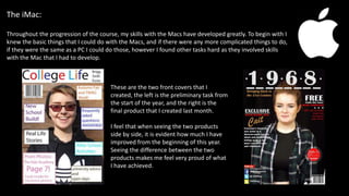
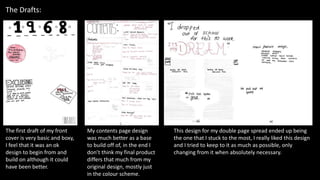
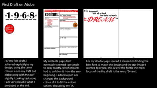
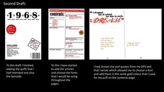
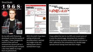
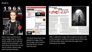
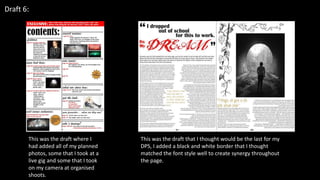
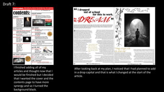
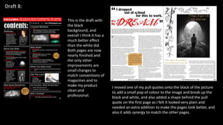
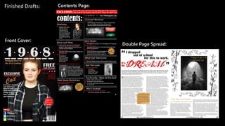
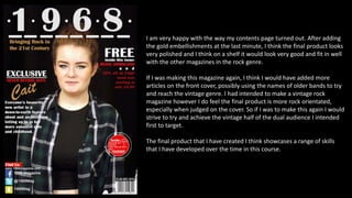
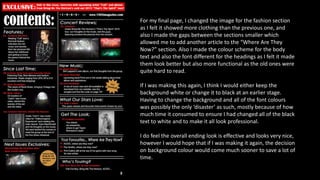
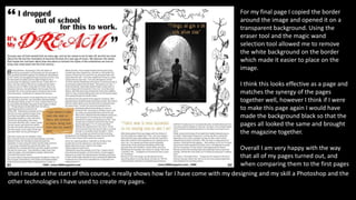
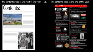
The document summarizes the progression of the author's skills in creating a magazine from their preliminary task to the final product. It shows drafts and revisions made throughout the process. The author reflects that their early work was basic but their skills improved greatly over time. Comparing their first and final covers and contents page, the author feels proud of how much they have developed. Some lessons were to establish design elements like color schemes earlier and include more articles on the cover to better fit the vintage rock genre. Overall, the author is happy with the professional quality and range of skills shown in the final product compared to their earlier work.
Disha NEET Physics Guide for classes 11 and 12.pdf
The Journey: Reflecting on Skills Growth
1. 7) Looking back at your preliminary task, what do you feel you
have learnt in the progression from it to the full product?
The Journey
2. The iMac:
Throughout the progression of the course, my skills with the Macs have developed greatly. To begin with I
knew the basic things that I could do with the Macs, and if there were any more complicated things to do,
if they were the same as a PC I could do those, however I found other tasks hard as they involved skills
with the Mac that I had to develop.
These are the two front covers that I
created, the left is the preliminary task from
the start of the year, and the right is the
final product that I created last month.
I feel that when seeing the two products
side by side, it is evident how much I have
improved from the beginning of this year.
Seeing the difference between the two
products makes me feel very proud of what
I have achieved.
3. The Drafts:
The first draft of my front
cover is very basic and boxy,
I feel that it was an ok
design to begin from and
build on although it could
have been better.
My contents page design
was much better as a base
to build off of, in the end I
don’t think my final product
differs that much from my
original design, mostly just
in the colour scheme.
This design for my double page spread ended up being
the one that I stuck to the most, I really liked this design
and I tried to keep to it as much as possible, only
changing from it when absolutely necessary.
4. First Draft on Adobe:
For my first draft, I
adhered explicitly to my
design, using the same
colours as on my draft but
elaborating with the puff
slightly. Looking back now,
I am very proud of what I
produced at the end.
My contents page draft
eventually seemed too simple
to copy exactly, which meant I
had to build on it from the very
beginning. I added a puff and
changed the background
colour of it to fit the colour
scheme chosen by my TA.
For my double page spread, I focused on finding the
best font to match the design and the star image I
wanted to create, this is why the font is the main
focus of the first draft is the word ‘Dream’.
5. Second Draft:
To this draft I finished
adding the puffs that I
had intended and also
the barcode.
To this I have started
to add the articles
and choose the fonts
that I would be using
throughout the
pages.
I had chosen the pull quotes from my DPS text
that I wrote which allowed me to choose a font
and add them in the same gold colour that I used
for my puff on the contents page.
6. Third Draft:
As my skills with Photoshop
developed, so did the quality of
my pages, I have changed the
outline of the puff and
removed the square puff as it
made everything look cramped.
I also have added my image
from my photoshoot.
With this draft I have been
adding articles and
deciding where I wanted
my images to be and
adding boxes where I
wanted them to go.
I have added the text to my DPS and moved some of
it onto the second page, deviating from my plans. I
did this so that my entire article would fit and also so
that I adhered to the conventions of a double page
spread article having more text than images.
7. Draft 5:
Here I have used the brush
and smudge tools to create a
darker eyeliner and make the
makeup more dramatic. I am
very proud of how this turned
out as I think it works really
well and looks fantastic.
This draft shows that I had
added the images from
the live gig I went to that I
had planned to include
from the start.
After I added the image I felt it looked a bit plain and
so the next goal I wanted to achieve was to find a way
to fill the white space and make the page more
enticing for the reader.
8. Draft 6:
This was the draft where I
had added all of my planned
photos, some that I took at a
live gig and some that I took
on my camera at organised
shoots.
This was the draft that I thought would be the last for my
DPS, I added a black and white border that I thought
matched the font style well to create synergy throughout
the page.
9. Draft 7:
I finished adding all of my
articles and thought now that I
would be finished but I decided
that I wanted the cover and the
contents page to have more
synergy and so I turned the
background black.
After looking back at my plan, I noticed that I had planned to add
in a drop capital and that is what I changed at the start of the
article.
10. Draft 8:
I moved one of my pull quotes onto the black of the picture
to add a small pop of colour to the image and break up the
black and white, and also added a shape behind the pull
quote on the first page as I felt it looked very plain and
needed an extra addition to make the pages look better, and
also it adds synergy to match the other pages.
This is the draft with
the black
background, and
overall I think it has a
much better effect
than the white did.
Both pages are now
nearly finished and
the only other
improvements are
small changes to
match conventions of
magazines and to
make my product
clean and
professional.
12. I am very happy with the way my contents page turned out. After adding
the gold embellishments at the last minute, I think the final product looks
very polished and I think on a shelf it would look very good and fit in well
with the other magazines in the rock genre.
If I was making this magazine again, I think I would have added more
articles on the front cover, possibly using the names of older bands to try
and reach the vintage genre. I had intended to make a vintage rock
magazine however I do feel the final product is more rock orientated,
especially when judged on the cover. So if I was to make this again I would
strive to try and achieve the vintage half of the dual audience I intended
first to target.
The final product that I have created I think showcases a range of skills
that I have developed over the time in this course.
13. For my final page, I changed the image for the fashion section
as I felt it showed more clothing than the previous one, and
also I made the gaps between the sections smaller which
allowed me to add another article to the “Where Are They
Now?” section. Also I made the colour scheme for the body
text and also the font different for the headings as I felt it made
them look better but also more functional as the old ones were
quite hard to read.
If I was making this again, I think I would either keep the
background white or change it to black at an earlier stage.
Having to change the background and all of the font colours
was possibly the only ‘disaster’ as such, mostly because of how
much time it consumed to ensure I had changed all of the black
text to white and to make it all look professional.
I do feel the overall ending look is effective and looks very nice,
however I would hope that if I was making it again, the decision
on background colour would come much sooner to save a lot of
time.
14. For my final page I copied the border
around the image and opened it on a
transparent background. Using the
eraser tool and the magic wand
selection tool allowed me to remove
the white background on the border
which made it easier to place on the
image.
I think this looks effective as a page and
matches the synergy of the pages
together well, however I think if I were
to make this page again I would have
made the background black so that the
pages all looked the same and brought
the magazine together.
Overall I am very happy with the way
that all of my pages turned out, and
when comparing them to the first pages
that I made at the start of this course, it really shows how far I have come with my designing and my skill a Photoshop and the
other technologies I have used to create my pages.
15. My front cover at the start of the year VS. my front cover at the end of the year.
16. My contents page at the start of the year VS. my contents page at the end of the year.