Question 6 what have you learnt about technologies from the process of constr...
Film Magazine Sketch Inspiration
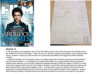
1. Sketch A
I was fascinated by the magazine cover on the left I liked how the name of the character was situated across
the middle and on top of the image , I wasn’t too sure if I wanted to copy the exact style in case my sketch went
wrong . However I made sure that the name of my character was different and bigger then all the sell lines
included,
. I made the first letter of my characters name in a bubble writing font so that the audience can be directed to
who the main character is . I’ve included sub images at the bottom of my page instead of the top because I
wanted all the attention to go to the film magazine masthead example just like the image on the left it is a well
known film magazine that is why the main image is situated on top of the masthead because the audience will
still recognise what company the magazine is from . I've also tried to keep the sell lines minimal so that the
audience do not get distracted from the main focus which is the characters feature in the magazine , however
after finishing my sketch I thought that the more sell lines included the more fans of this genre I may attract.
2. Sketch B
For my sketch B I was influenced by the Empire
magazine , the characters body language and position
inspired me to give my character personality for example
the stern facial expression which connotes seriousness
and also how the arms are positioned it connotes power
and a bold status . For my sketch the main image is very
direct as the sell lines are on the side allowing the
audience to identify the character . My masthead has
been sketched in a different font ( inspired by the scream
magazine ) I used a zig zag pattern to draw my fonts the
pattern connotes cutting with a knife it also reveals the
character and the genre of the film. On top of my
masthead there are blood drops and splats because
blood is a typical convention / prop used in horror films .