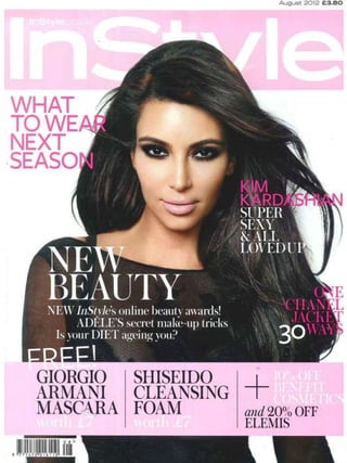
2. InStyle front cover
Masthead: The masthead on this specific article cannot be seen as much as it normally
would be, so this must mean that the image of the model must be more important and
they want the magazine to drag attention to this image. It also could mean that the
magazine is that well known that the masthead does not need to be there in order to be
recognized by the audience.
Main Image: The photograph of the model has been taken as a mid shot in order to
include the models face in detail as well as some of the clothing she is wearing, which fits
into the theme of the fashion magazine that the image is featured on. As the model is a
well-known celebrity, she could also attract people to the magazine who look up and
idolise her, so that they buy the magazine for that reason. The image is in a high key
lighting setup, with the model posing leaning on one side of her body. There has been a
fan blown on the models hair, so that it is floating around during the photograph. This
gives the model a flawless look, and as her makeup has been done very carefully and
exact, it makes her look attractive in a way that people would want to see. Girls will look
at the model in an idolising way, and as males will find her attractive they may even like
the magazine (as a second audience).
Text: Some of the other articles that are featured inside the magazine are on the front
cover too inside of plugs, overlapping the main image in reverse colours so that it is easy
to read and understand. The text is only located on the models shirt and hair, so that not
too much of the important details are covered up such as facial features. The fonts used
within the texts are a variety of different styles, which is good for the audience as it would
entertain them stopping them from getting bored of seeing the same style throughout. The
main coverline is located in the middle slightly to the left of the page. This has been
placed here in white text so that it is over the black shirt, therefore colours don’t clash.
The text is the largest on the page (other than the masthead), therefore you know it is the
most important one.
Colours: The colours used in this front cover are pink, white and black. I think these
colours go well together as they aren't colours that will clash with each other. The only
colours which I don’t think go are the white text on light pink background part in the
banner at the bottom of the page. I think this makes it slightly hard to see the text. The
masthead is in a white text on light pink background. I don’t think this works particularly
well either, but as the text is in bold and is a lot larger than other texts, the words are still
noticeable, just not very bold or bright. The models outfit match her hair and makeup,
creating a very dark and bold colour scheme on the main image itself. This adds the
colour to the front cover, as the text and banners already included are light colours
therefore don’t stand out as much.
Other information: The issue date is located above the masthead in the usual place, so
that the audience knows where to look for it. The layout is quite basic which is good for
new readers of the magazine, so that they know where everything will be located roughly.