![Techniques for Reviewing a User Interface Rhonda Bracey [email_address] http://www.cybertext.com.au](https://image.slidesharecdn.com/techniquesforreviewinga-userinterfacewua2008slides-1212051111500617-9/85/Techniques-for-Reviewing-a-User-Interface-1-320.jpg)


![Some developers get it … your matter-of-fact, no-holds-barred, warts-and-all style of constructive criticism is new to the [team]… Have you been asked to do further in-depth reviews of their applications? It would be good to have your recommendations/guidelines adhered to from the outset. --email from Team Architect and Integration Coordinator, Oct 2007](https://image.slidesharecdn.com/techniquesforreviewinga-userinterfacewua2008slides-1212051111500617-9/85/Techniques-for-Reviewing-a-User-Interface-46-320.jpg)

![Thank you! Any questions? Please complete your evaluation sheets Contact me: [email_address] http://www.cybertext.com.au](https://image.slidesharecdn.com/techniquesforreviewinga-userinterfacewua2008slides-1212051111500617-9/85/Techniques-for-Reviewing-a-User-Interface-56-320.jpg)

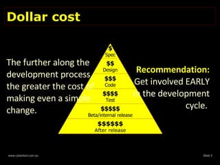
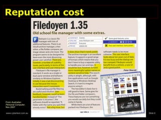
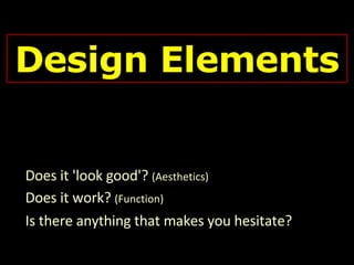
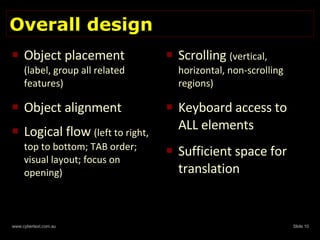
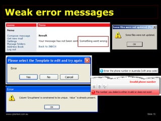
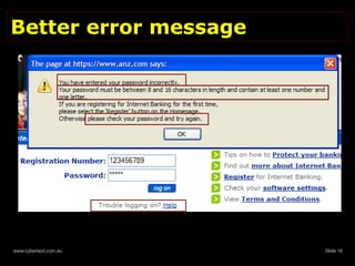
The document discusses techniques for reviewing user interfaces, emphasizing the importance of effective communication through design clarity, consistency, and conciseness. It highlights the cost implications of making changes late in the development process and provides guidelines for evaluating design elements, text accuracy, and user interactions. Ultimately, it advocates for early involvement in the development cycle and the use of various tools and resources to enhance user experience.