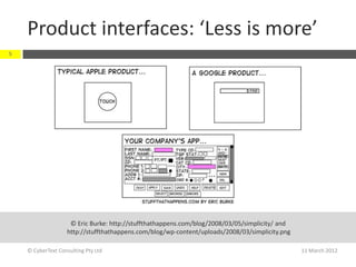
![‘Less is more…’
4
From: ‘Effective UA for [mobile] apps is more
'Developing
User Assistance about crafting words and phrases … about
for Mobile
Applications' by
spending more time coming up with
Joe Welinske, precisely the right words.
Intercom,
November
2011 (p. 9)
During the editing process, the emphasis
must be on strictly limiting the volume of
text while maintaining quality and
usefulness.’
© CyberText Consulting Pty Ltd 11 March 2012](https://image.slidesharecdn.com/uitext-120321023922-phpapp01/85/User-Interface-text-4-320.jpg)
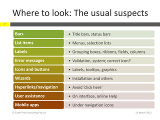
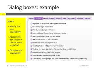
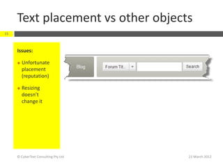
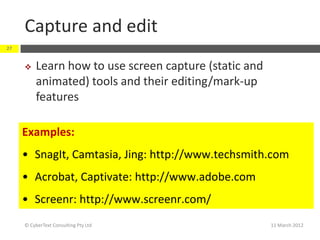
![Error messages 3
32
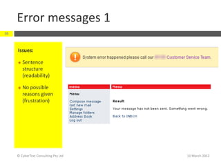
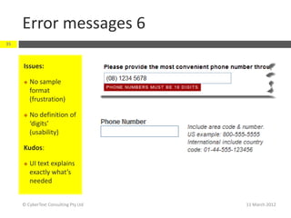
Issues:
Conflicting
information
(frustration)
Inappropriate
time scale
(readability)
Inconceivable
time (frustration)
[48480 days = 133
years!]
© CyberText Consulting Pty Ltd 11 March 2012](https://image.slidesharecdn.com/uitext-120321023922-phpapp01/85/User-Interface-text-32-320.jpg)

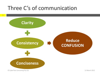
The document discusses principles for reviewing user interface (UI) text, emphasizing the importance of clarity, consistency, and conciseness, summarized as the 'three C's of good communication.' It also highlights the need for careful editing and consideration of global user needs in UI design. Additionally, the document outlines common issues in UI text, navigation, and error messages, advocating for best practices and effective communication methods throughout the development process.