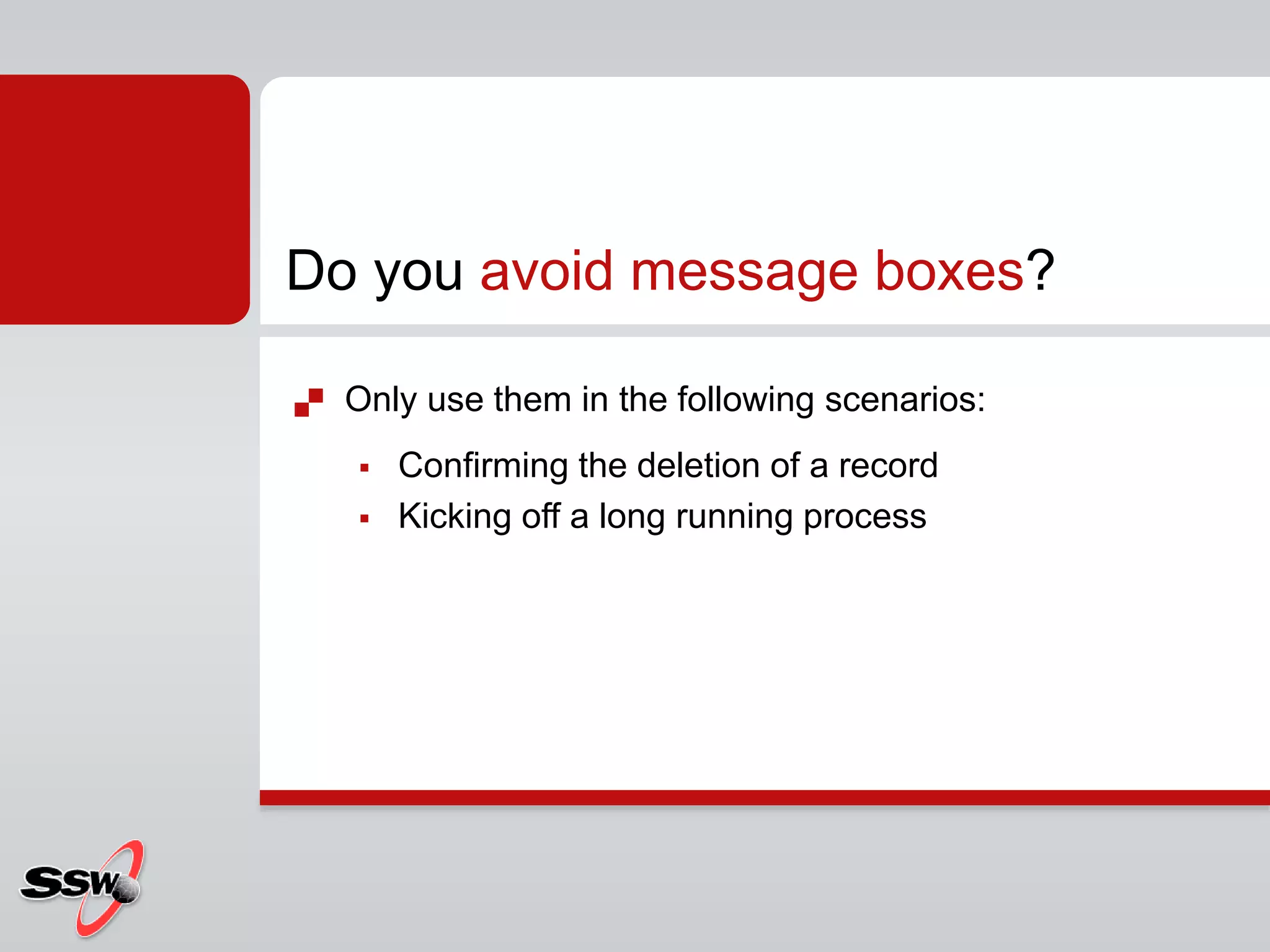
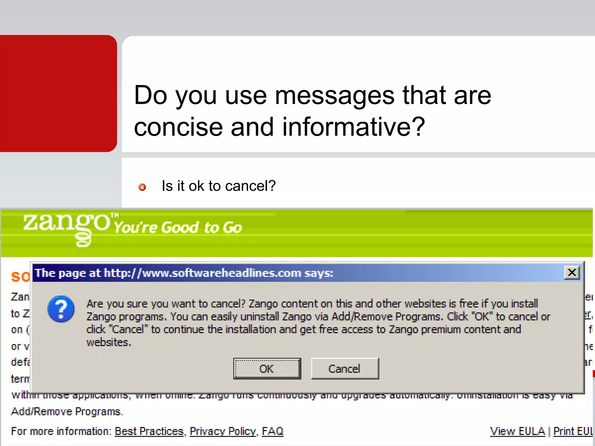
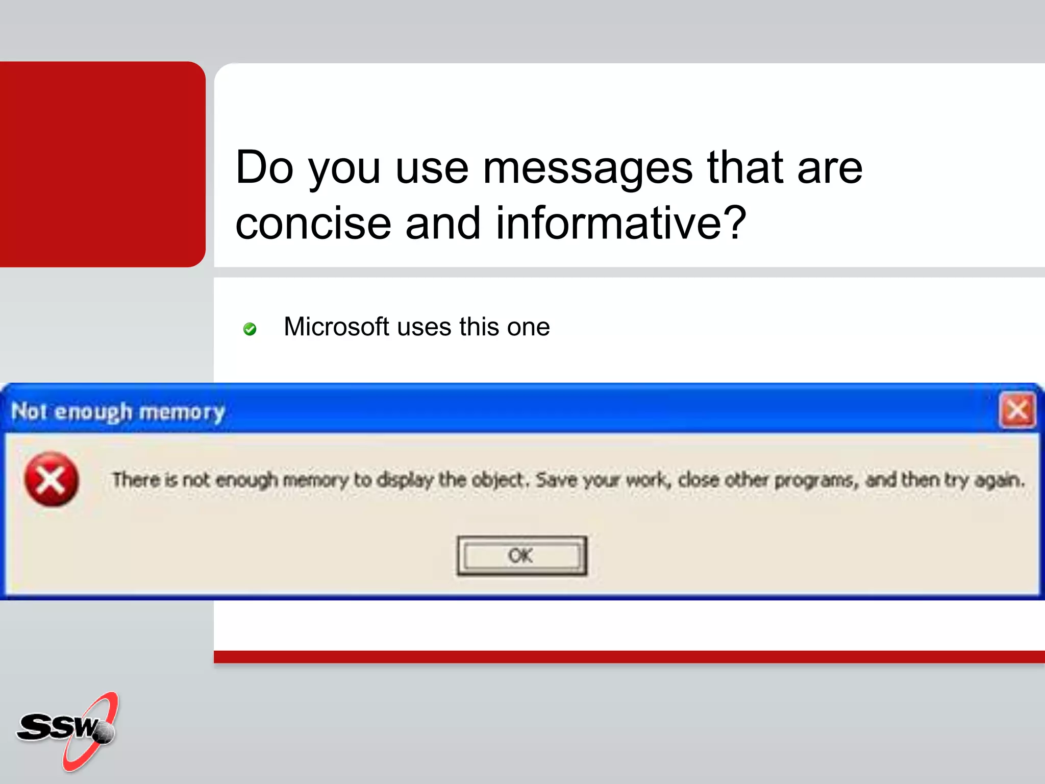
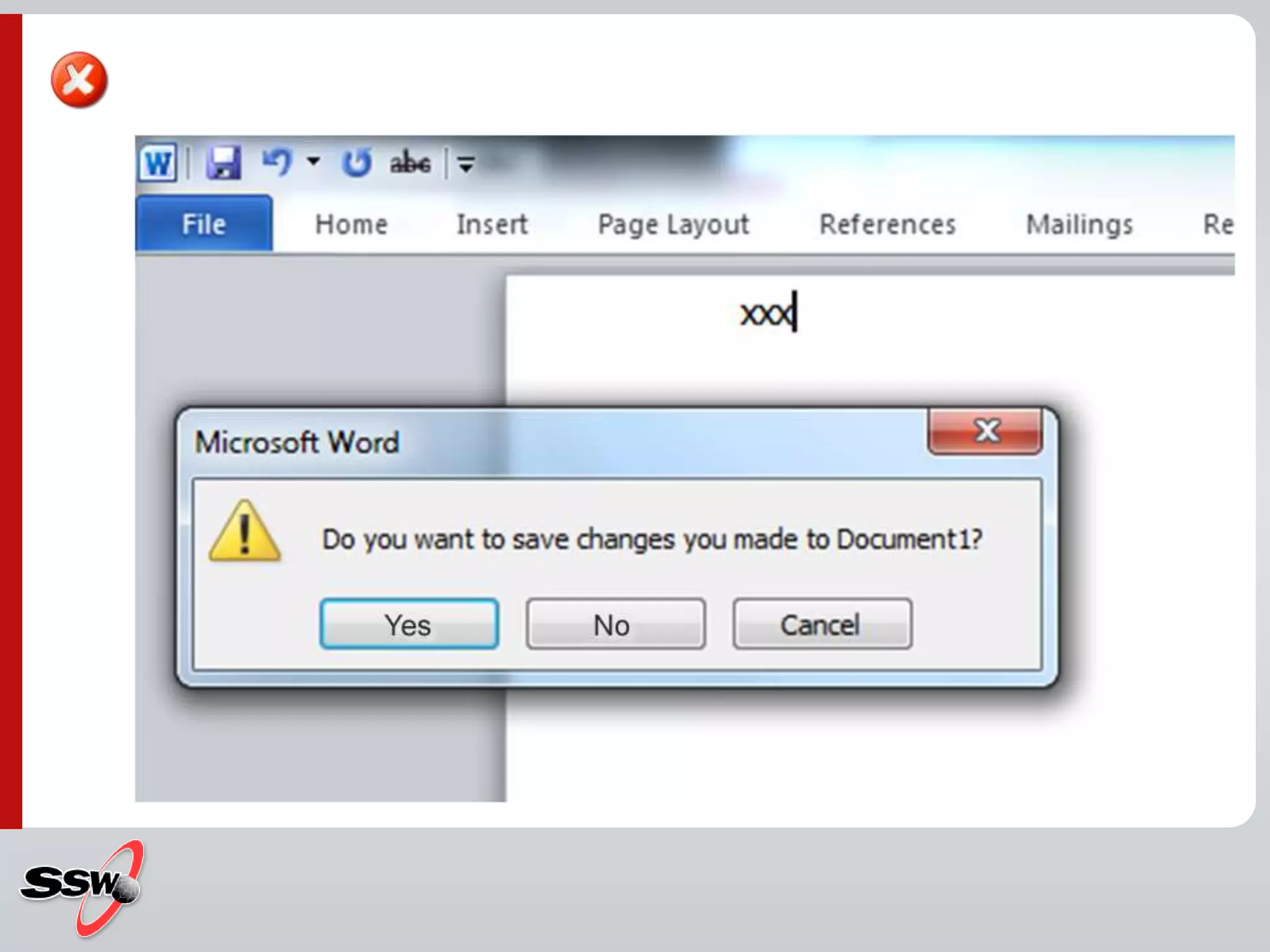
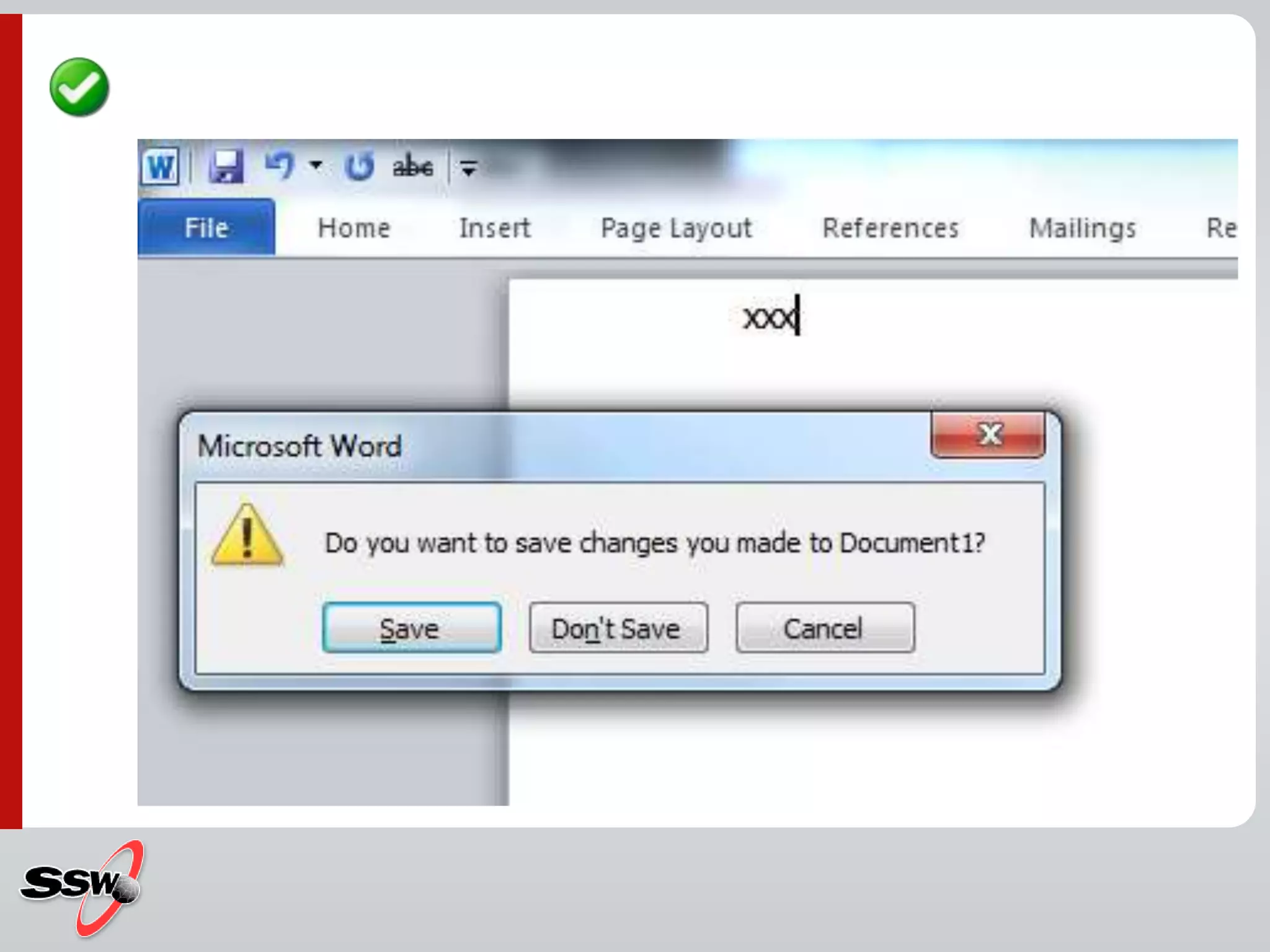
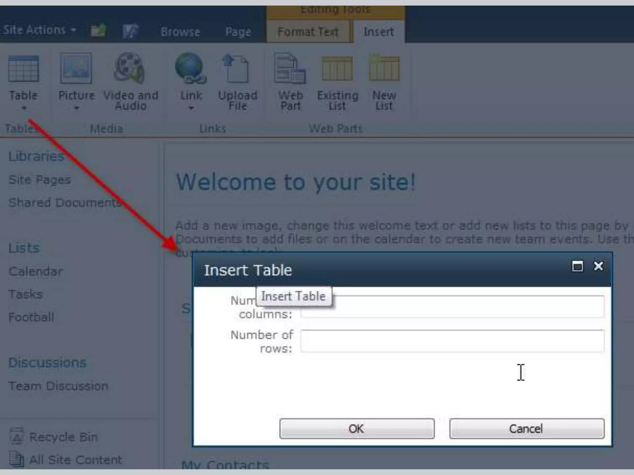
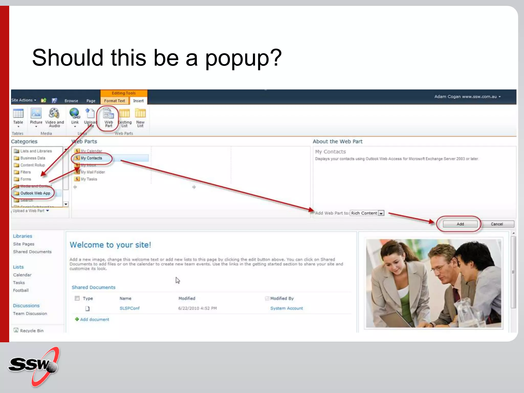
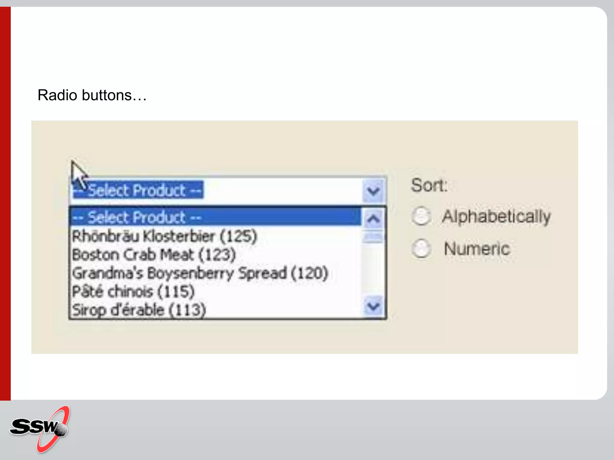
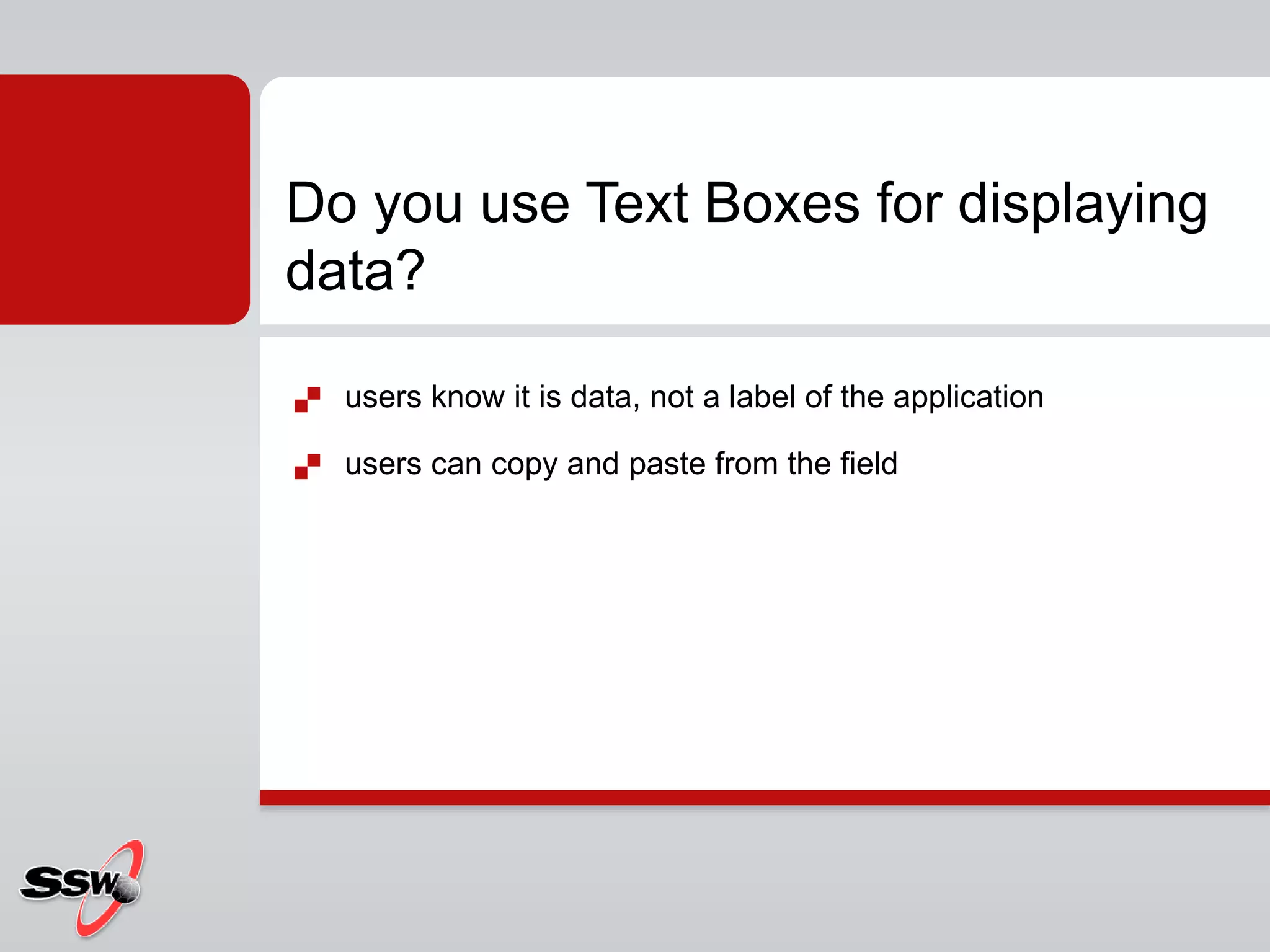
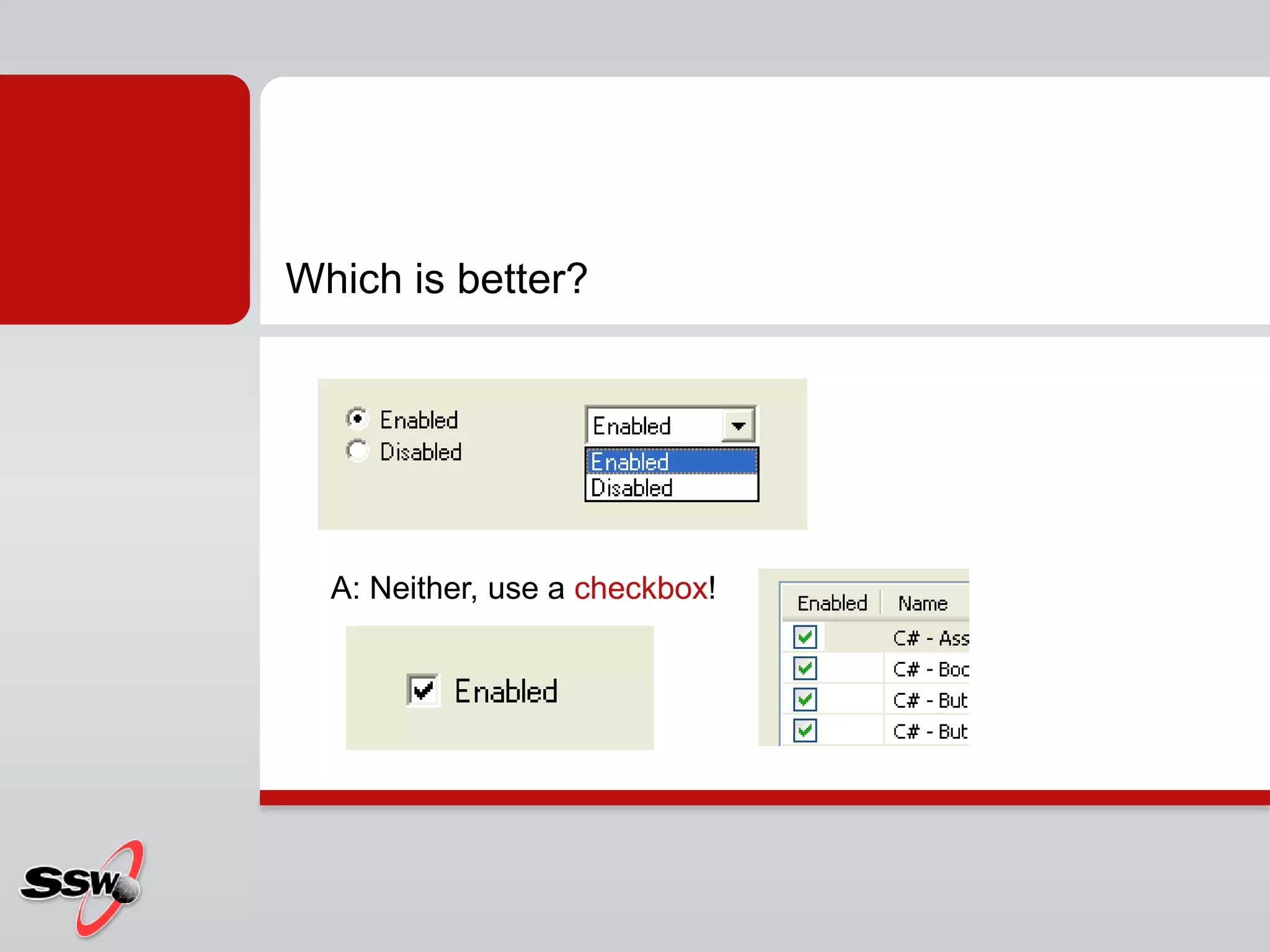
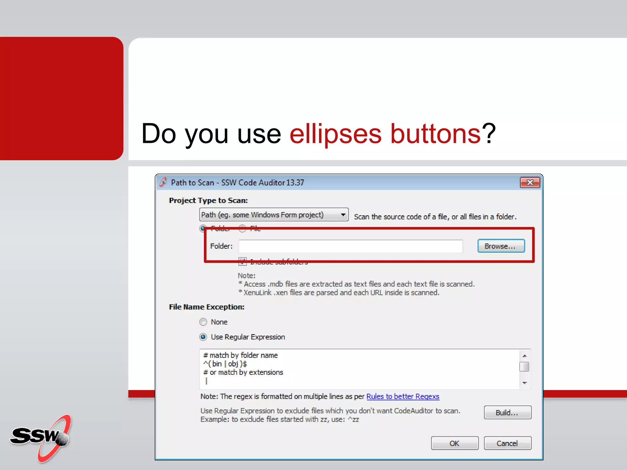
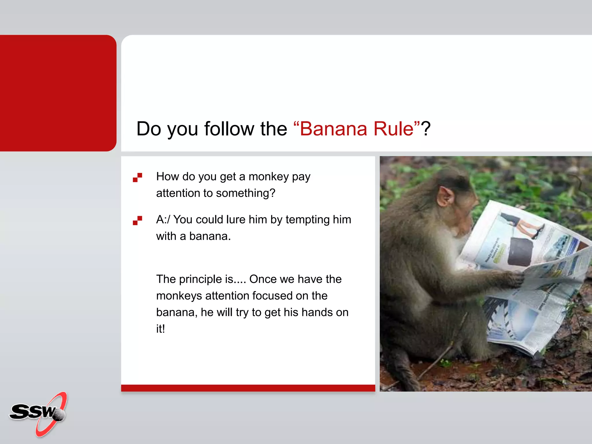
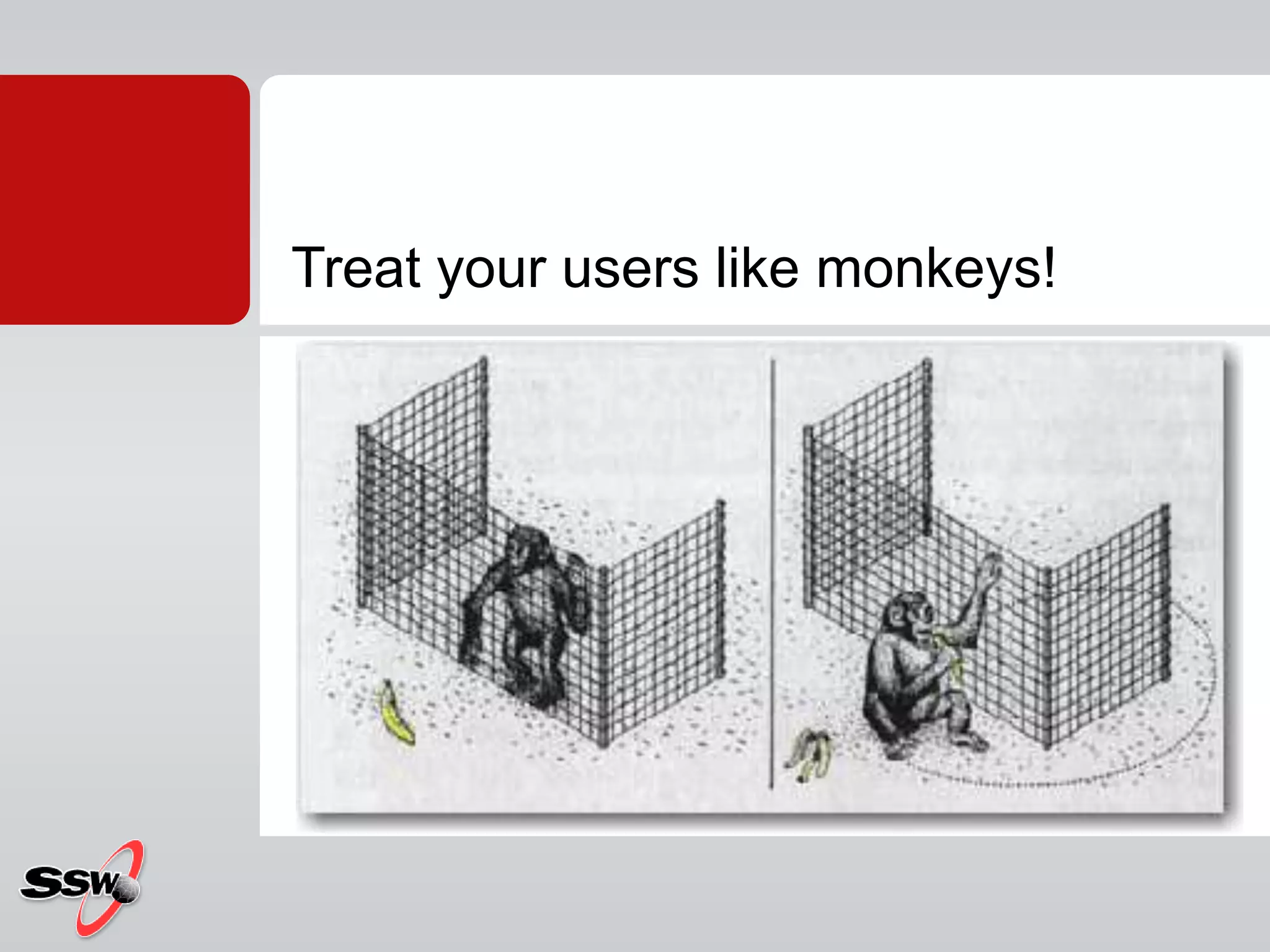
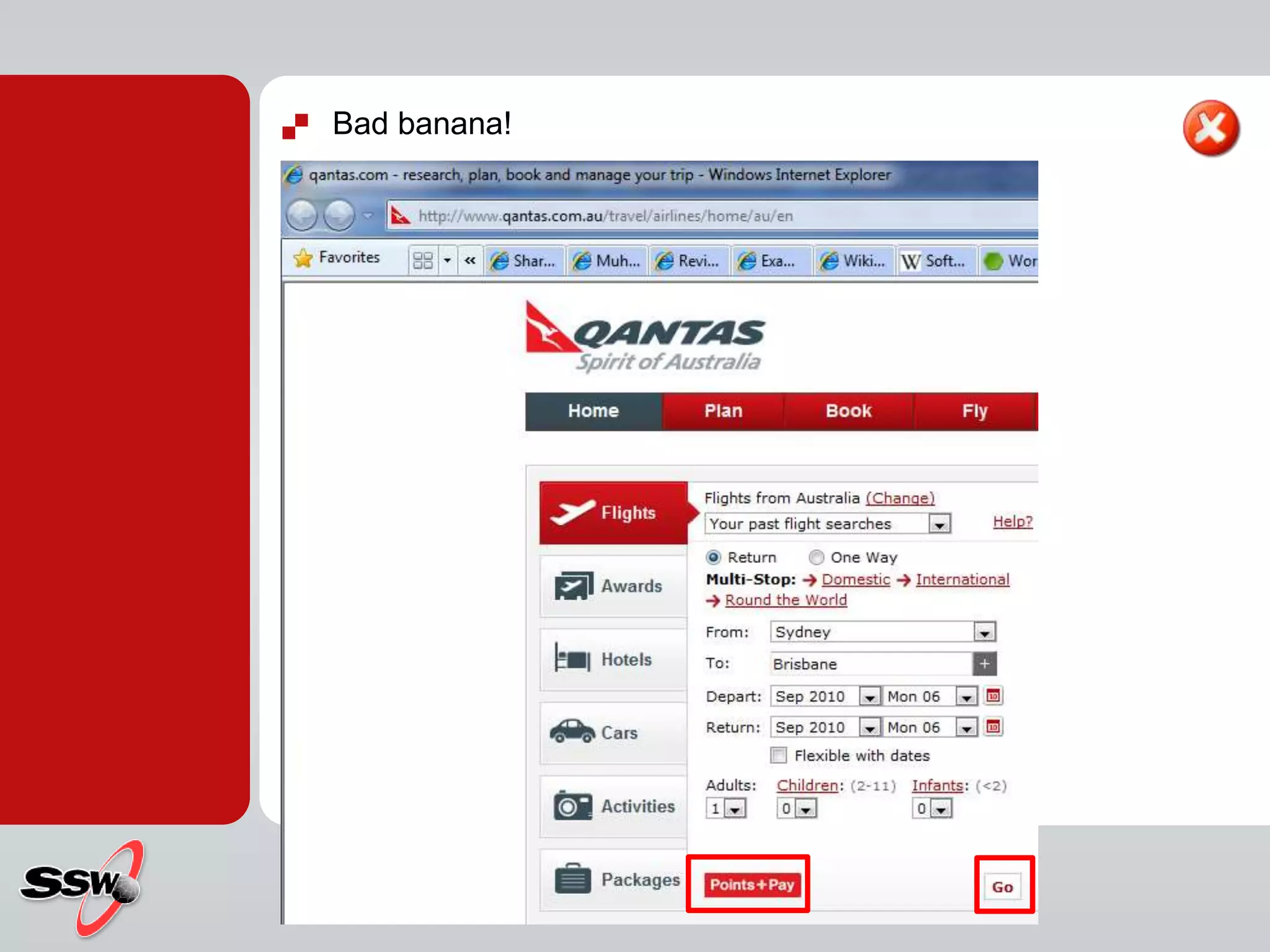
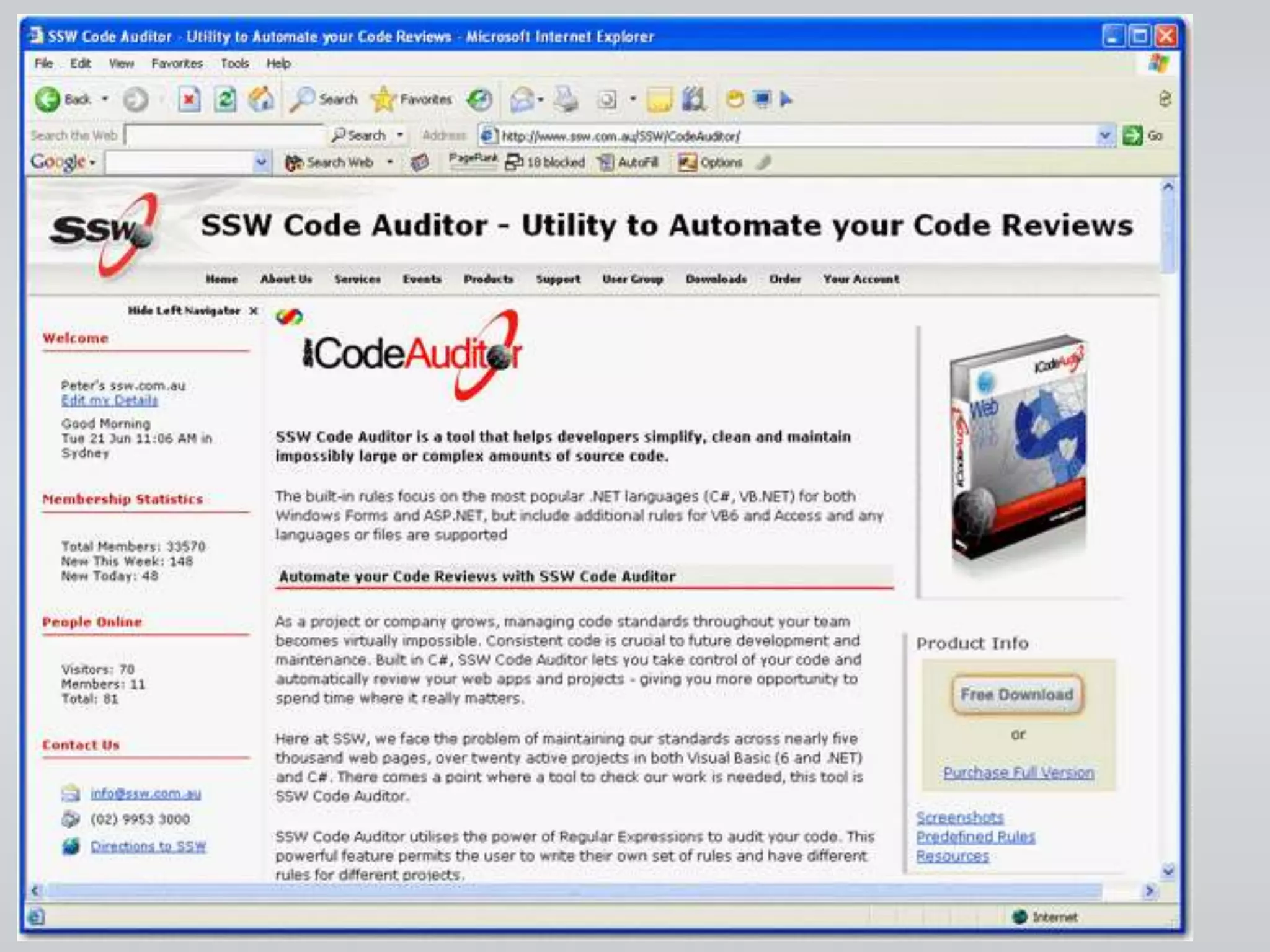
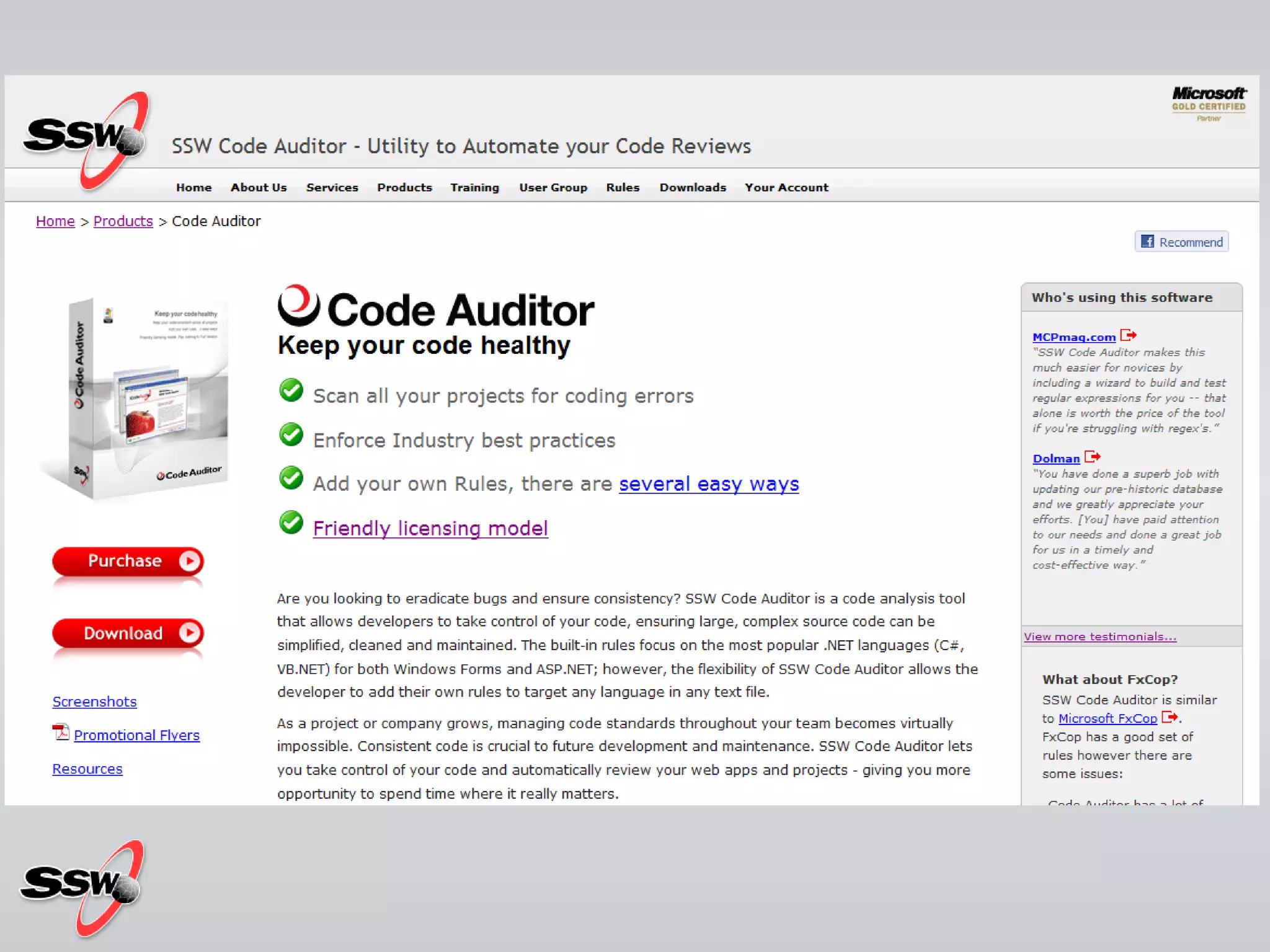
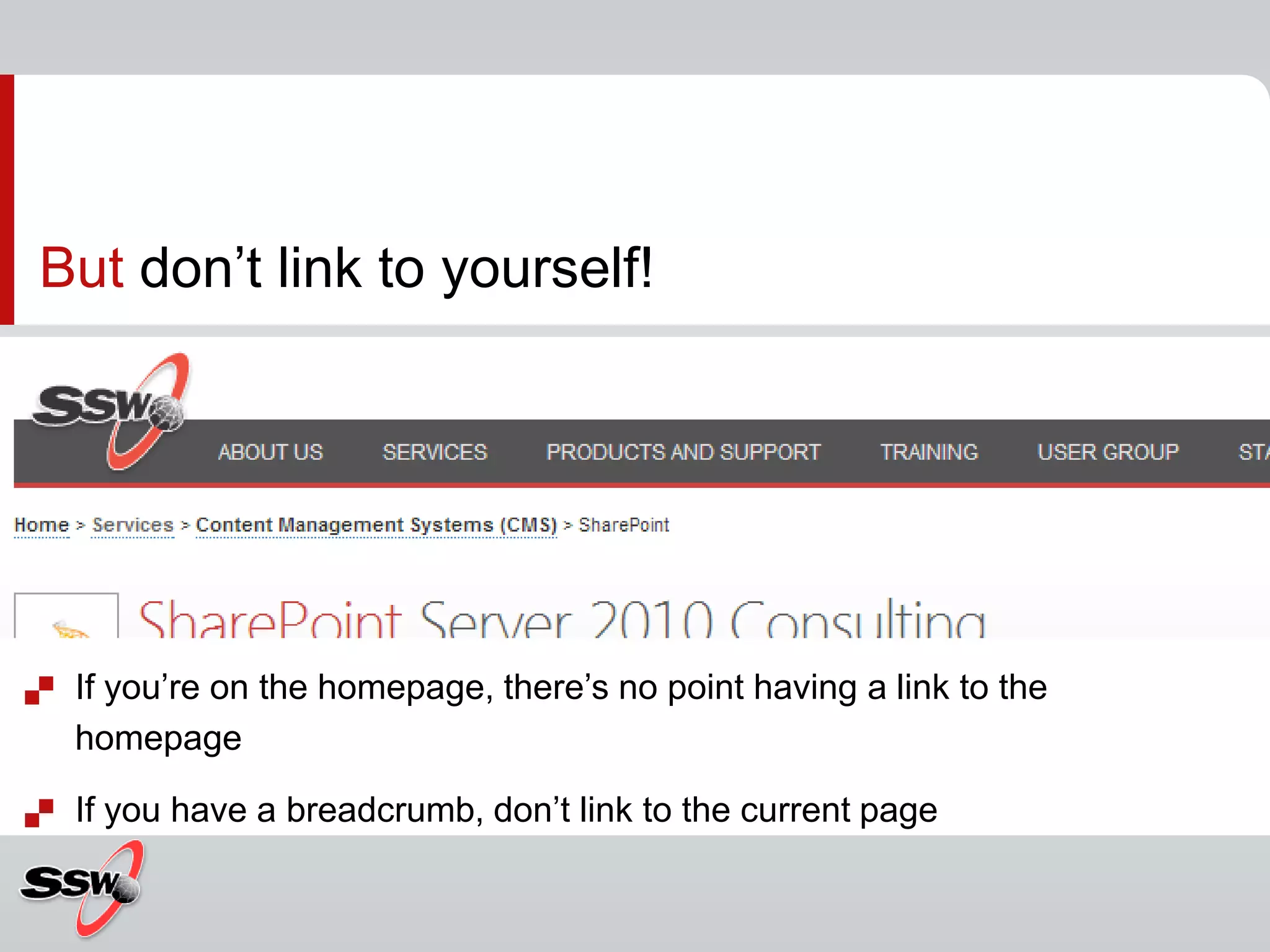
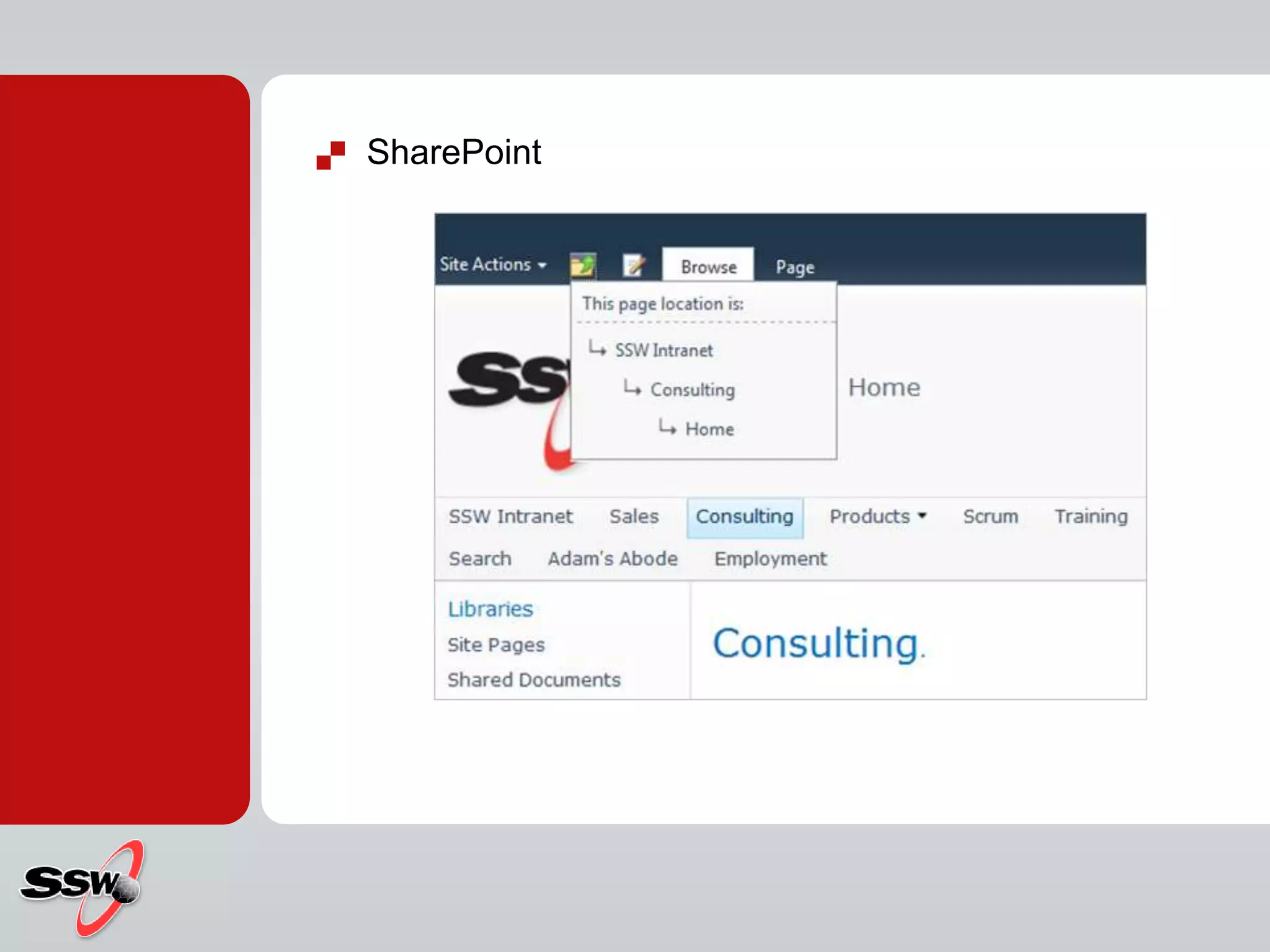
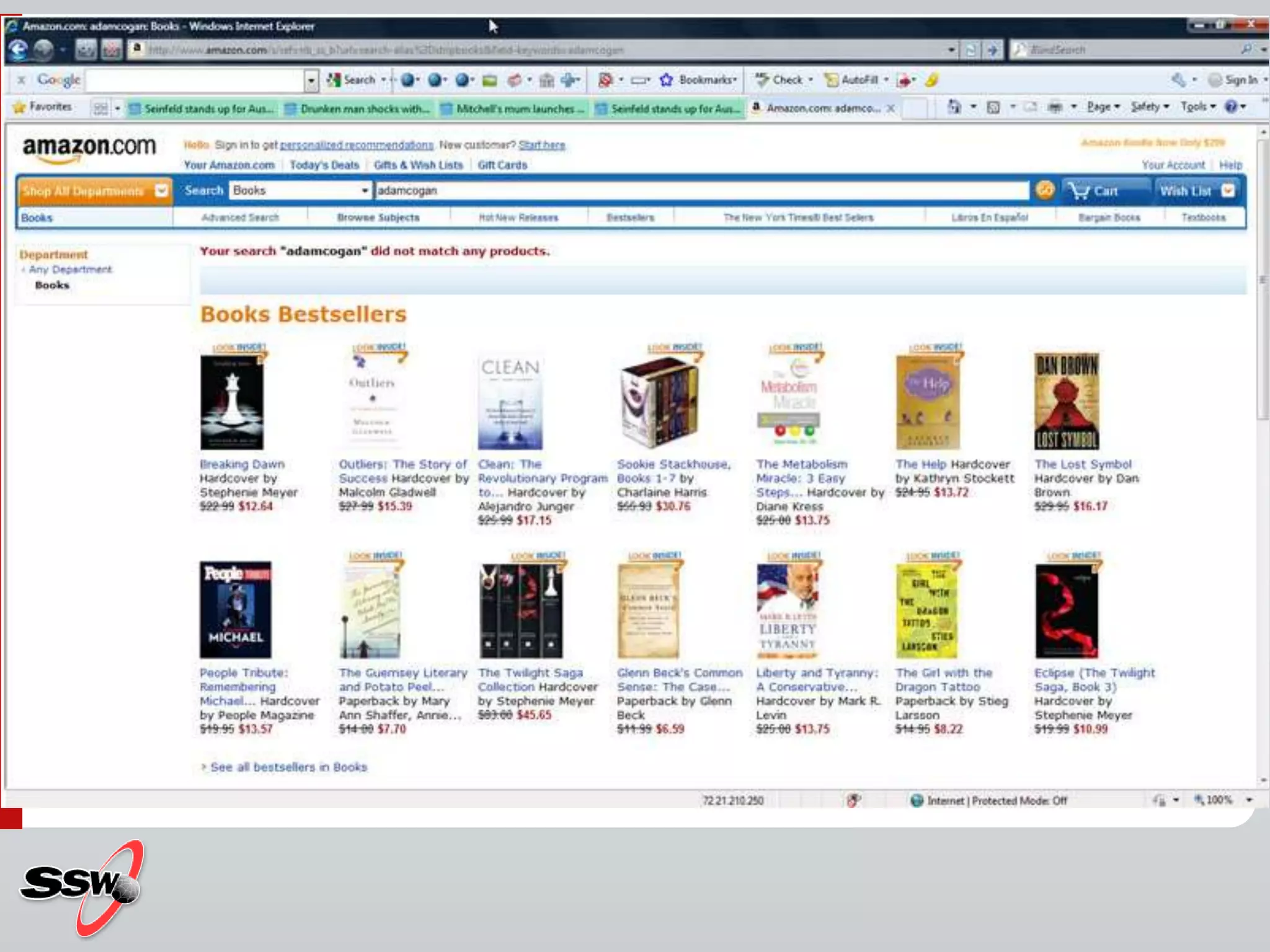
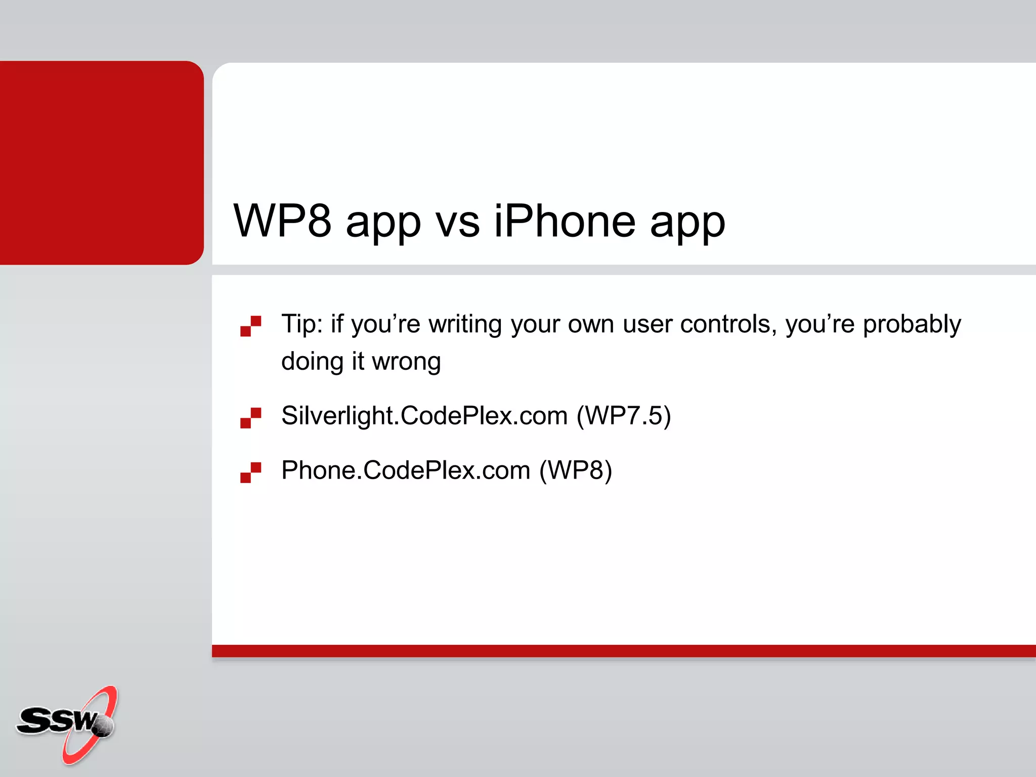
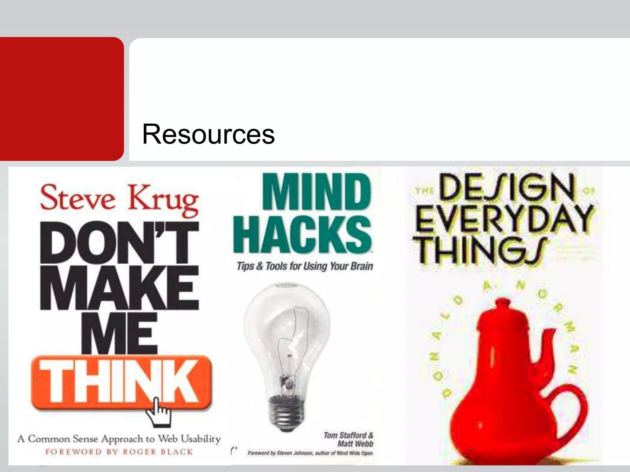
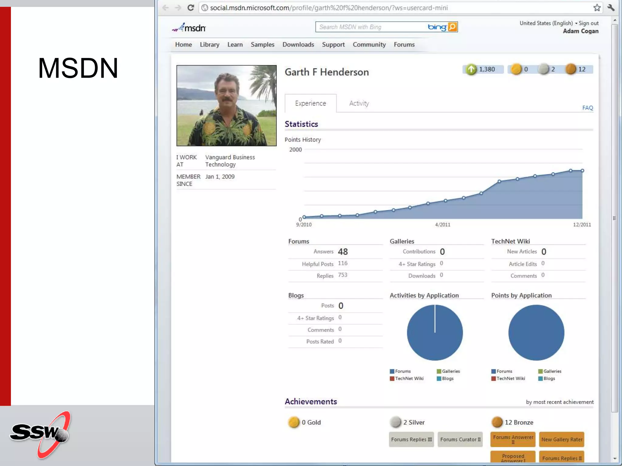
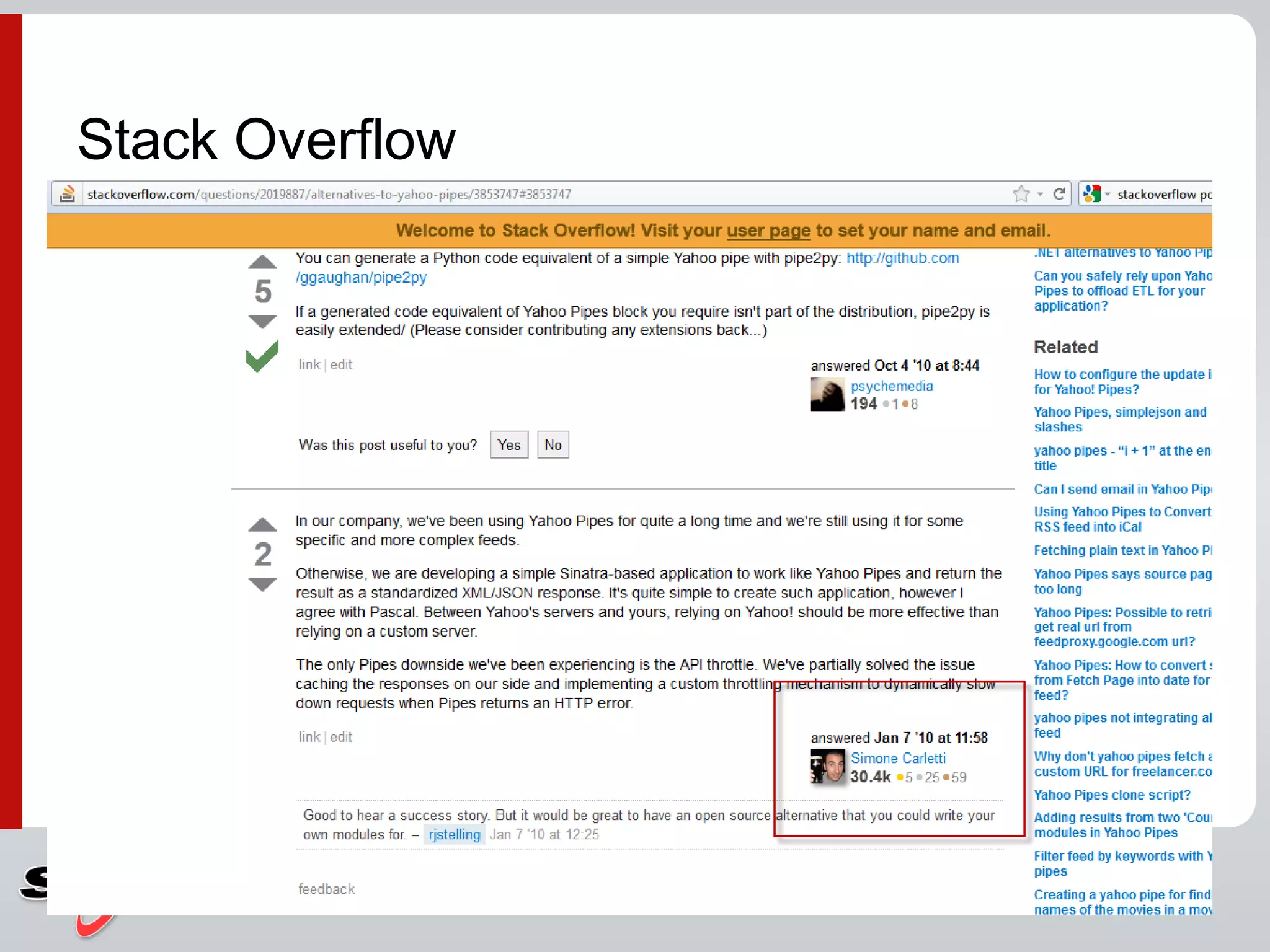
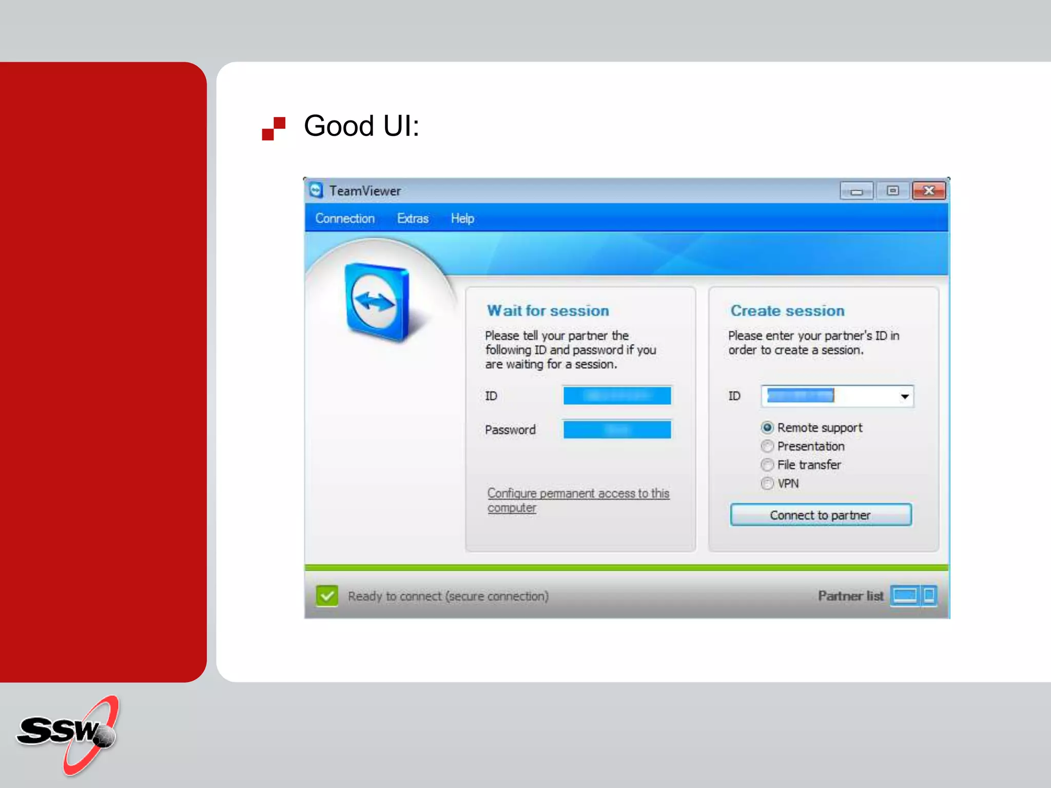
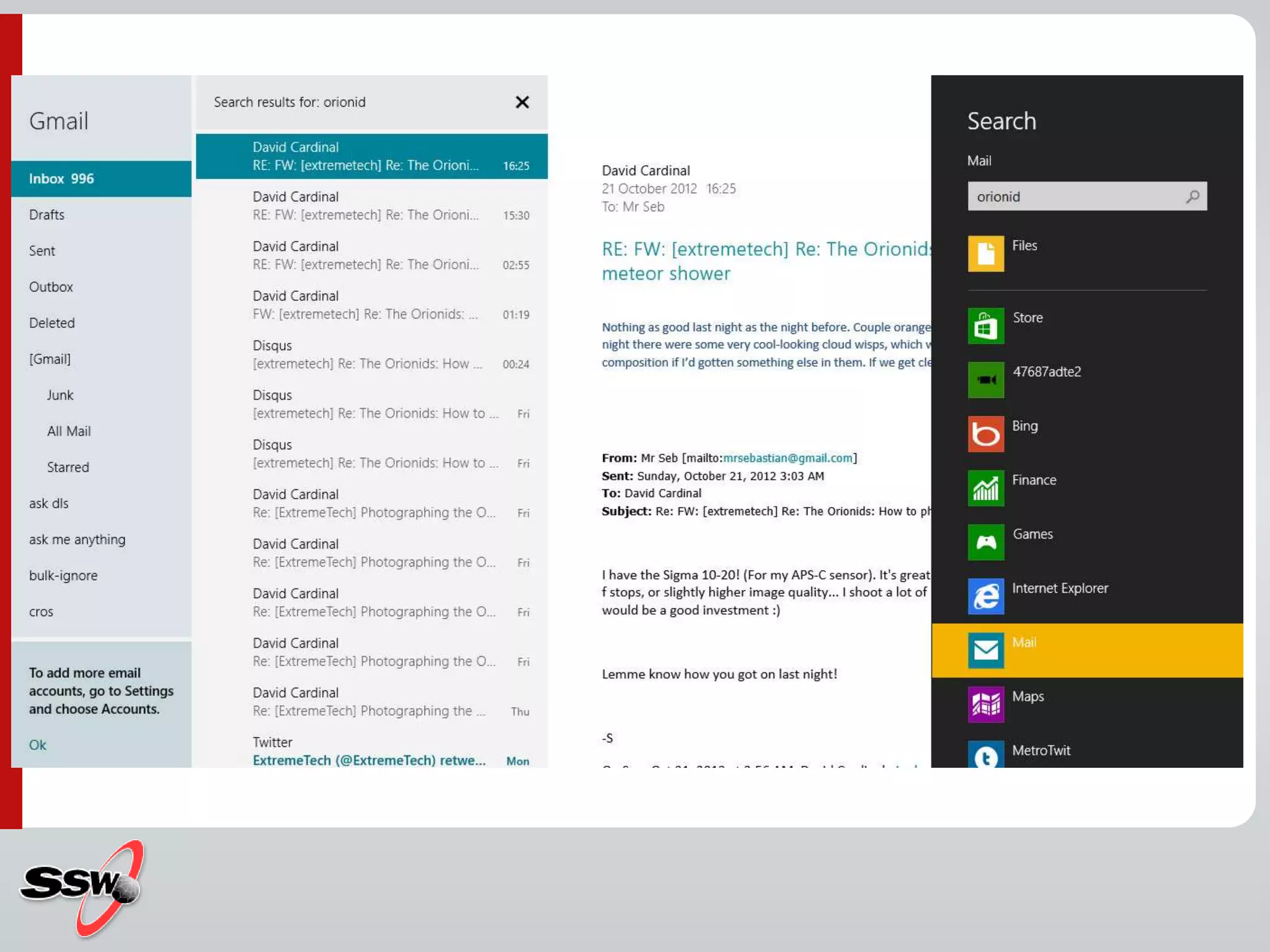
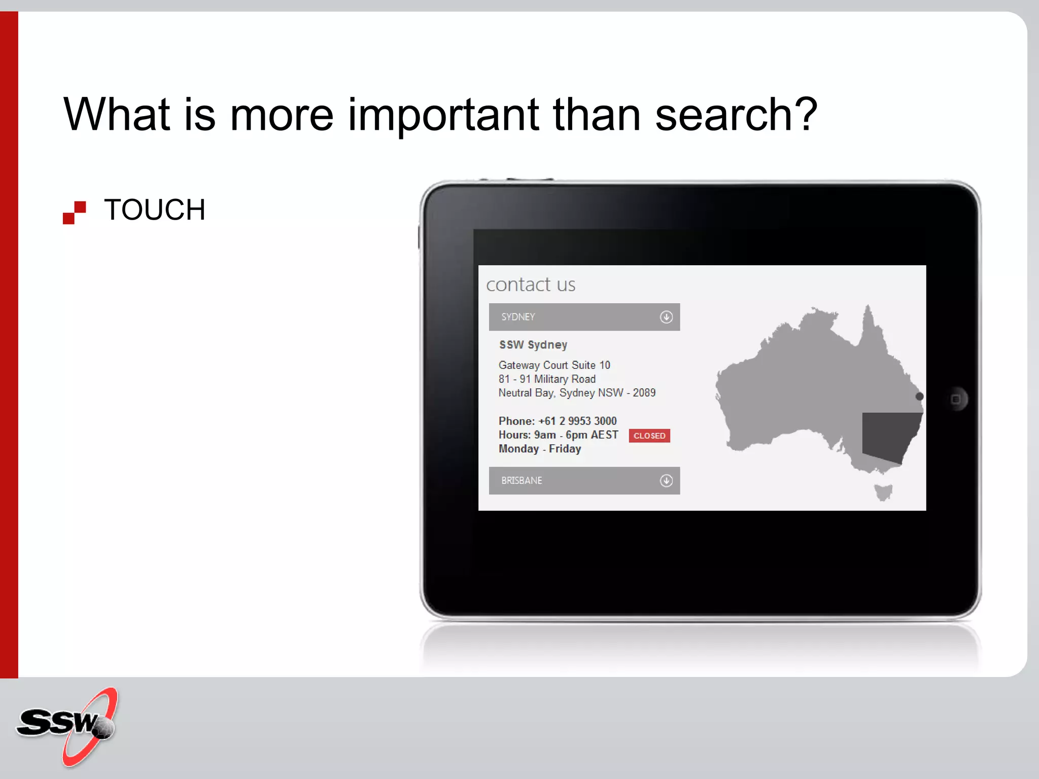
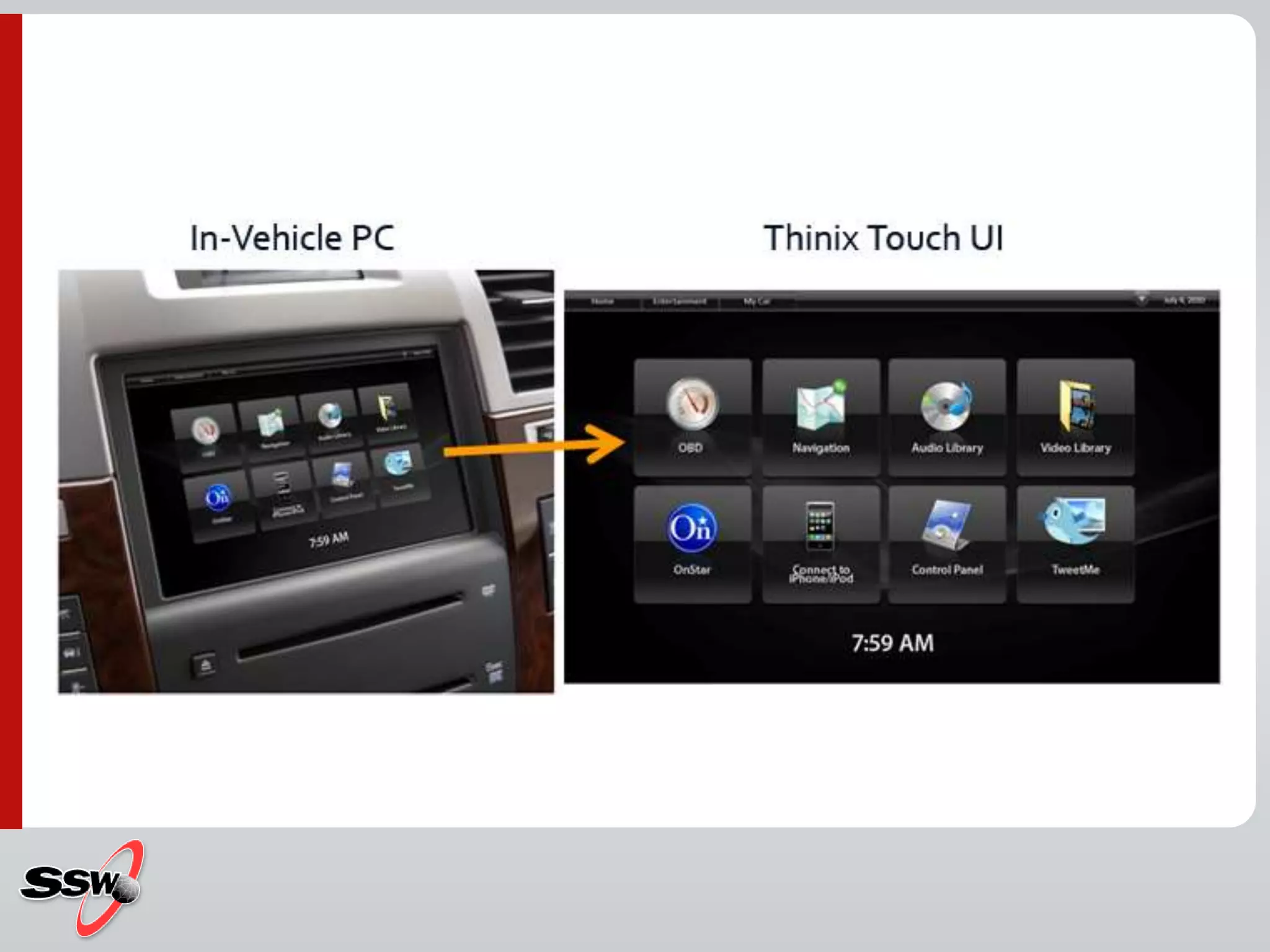
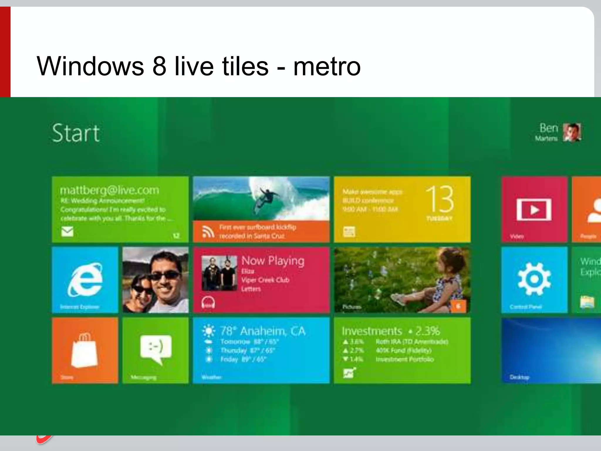
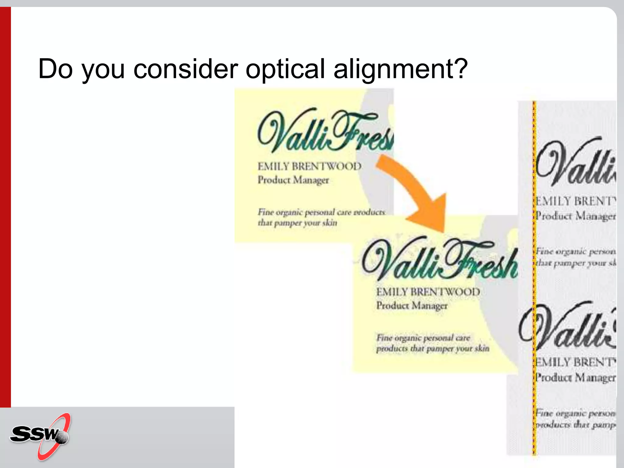
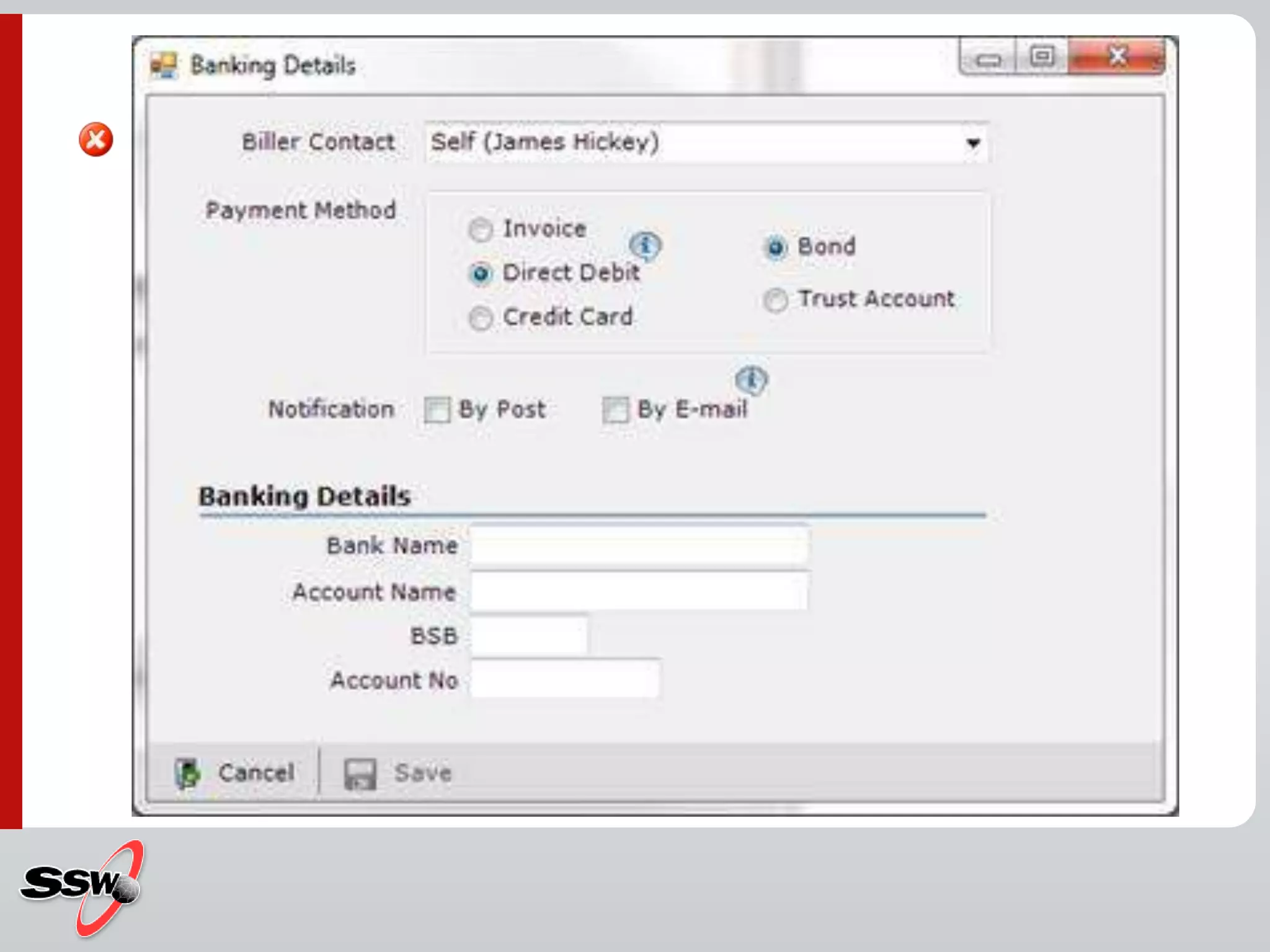
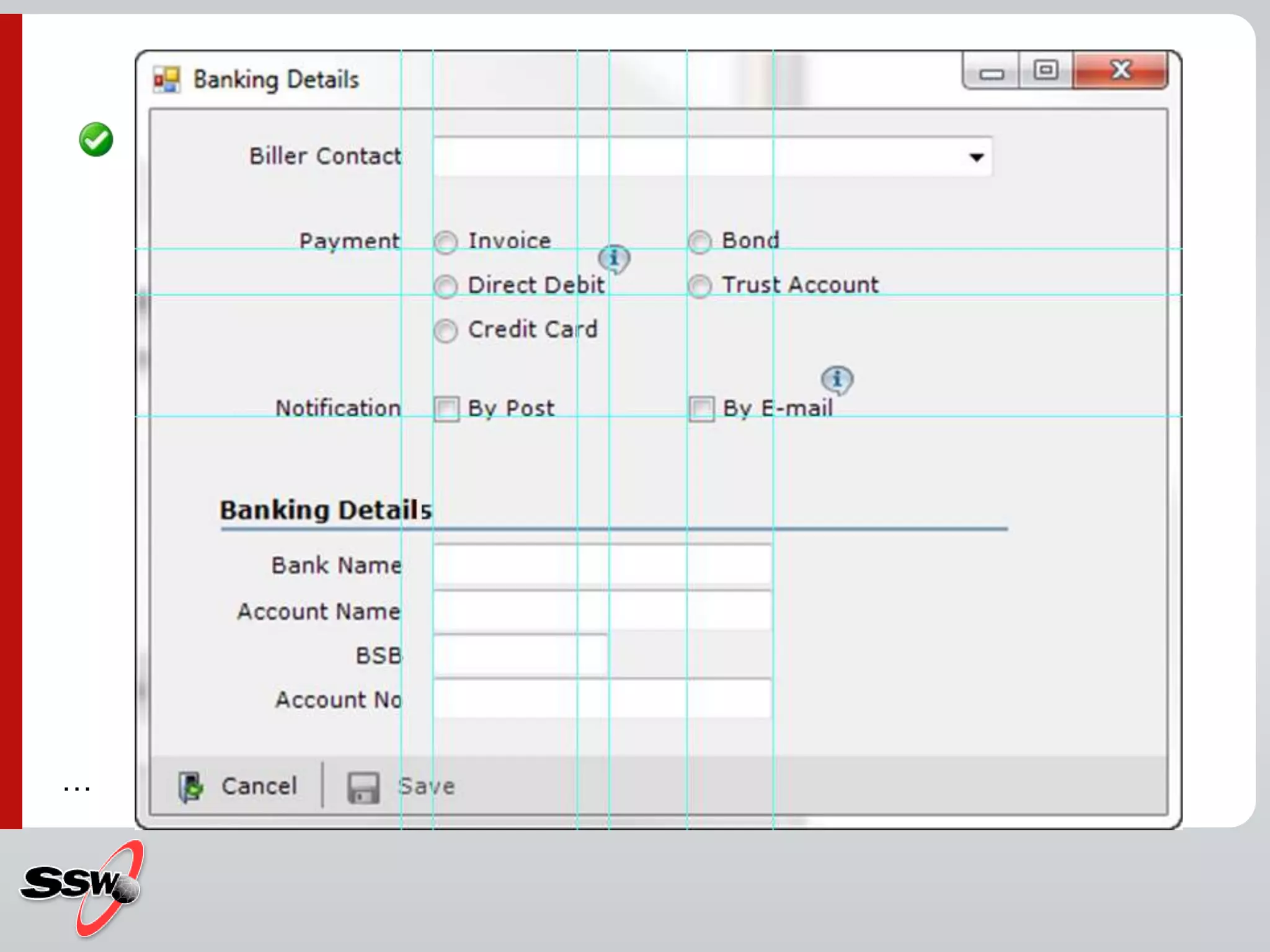
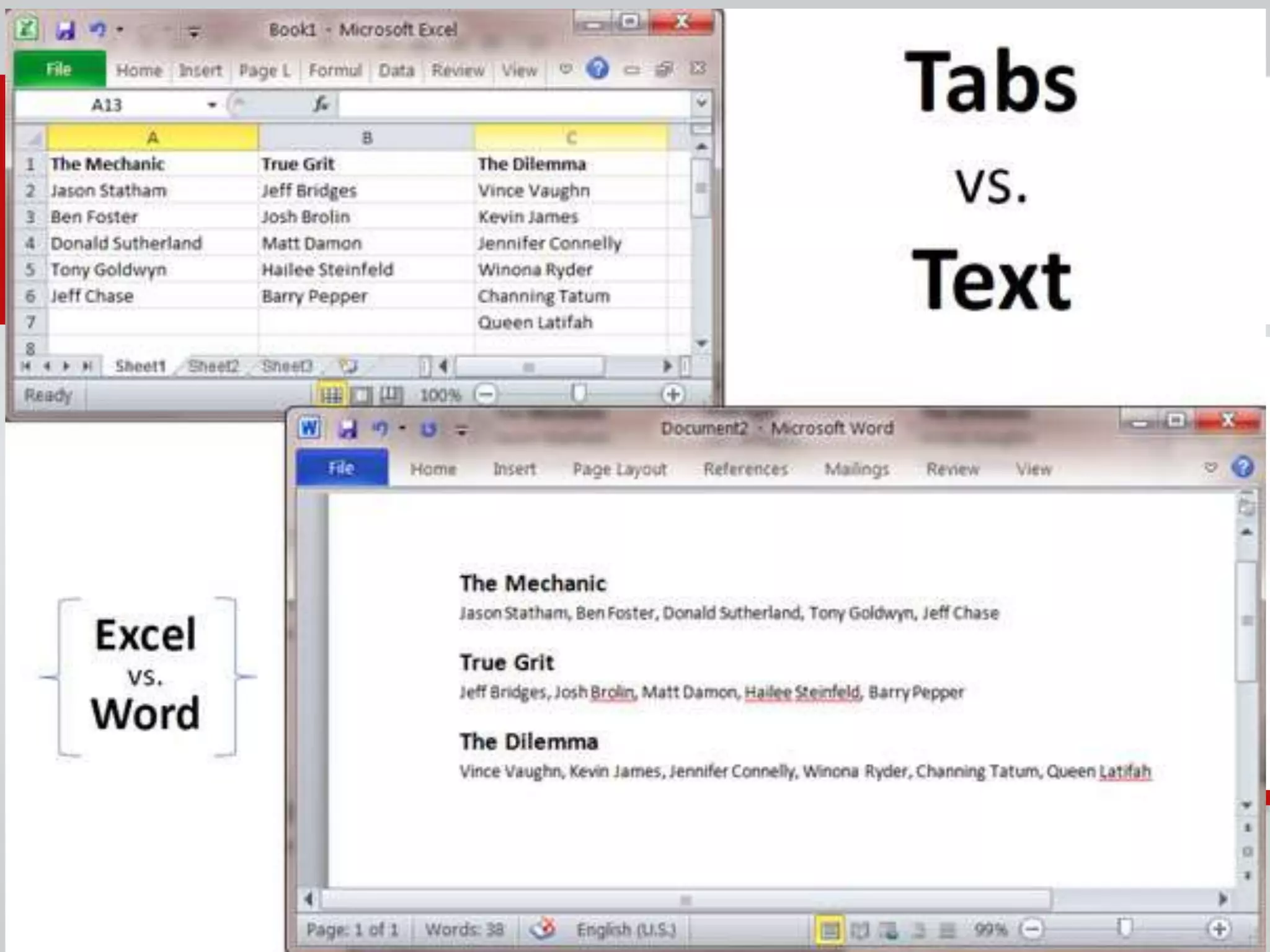
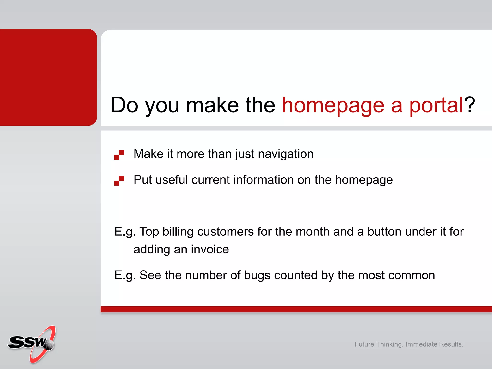
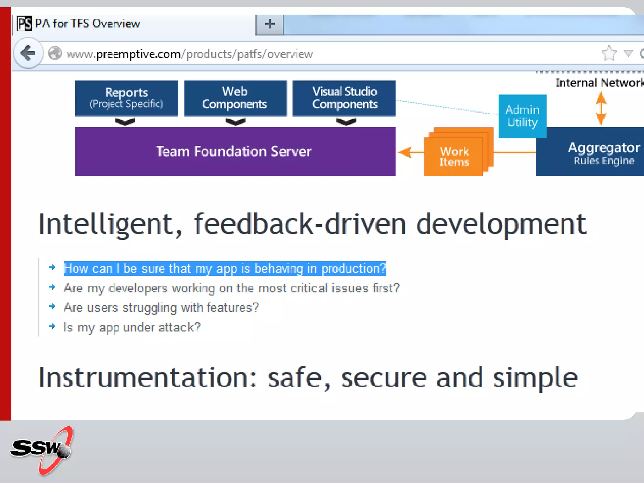
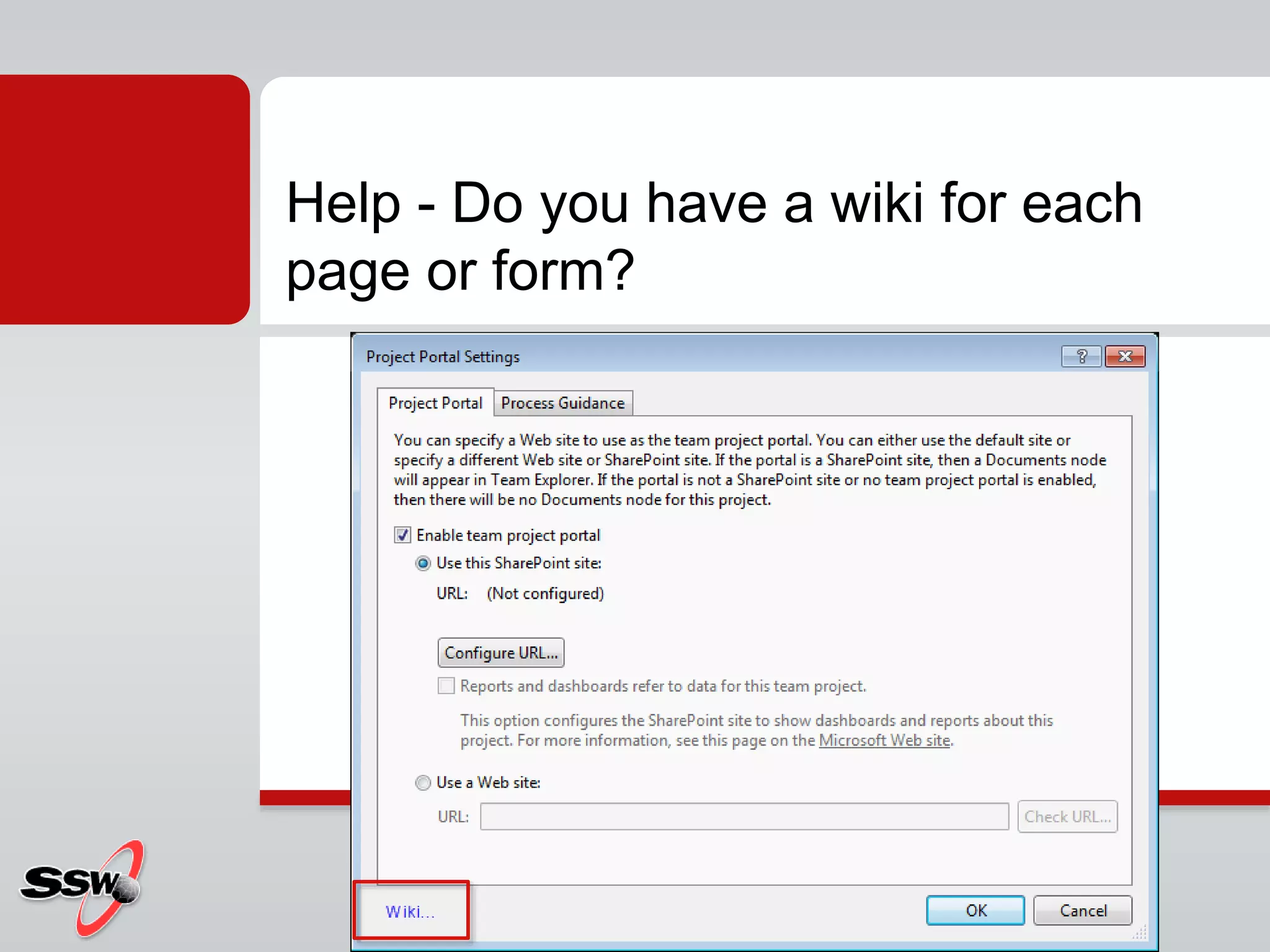
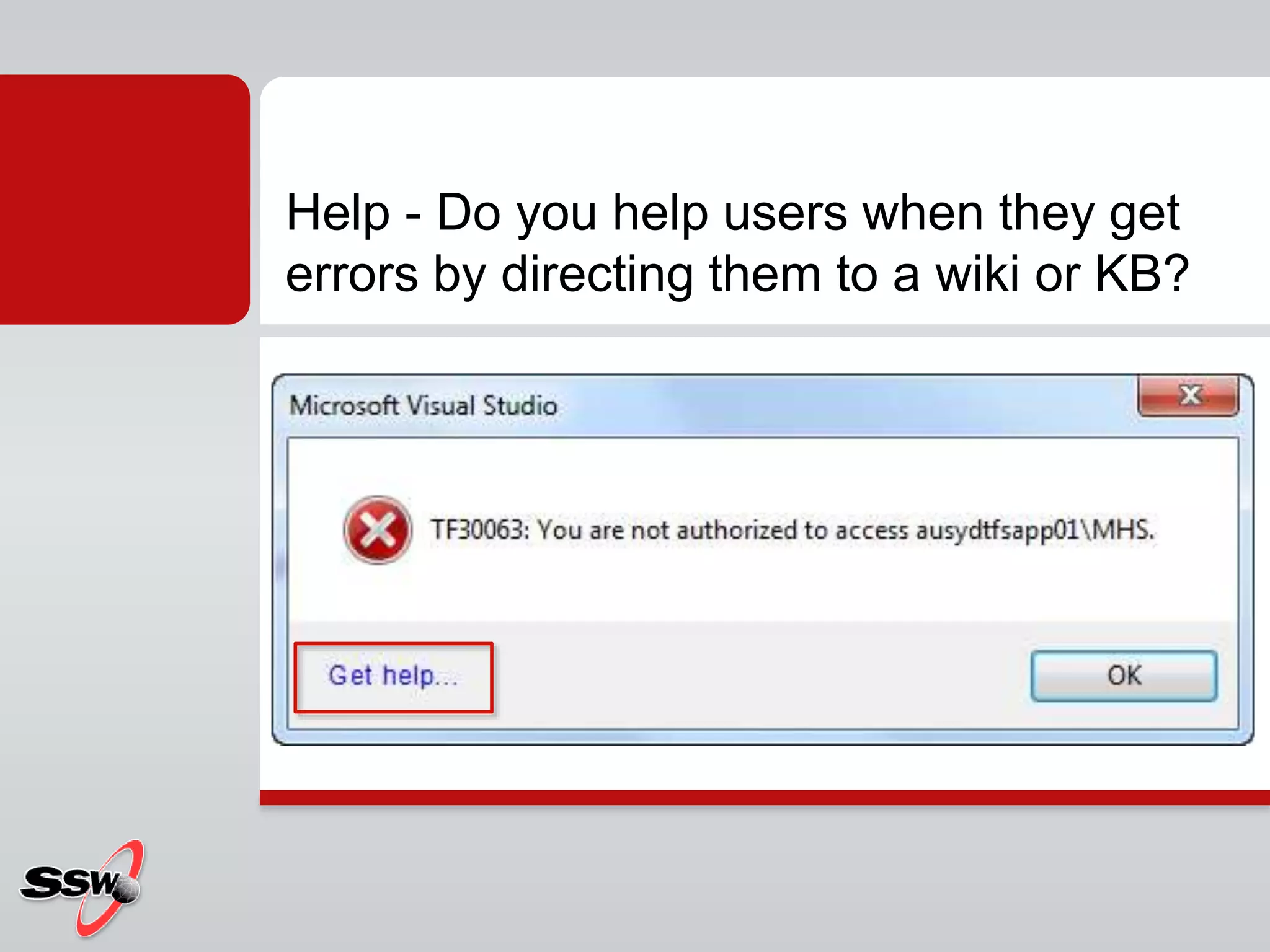
The document discusses interface usability and best practices for creating effective user interfaces across various platforms including Windows applications, web UI, and mobile interfaces. Key points include the importance of intuitive design, minimizing user error, encouraging experimentation, and providing helpful user guidance, such as training resources and comprehensive help menus. It emphasizes the necessity for clean, understandable interfaces that facilitate user comfort and efficiency.

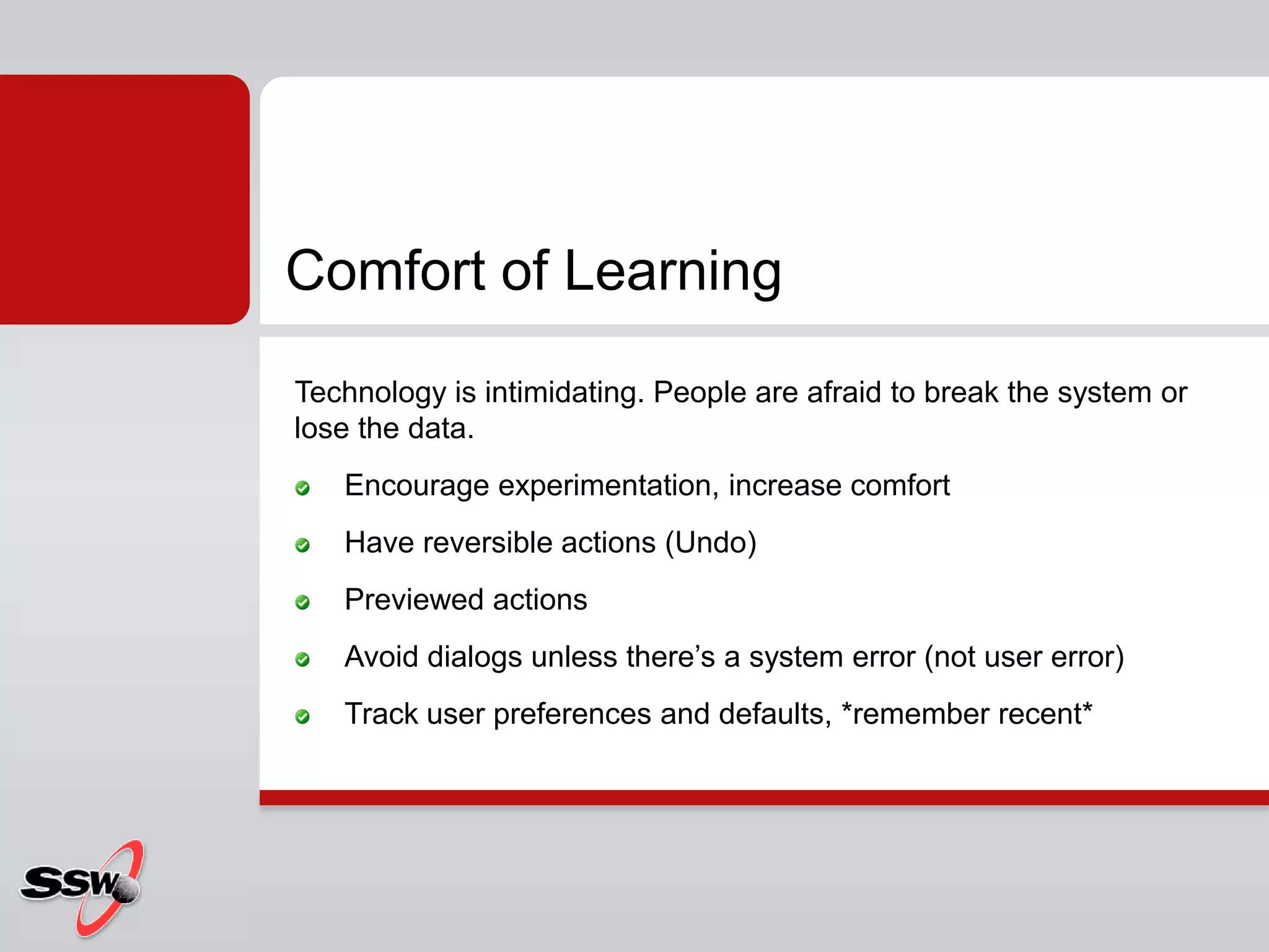


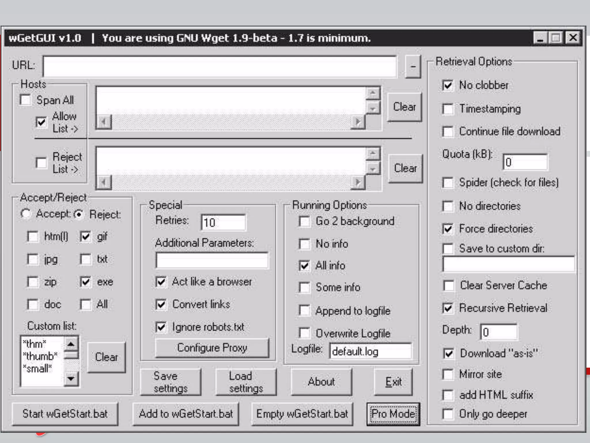


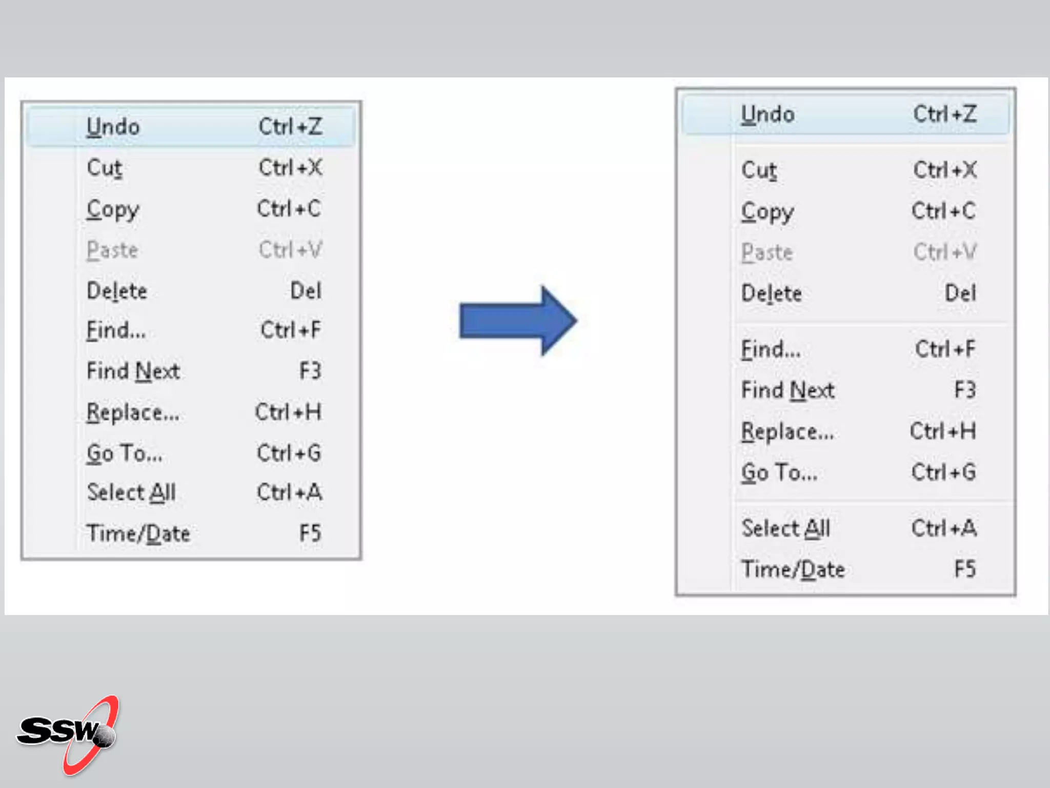


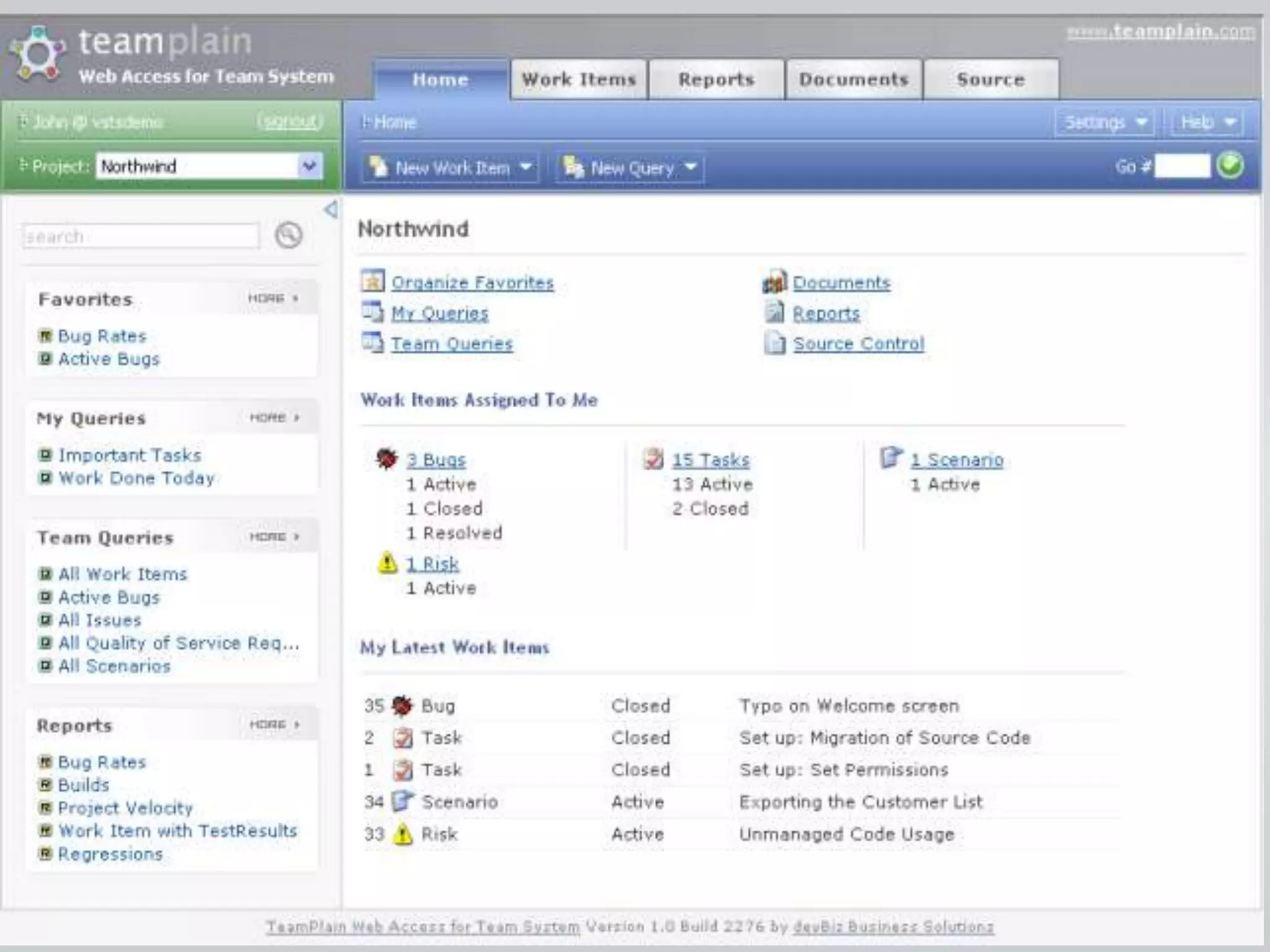


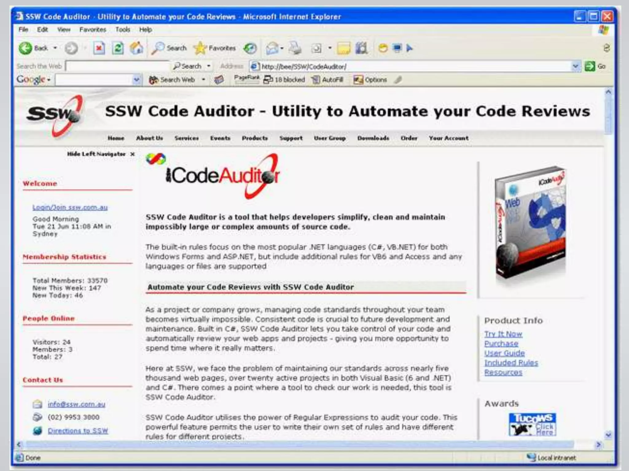
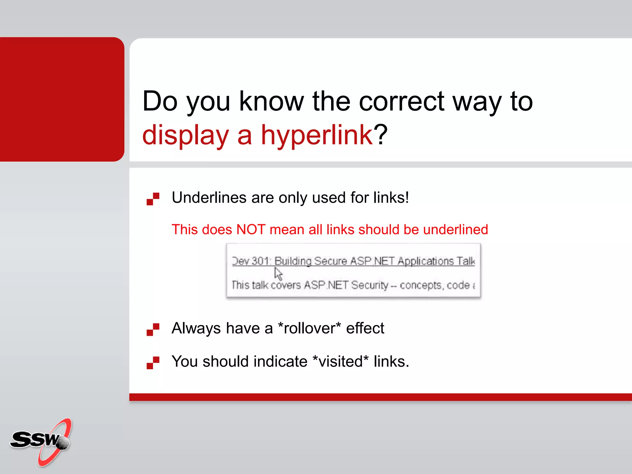
![ Training Videos
Online User Guide
Knowledge Base
Make a Suggestion
Report a Bug
Check for Updates
Run Unit Tests...
About [Product Name]...
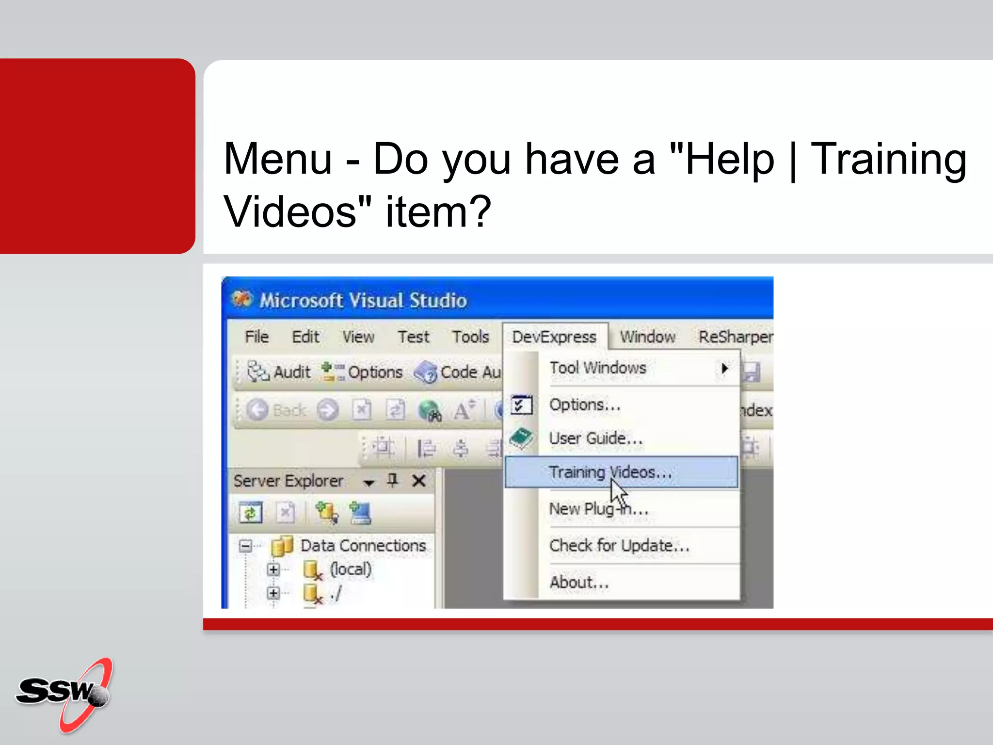
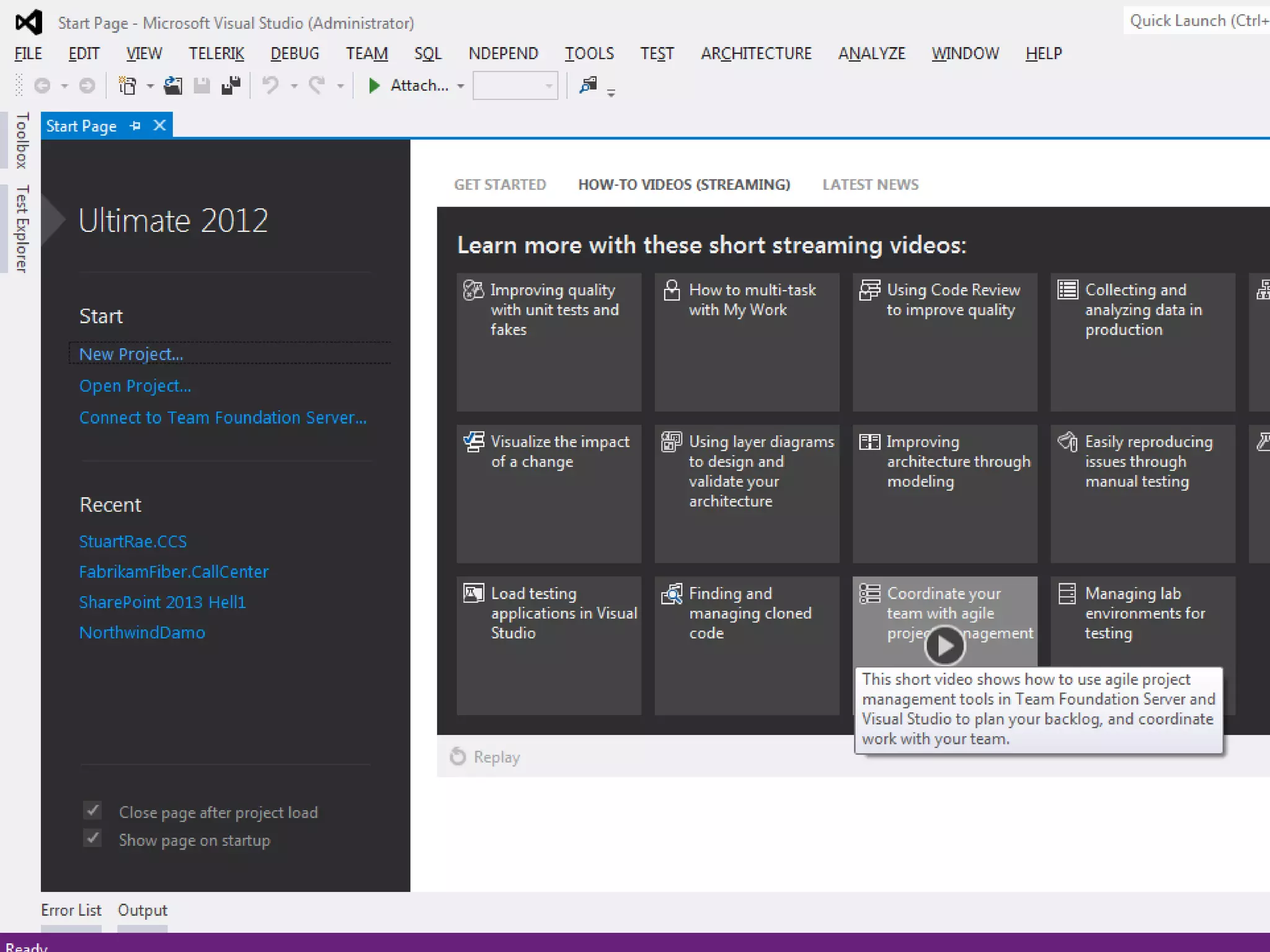
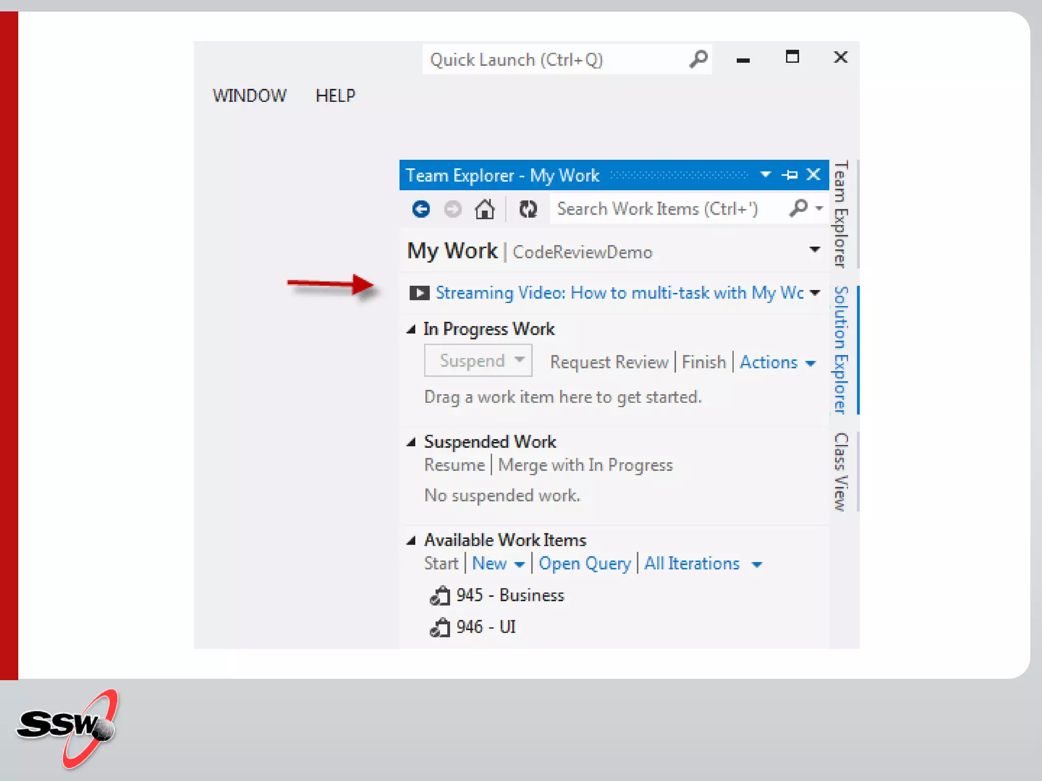
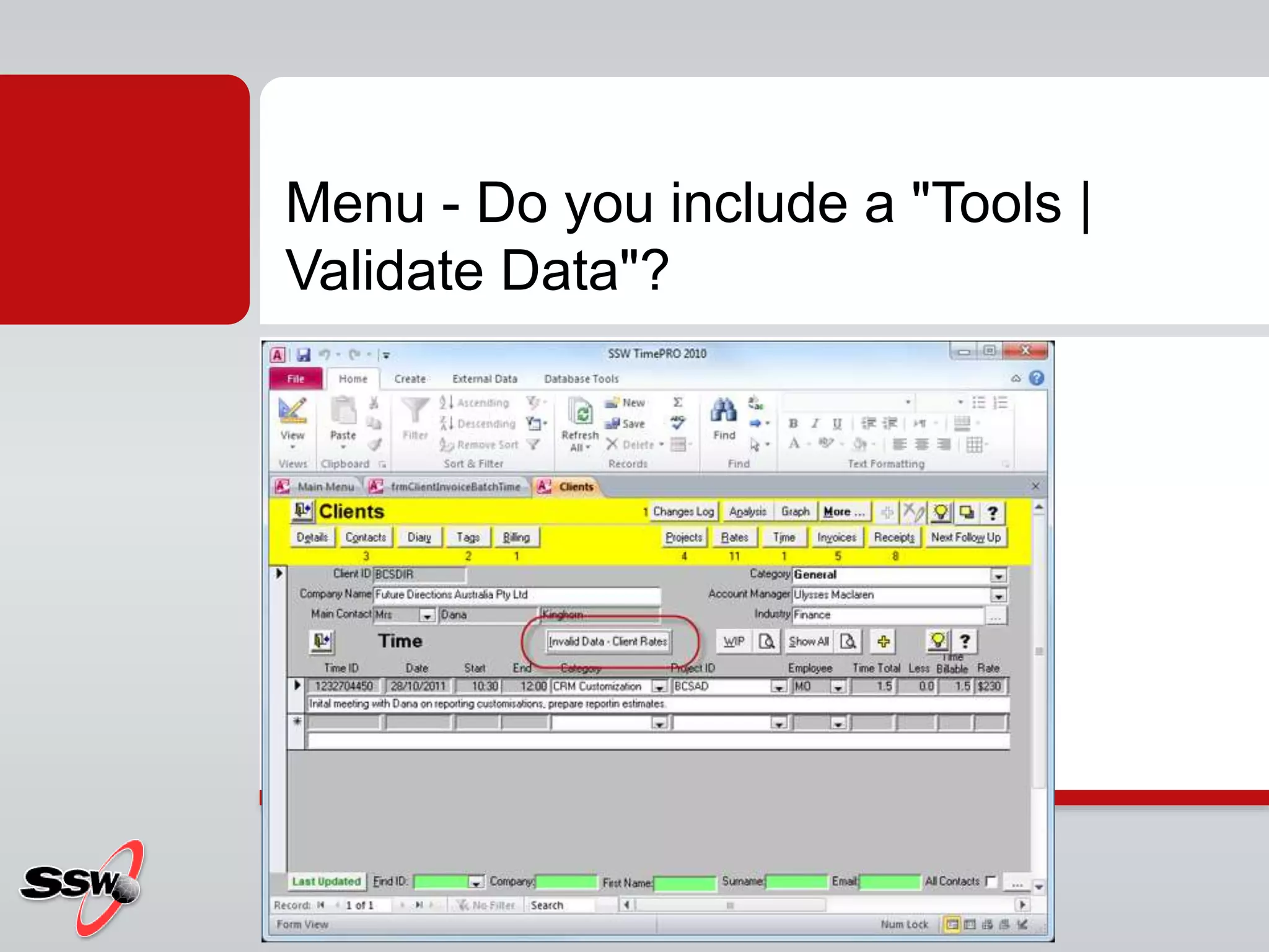
Menu - Do you know the 8 items
every "Help" menu needs?](https://image.slidesharecdn.com/interface-usability-adding-schweppervescence-ver3-8-120910074547-phpapp02/75/Interface-usability-adding-schweppervescence-ver3-8-70-2048.jpg)