“Oh GOSH! Reflecting on Hackteria's Collaborative Practices in a Global Do-It...
Magazine ancillary planning
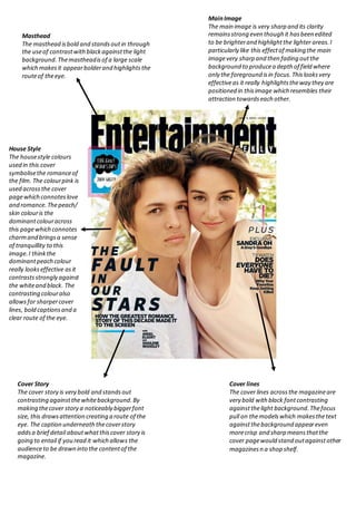
1. Masthead
The masthead isbold and standsout in through
the useof contrastwithblackagainstthe light
background.Themastheadisof a large scale
which makesit appearbolderand highlightsthe
routeof theeye.
MainImage
The main image is very sharp and its clarity
remainsstrong even though it hasbeen edited
to be brighterand highlightthe lighter areas.I
particularly like this effectof making the main
imagevery sharp and then fading outthe
background to producea depth of field where
only the foreground isin focus.Thislooksvery
effectiveas it really highlightstheway they are
positioned in thisimage which resembles their
attraction towardseach other.
House Style
The housestyle colours
used in this cover
symbolisethe romanceof
the film. The colourpink is
used acrossthe cover
pagewhich connoteslove
and romance.Thepeach/
skin colouris the
dominantcolouracross
this pagewhich connotes
charmand bringsa sense
of tranquillity to this
image.I thinkthe
dominantpeach colour
really lookseffective asit
contrastsstrongly against
the whiteand black. The
contrasting colouralso
allowsfor sharpercover
lines, bold captionsand a
clear route of the eye.
Cover Story
The cover story is very bold and standsout
contrasting againstthewhitebackground.By
making thecover story a noticeably biggerfont
size, this drawsattention creating a route of the
eye. The caption underneaththecoverstory
addsa brief detail aboutwhatthiscover story is
going to entail if you read it which allows the
audienceto be drawn into the contentof the
magazine.
Cover lines
The cover lines acrossthe magazineare
very bold with black fontcontrasting
againstthelight background.Thefocus
pull on themodelswhich makesthetext
againstthebackground appeareven
morecrisp and sharp meansthatthe
cover pagewould stand outagainstother
magazinesn a shop shelf.