
Recommended
More Related Content
What's hot
What's hot (18)
Similar to Nme front cover analysis
Similar to Nme front cover analysis (20)
Recently uploaded
Recently uploaded (20)
Nme front cover analysis
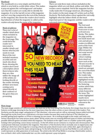
- 1. Masthead The masthead is in a very simple and block font which is very bold in a solid white colour. This makes it pop out against the red background and makes sure that the readers are easily able to identify the magazine. It is in the top left corner of the magazine and isn’t very big compared to the rest of the features on the magazine, this shows the readers don’t need a big indication of what the magazine is called as the readers already know the name of the magazine. Colours There are only three main colours included on the magazine which are red, black, yellow and white. This creates a more simplistic feel to the magazine but also really makes the front page stand out, attracting also the readers to the main image of 5 artists such as Pete Docherty. The bold yellow colour against the red really highlights what the editors think are the most important part of the magazine and the readers will be extremely interested in. Main Image The main image consists of 5 differentartists the main one at the front being Pete Docherty.He is larger than the rest of the features on the page showing he has the most importance than the others artists or more relevant to the readers. Pete Docherty was the main singer and guitarist of ‘The Libertines’ whowere and are still an extremely famous indie/rock band. Showing Pete on the frontcover couldattract a lot more readers because they want to find out if The Libertines are possibly getting back together or if Pete is releasing his own music. He is looking straight at the reader and looks very serious showing he has some serious music plans? All the artists seen are wearing different types of clothes, eachshowing possible different genres included within the magazine. The furthest on the right is seen in a leather jacketwith a gothic looking t shirt presenting a more heavy rockmusic. Tothe left of him wesee someone in a top hat and a brownjacket. This could present folkmusic included in the magazine. Then there is Pete Docherty whois normally seen in ripped jeans and ruffed up t shirts but in this image he is wearing a blacksuit jacket, blacktrousers and a white shirt, again showing he is getting more serious about his music and growing up. To the leftof Docherty wecan see Paul Weller in a suit and tie, he could represent an older generation of rockmusic. The artist to the left of Paul Weller is wearing a blackleather jacketa low cut black t shirt witha fashionable hair cut, this couldrepresent a pop rock genre Mode of address There isn’t a lot of smaller detail about whats included in the magazine on the front page. This could show the reader isn’t interested in smaller details and knows what he/she wants to read. Most of the text included mentions an artist and not much else about them, showing the readers don’t need a description about them to know who they are. Also within the image all of the artists are looking directly at the reader showing all their new music coming out is aimed directly at their audience of the genre they are presenting. Font The font used within the whole front cover is sans serif and very blocky. This makes the page and the text itself stand out a lot and attracts readers to different parts of the front page. Within the different parts of text some words are a different colours making them stand out more such as the ’50 new records’ is in red making it stand out amongst the rest of the black text. This makes the reader take more notice of the highlighted words. This is also seen in the featuring section which lists many different artists featured in the issue. The artists highlighted maybe more important or more relevant to the reader.