Measures of Dispersion and Variability: Range, QD, AD and SD
Double page spread
1. OliviaTaylor
Double page spread –
Kerrang
House style - the house
style isblackwhite and
yellow andthisrelatesin
all articlesandthe front
cover.The coloursused
relate backto the genre
of musicRockand Roll.
The colours are dark and
moodymuch like the
genre of the musicrock
and heavymetal.
Guttenbergdesignprinciple-
inthe strongfallowarea
there iswhite text“Of Mice
&Men” thisisone of the
firstplace our eye isdrawn
to and we clearlysee the
band’sname so were aware
the article isabout them. In
the primaryoptical area
there ispart of the headline
and twomembersof the
band,thisshowswhothe
article isaboutand what the
article isabout.
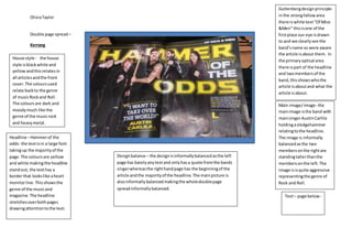
Main image/image- the
mainimage isthe band with
mainsingerAustinCarlile
holdingasledgehammer
relatingtothe headline.
The image is informally
balancedasthe two
membersonthe rightare
standingtallerthanthe
membersonthe left. The
image isisquite aggressive
representingthe genre of
Rock and Roll.
Headline –Hammerof the
odds- the textisin a large font
takingup the majorityof the
page.The coloursare yellow
and white makingthe headline
standout, the texthas a
borderthat lookslike aheart
monitorline. Thisshowsthe
genre of the musicand
magazine.The headline
stretchesoverboth pages
drawingattentiontothe text.
Text– page below -
Designbalance – the designisinformallybalancedasthe left
page has barelyanytextand onlyhasa quote fromthe bands
singerwhereasthe righthandpage has the beginningof the
article andthe majorityof the headline.The mainpicture is
alsoinformally balancedmakingthe wholedoublepage
spreadinformallybalanced.
2. OliviaTaylor
TextAnalysisKerrangSecondPage
Text- Alliteration“whatwe were”thisisusedwhenAustinistalkingabouthowwhentheyfirststartedthe bandtheydidn’treallyknowwhattheywere
doingand howtheyjusthad fun.The textisin an informal interview/chatstyle andthiscomesoff asextremelypersonal andmakesthe readerfeellike
theyare personallytalkingtothe band. Ellipsis–“ we’re agreat band”thisis usedwhenthe leadsingeristalkingabouthowmuchsuccessthe bandhas had
, comingoff as cocky and sure makinghimseemconfidentinhisband.Thislinks backto the picture of himholdingasledgehammerandshowshispower
bothphysicallyandinthe musicworld. SemanticField– “self-titled(debut) record we didn’tknowwhatwe were doingwe were abunchof kidsinthe
studio”thisisusedwhenthe leadsingertalksabouthowtheybeganandhowtheygot to where theyare today.The style of textthroughoutthe interview
isveryinformal andconversational whichsuitsthe targetaudience asteenagerswill notwanttoreadformal text.
3. OliviaTaylor
Q
Text– alliteration- Duos
2011 debut- talkingabout
howthe band foundfame
the textisin a formal style
before the interviewbegins.
Ellipsis- “it’snotmorbidit’s
positive”thisisusedwhen
the band isbeing
interviewedandwasasked
abouttheirowndeath
circumstances.Thisisina
interviewstyle howeverit
isn’tyourtypical interview
for a musicmagazine.
House style- the house
style iswhite blackandred
themedcorrespondingto
the front page and
contentspage.Byusing
the same colours
throughoutthe magazine it
lookspolishedandclean
cut givingita professional
feel.
Guttenbergdesignprinciple
– inthe primaryoptical area
the headline –CASHFOR
QUESTIONSis shownthisis
the firstthingwe see and
whatour eyesare drawn to
whenwe firstlookat the
spread.It tellsthe audience
whathe spreadisabout.
In the strongfallowarea
there isa small caption- off
the wall rizzle kicksgive it
the full batmanand robin.
Thisshowswhatthe main
image isaboutand
introducesthe interview.
The main image iscolourful
whichwill appeal tothe
youngeraudience
Headline- Cashfor
Questions –Rizzle
kicks.The headline
isblack anda large
fontat the topof
the page andthe
bandname isinred
makingitstand out
fromthe restof the
text.
Main image - the mainimage isthe band
dressedasbatmanand robineditedto
lookAsif there climbingup a cartoon
building.The image showstheyview
themselvesassuperheroesinthe music
industry. The image isverybrightand
colourful andthe bandmembersare
smileyandhappy,verytypical of apop/
currentmusicmagazine.
Designbalance- the double page spread
isinformallybalancedasonthe leftpage
there isheadlines,textandpictures
whereasthe righthandpage is justa
picture witha badge and small;amount
of text.The targetaudience isyounger
and won’twantto readtoo much text.