Interactive Powerpoint_How to Master effective communication
Analysin 6 Digipak's
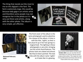
1. The thing that stands out the most to
me on this digipak is the font. The
font is extremely large, this could be
because lady gaga is an artistic artist
and therefore some people may not
recognise her in the photo as it is
very out there and artistic, along
with the other photo. The album is
very simple, yet effective.
Released February
2010
The front cover of the album is the
same photograph used to advertise
the release of the album. It links in
with the title, ‘Lights’, as their is
fairy dust lit up in her hair giving it a
magical look. The lighting in these
photographs is very dim, bringing
out the artists facial features. The
photos look very dated and almost
like they've been painted. The text
links with the album name ‘Lights’
as it looks like it is glowing.
This is amore recent album of Ellie’s from
October 2012. you can see that she has
improved as an artist as she has amore
unique artistic photo. This makes her look
more professional and shows that she has
frown within the music industry.
2. The images used in this digipak have high saturation and contrast making the images very
striking, especially the front of the digipak. The red hair brings a lot of colour to the
photo making it look warm. It almost has a retro effect as there is a tint of blue in the
places that would normally be black. Rihanna is a very famous artist. Therefore, the audience
will immediately know who it is from a glance at the cover. The photo where she is lying in
roses reminds me of Alice in wonderland. This could connote that Rihanna’s album can take you
on an adventure. The red roses may connote that the album is about romance as this is
stereotypically what red roses connote.
This photography is quite artistic as it bring the main focus on Rihanna's face. On the photo
where she is in the roses you can see that on the right panel the roses are larger and
stretched drawing the yes into the middle panel where Rihanna's face is. They have managed
this from the angle that the photo was taken from.
The font on the digipak isn't very noticeable. This is most likely because she is extremely
famous and people would already know who it is. This thin, spread out font gives the digipak a
classy look, making it look professional and neat. This is what I like most about the digipak.
It makes it look very pretty and is pleasing to the eye. It is very feminine. The font is
placed at the top and the bottom of the front cover and is spread out. This creates main focus
3. The images used in this digipak are very artistic photography. They are very simple but she is
wearing artistic/statement clothes. The font on this digipak is quite small. This is because
Beyonce is a very established artist and therefore people would recognise her album from
her face. This digipak has a very 1920’s feel to it as the CD’s look like vinyl records ad the
images are in black and white. The artist is represented in a very sexual way. This appeals to
the male gaze as males want her and females want to be her. This represents pop/RnB very
well as the pictures aren't too out there and they mainly focus on the artist.
4. The image used is quite artistic
photography. There are high levels
of contrast, making David Guetta
stand out more as he stands out of
he shadow.
David is wearing aviators in this
photo. This may be because he is
commonly seen wearing sun glasses
as he DJs around the world
especially in places like Ibiza
and Mallorca rocks. These are
party holiday destinations. You
can also see what his top says,
“Haymakers”, suggesting that he
is the best in the house genre of
The black and white style helps
music.
the title f the album, “One Love”, stand out. Pink is a stereotypical
colour to be used in the house genre, so is yellow. This gives you an
idea, along with the font, of what type of music it is (house). The font
of the album title is like paint, this is quite messy suggesting that it
isn't something like classical music and that it is loud and fun.
The font of the artist’s name, “David Guetta”, is in the font that they
always use. This is a font specifically for David Guetta as an artist.
5. The images used in this digipak are very unique. However, they link with the name of the album,
“Only by Night”. Therefore, it works very well. The way they have edited the front cover of the
digipak is very clever, as all four members of the band are on there making up one face. The
back of the digipak as meant to act like the back of the head. I, personally, think that this is very
effective. The text font on this digipak is tiny. You would have to pick up the album to see who it
is and what songs they have on the album. However this can be seen as clever because the
photo on the front may entice the consumer to pick it up. King of Leon have an alternative,
arena rock sound. Their photos represent their genre well as it is unique. It is a convention of
rock bands to involve dark colours like black and they have used dark greens and black in their
photos. Their is also a sense of night. Their album over is very recognisable due to their unique
edit to the photo.