1. Q
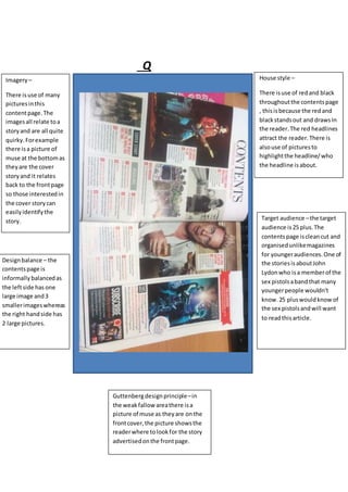
House style –
There isuse of redand black
throughoutthe contentspage
, thisisbecause the redand
blackstandsout and drawsIn
the reader.The red headlines
attract the reader.There is
alsouse of picturesto
highlightthe headline/who
the headline isabout.
Imagery –
There isuse of many
picturesinthis
contentpage.The
imagesall relate toa
storyand are all quite
quirky. Forexample
there isa picture of
muse at the bottomas
theyare the cover
storyand it relates
back to the frontpage
so those interestedin
the cover storycan
easilyidentifythe
story.
Designbalance – the
contentspage is
informally balancedas
the leftside has one
large image and3
smallerimageswhereas
the right handside has
2 large pictures.
Target audience –the target
audience is25 plus.The
contentspage iscleancut and
organisedunlikemagazines
for youngeraudiences.One of
the storiesisaboutJohn
Lydonwho isa memberof the
sex pistolsabandthat many
youngerpeople wouldn’t
know.25 pluswouldknowof
the sex pistolsandwill want
to readthisarticle.
Guttenbergdesignprinciple–in
the weakfallow areathere isa
picture of muse as theyare onthe
frontcover,the picture showsthe
readerwhere tolookfor the story
advertisedonthe frontpage.
2. Kerrang
Designbalance- the
contentspage is
informallybalanced as
the picturesare dotted
aboutacross the page
givinga messylook
whichreflectsthe
genre
Target audience –the
target audience ismale
teensas the musicisn’t
as popularwitholder
people.The advertsin
the magazine relate to
affordable products
teenagerswouldbe
able to buyfor
example tourtickets
Guttenburgdesignprinciple-
In the weakfallow area there isa picture of
nirvanaand small textthisisbecause the
lastplace our eyeslook.Inthe strongfallow
area there is the contentspage symbol ,a
large blackcircle withthe word contenton
writteninwhite thisstandsout andis the
firstplace our eye travelsto.
House Style- The main
coloursare redblackand
yellowlinkingbackto the
frontcover.There is a
mainpicture at the top
of the contentspage
showingthe band“A day
to remember”inthe
Kerrangoffices.There is
alsoothersmall pictures
thisissimilarinall
magazinesthe onlything
that changesisthe size
of the picture andthe
side badge thatsays “this
issue wascreatedwith
helpfrom”
Imagery- there is
multiple pictures usedin
the contentspage the
imagesall relate to
stories.The picture in
the weakfallowareaisa
picture of nirvana
relatingtoa story.
3. Q and kerrangmagazine are verydifferentstylesandhave manydifferences.Kerrangislessclean
cut and more messy whereas Qispolishedandcleancut.
Kerrangis a cheapmagazine aimedatteenage boyswe cantell thisbythe advertisementswithin
the magazine andalsothe use of colourseg the redand blackis veryboyishandpunkthemed. Qisa
slightlymore expensivemagazineaimedatanaudience of 25+ againthisis notable bythe adverts
and colours,the maincoloursare white redand blackwhichare similartoKerranghoweverin
Kerrangthere isalsouse of yellowtext.
Both magazineshave agooduse of imageryandan informal designbalance howeverQmagazine
looksmore cleancut and organisedwhereasKerrangslooksmessyandchaoticsimilartoitstarget
audienceslife.Althoughtheybothhave thesesimilaritiestheyare verydifferenttosuitdifferent
audiences.
the magazinesbothuse the Guttenbergdesignprinciplethe same waybyputtingthe key
information/storyinthe strongfallowareassoit’sthe firstthingthe audience sees. The other
picturesinbothcontentspage relate tootherstoriesinthe magazine.
Overall bothmagazinesare similarintechnique astheyuse theminthe same waybutboth create a
verydifferentlooktoattract differentaudiences.If the magazineswere of the same genre they
wouldlookmore similarhoweverbecausekerrangisaHard rock magazine andQ isA classicrock/
indie magazine theylookverydifferent.