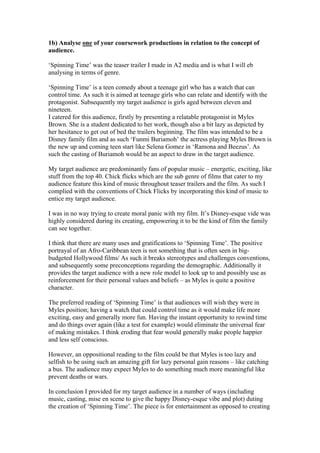
The document discusses the analysis of film poster conventions for a coursework project. Key conventions identified include bold graphic fonts, glamorous photography, smaller framed photos, and barcode/edition information. The response describes applying these conventions to create a horror film poster, including taking photography, using a glowing font over a character's head, and "cracked" fonts to fit the genre theme. Overall, the response reflects on gaining more confidence in identifying generic conventions and improving technology skills over the two-year course.

