1. The masthead for this magazine is very bright and bold. The main part of the
masthead (‘Hammer’) is in red which is a very dominant colour. The whole of the
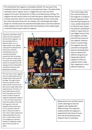
masthead is also in capitals, and is in a bigger font size to the rest of the The central image really
magazine front cover. By having this it makes it very bold and eye catching. This fits in with the theme of
magazine has also used its colours to fit with their genre. Metal hammer focuses the magazine. It is obvious
on heavy rock music, which is a very dark and angry type of music. So by using by their appearance that
the colours they have shown this. For example, red is stereotyped with anger, they will sing that genre of
danger etc. And they have not used extremely bright colours, but have made the music, and by having them
whole magazine front cover look very dark and mysterious so the audience gets on the front cover it gives
a real feel of what may be inside the magazine. the audience something to
relate to. It gives them an
even bigger reason to buy
They have used a flash, which
the magazine, and they
stands out a lot compared to
the rest of the magazine. It is
feel that they are part of
the only object that is a the magazine. However,
different shape. It is in a there is a central image
bright orange, and is slightly the magazine have also
covering the masthead which used other small graphic
catches your attention features. By having these
automatically as you are they can show lots of
normally firstly drawn different things that are
towards the title. By reading
happening inside the
this it makes the reader want
magazine so they can
to read on. By having clashing
colours for example the circle
advertise what’s inside
organge and the writing white their magazine to a lot of
and yellow it becomes very different audiences.
bold and eye catching.
The cover lines on the magazine
cover are bright yellow with an
orange lining so they jump off
the page. The bright colours
draw your attention to the
words and the contrast to the
dark central image makes them
really stand out. The font is in
block capital letters and the
front cover gives you a list of
teasers of what’s inside the
magazine drawing the audience
in. The use of buzz words also
makes the audience think that Metal hammer has used their layout
this magazine is the only to their advantage to have the
magazine that has that story magazine seem packed with
etc. For example ‘Exclusive different things. This makes the
total’, it draws the reader in. audience believe the magazine is
This is also in block capitals and packed full of information of music,
bright yellow light the cover and is full of interesting and new
lines. It really makes it stand
things for them to read about.
out; bringing your attention
towards it, making the reader
want to find out what it is
about.