
Recommended
More Related Content
What's hot
What's hot (19)
Viewers also liked
Viewers also liked (20)
Similar to Prelim Analysis
Similar to Prelim Analysis (20)
Recently uploaded
Recently uploaded (20)
Prelim Analysis
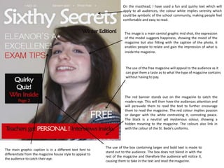
- 1. On the masthead, I have used a fun and quirky text which will apply to all audiences, the colour white implies serenity which could be symbolic of the school community, making people feel comfortable and easy to read. The image is a main central graphic mid shot, the expression of the model suggests happiness, showing the mood of the magazine but also fitting with the caption of the photo, it enables people to relate and gain the impression of what is inside the magazine. The use of the free magazine will appeal to the audience as it can give them a taste as to what the type of magazine contains without having to pay. The red banner stands out on the magazine to catch the readers eye. This will then have the audiences attention and will persuade them to read the text to further encourage them to read the magazine. The red colour implies passion or danger with the white contrasting it, connoting peace. The black is a neutral yet mysterious colour, showing a hidden meaning to the magazine. The colours also link in with the colour of the St. Bede’s uniforms. The use of the box containing larger and bold text is made to The main graphic caption is in a different text font to stand out to the audience. The box does not blend in with the differentiate from the magazine house style to appeal to rest of the magazine and therefore the audience will notice it, the audience to catch their eye. causing them to take in the text and read the magazine.
- 2. Sectioned contents into columns, rule of 3, helps the reader easily navigate around the magazine as well as giving it an organised structure. Large page numbers to make finding pages easier, shows the pages that stand out more by being a larger bold text. Photo caption articles to give a very brief description about what’s on the specific page as well as slightly introducing the image. Actual contents list to show what’s on what page as well as the page number to allow the audience to see what’s where.