The magazine cover uses design techniques to attract buyers:
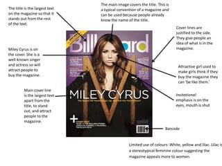
- The title is the largest text to stand out from other text.
- Miley Cyrus is featured on the cover to attract people given her fame.
- Cover lines provide a preview of magazine contents to generate interest.
- Limited colors like lilac suggest the magazine appeals more to women.


![Magazine research really official [recovered]](https://cdn.slidesharecdn.com/ss_thumbnails/magazineresearchreallyofficialrecovered-160222160255-thumbnail.jpg?width=640&height=640&fit=bounds)


![Magazine research really official [recovered]](https://cdn.slidesharecdn.com/ss_thumbnails/magazine-research-really-official-recovered-160211094822-thumbnail.jpg?width=640&height=640&fit=bounds)


