
Recommended
More Related Content
What's hot
What's hot (20)
Similar to Magazine comparison
Similar to Magazine comparison (20)
More from maximgummer
More from maximgummer (20)
Recently uploaded
Recently uploaded (20)
Magazine comparison
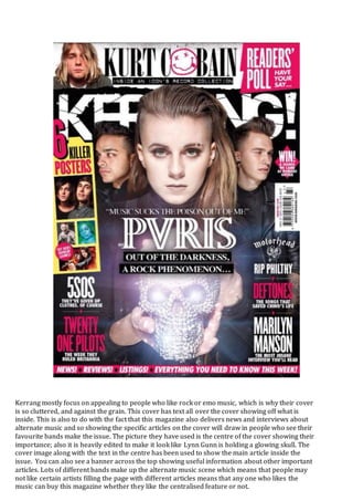
- 1. Kerrang mostly focus on appealing to people who like rock or emo music, which is why their cover is so cluttered, and against the grain. This cover has text all over the cover showing off what is inside. This is also to do with the fact that this magazine also delivers news and interviews about alternate music and so showing the specific articles on the cover will draw in people who see their favourite bands make the issue. The picture they have used is the centre of the cover showing their importance; also it is heavily edited to make it look like Lynn Gunn is holding a glowing skull. The cover image along with the text in the centre has been used to show the main article inside the issue. You can also see a banner across the top showing useful information about other important articles. Lots of different bands make up the alternate music scene which means that people may not like certain artists filling the page with different articles means that any one who likes the music can buy this magazine whether they like the centralised feature or not.
- 2. This magazine cover takes a significantly different route through showing the contents of the magazine. The band featured in the magazine is the same but the way of presenting them is different. In this magazine the band a presented more like a pop or alternate group than too a rock band like in the Kerrang magazine. Also the only evidence of any other articles is in the top lines above the AP logo, this is much simpler than Kerrang though as the line doesn’t have any full sentences and for the most part is just a list of names. Kerrang chose to use Pvris’ actual logo whereas AP made their own. AP is defiantly the route I would personally like to go down as it represents the alternate genre a lot better, Kerrang seems a lot more focused on appealing to the rock scene and the emo scene rather than the alternate scene.