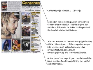
1. Contents page number 1 (Kerrang)
Looking at the contents page of kerrang you
can see that the colour scheme is quite dull
and dark. This could be linked to the genre of
the bands included in this issue.
You can also see on the contents page the way
all the different parts of the magazine are put
into sections such as feedback,news,live
reviews,features,icons,album
reviews,gigs,swag and famous last words.
At the top of the page it gives the date and the
issue number. Readers would find this useful
and informative.
2. Contents page number 2 ( Rolling stones)
Looking at the rolling stones magazine
contents page we can see that some of
the colours are quite bright and the title is
in bold. This could be because they want
us to notice it first.
The different parts of the magazine are
also put into sections here. The sections
used are Features, Rock & Roll and 2012
year in review.
In the middle of the page there is a
section with a caption entitled ‘The 50
greatest hip-hop songs of all time. This
would attract readers because they may
want to see if their opinion on the
greatest hip-hop songs differs from the
rolling stones.
3. The title of the magazine and
the page are both in bold. This
is so the reader knows straight
away what the page is.
Special offers
here that will
attract the
reader to get a
subscription
Even though the
only colours most
used are red and
white it still seems
quite bright and
vibrant. There
might be a
particular happy
vibe to this specific
issue.
The different
parts of the
magazines are
put into the
sections
news, radar, r
eviews, live
and features.