Independent Sonagachi Escorts ✔ 9332606886✔ Full Night With Room Online Booki...
Front cover analysis
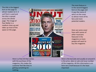
1. The title is the biggest
font on the page to
attract readers to it. A
serif font is used and
the title is spread
across the whole
page. The image of
Paul Weller is a
medium close up and
takes up most of the
space on the page.
Here is a free CD that comes
with the purchase of the
magazine, this makes the
customer feel like they’re
getting something for
nothing
The main feature is
in the second biggest
font on the page and
it says the name of
who’s on the cover
to attract more of his
fans and more
potential readers.
Here are some cover
lines with names of
other musicians
featured in the
magazine so more
people will want to
buy the magazine.
Here is the barcode and usually on around it
is the price, date on sale and issue number
of the magazine. All this information is on
here very small because it’s the least
important
2. The puff shows a
competition prize
The title font is a white
bold san serif font. The
lines through the title
could represent shattered
glass which can be
associated with rock
music. As the genre is
know for smashing up
stuff.
Here are some free pull out
poster, these tend to appeal
to younger readers who put
them up on their bedroom
walls.
In this issue of Kerrang
multiple singers are on
the cover, this will
attract more readers to
pick up a copy if one of
their favourite bands
are in it.
The main feature is
in the centre of the
page and is the
biggest thing. This
signifies the
importance of the
feature.
The barcode on
Kerrang also has the
price and issue number
here as well just like
other magazines
3. Here in the corner
of the title self
promotion. This is
the website
address so that
you can read news
about bands
straight away.
Here is another list of bands
that are featured in the issue
and it’s a bigger list so more
people will want to buy rock
sound to read about the
bands.
Above the title other bands featured in
this issue are listed. This is at the top
because so it’s near the title which is the
biggest thing on the page.
The photo is a close up
of Dave Grohl who’s
band (the Foo Fighters)
is the main feature in
this issue.
The cover lines here
are some of the other
stories featured in the
issue to attract more
readers.
4. Since the title is
only one letter it is
place in the top
left hand corner as
this is where we
start reading.
The 100 is in a bold
bright colour to
attract attention to
it.
Just like all the other
magazine front covers
other musicians
featured in the issue
are listed.
The use of a quote is
more intriguing as the
quote is out of
context so they will
want t read to find
out more about why
that was said
Here is a puff, the use of
it makes the story
separate from all the
others on the page.
5. The use of the word
free draws attention
to the magazine
because people like
free stuff, also it’s in
the top left hand
corner of the page
which is where most
people start reading.
Here just like in
Uncut is a free CD
so it gives the
reader the sense
of getting
something for
nothing.
Cover lines showing
other stories featured
in this issue with the
band/artist’s name
being bigger.
Barcode in the same location
as the other magazines also
here, like Uncut, you can find
all the information about the
magazine such as price and
the issue number