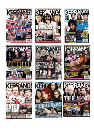
2. Front Cover Overview
The front covers which I chose to look at are all from the front cover of ‘Kerrang!’ magazine, this
means that they all were designed for specific target audience i.e funs of rock and heavy metal
music, who tend to live a very wild lifestyle. In addition to this, since I myself plan to create music
magazine similar to ‘Kerrang!’, this investigation will help me to identify common features and
patterns in this magazine, which I will then be able to include in my own magazine cover.
All front covers which can be seen above promote standard magazine front cover coventions such
as: a main image, which stand out in comparison to everything else on the front cover, featuring
the rock band that this edition promotes; the mashead is always kept the same and is presented in
an appropriate font; sell-lines surround the image and lure in the target audience and feature article
photos that relate to the content inside.
Furthermore, there are other repeated patters which can be seen on each front cover. For example,
every single front cover, which can be seen above, features a rock band instead of an artist. The
consistent appearance of bands on the front cover of ‘Kerrang!’, shows that solo artists are very rare
in the genre of music that this magazine celebrates. The reason for that is because heavy rock and
metal music requires loud solo electric guitars, as well as bass guitar and heavy drums sounds in
order to generate this king of resonance. Furthermore, the importance of the band is especially
shown during the ‘live’ performances, as the band knows each song by heart and is able to cover up
mistakes any of the band members may make during it. On every single front cover the audience can
see that one member of a band is standing at the front of the frame, highlighting his/her importance
in the band. The rest of the band members are positioned behind, forming a triangular shape so that
the audience would be able to see all of them. This is done in order to indicate the leader of the
band, who is usually the lead vocalist, which the viewer is more likely to recognize. This can be seen
as a very effective and clever way of luring in the audience. This idea is taken a step further in two
front covers of ‘Kerrang!’, featuring Paramore and Fall Out Boy, as the lead singers are not only
placed at the front of the band, but also they both lean forward, closer to the audience, almost
forcing them to give the singers more attention.
Looking at the front covers of ‘Kerrang!’, almost all of the artists presented on the front cover of
‘Kerrang!’ are male, except for the only female artist Hayley Williams of Paramore, who graces one
particular edition. Furthermore, smaller feature article photos, which can also be seen around the
front covers of ‘Kerrang!’, are also dominated by male artists. This suggests that male musicians are
seen as one of the key factors shaping the themes explored in rock music. At the same time, some
people may argue that it can be seen that females are underrepresented in the music press and,
perhaps, the music industry in general.
Moreover, there are similarities in the mise-en-scene, which can be seen throughout each magazine
front cover. Almost on every front cover, each band member wears similar costumes. The artists are
united by the fact that all of them wear informal clothes, such as T-shirts and sleeveless T-shirts,
hoodies, jeans etc., which are styled in a dark and relaxed colour. Those types of costumes are often
associated with the genre of rock and heavy metal music. However, on one of the front covers, the
members of Bring Me The Horizon are draped in a British flag, which consists of the colours blue, red
and white. Those bright colours make this front cover stand out on comparison to other ‘Kerrang!’
front covers. This prop selection is very remarkable and unusual, but reflects a celebration of
3. Britishness and British music, as well as showing that the band is proud to be British and is not afraid
to express that. The choice of prop is complimented by the accompanying sell-line: ‘Cool Britannia’.
Furthermore, this look may be more gladly accepted by not only the target audience, but by a
society in general, as well. The reason for that is because the band members show patriotic spirit,
giving an inspirational look to people, showing them that even if you like rock and have tattoos all
over you body, you are not necessary a bad, disrespectful person who lives a wild and rebellious life.
This could be said to break a common stereotype. The words ‘Cool Britannia’ might also suggest that
the music of bands like ‘Bring Me the Horizon’ helps to make Britain cool. In addition to the mise-en-
scene already discussed, dark long hair seems quite popular with this genre of music, as most of the
artist feature on the front covers have dark or/and long hair, thus reflecting the dark mood
associated with the genre of rock and heavy metal music. The artists also often have untidy edgy hair
style, as well as asymmetrical cuts, reflecting a desire to be different and to not follow the crowd.
Another shared feature, which can be seen on all nine front covers is that they all feature smaller
feature article photos which are related to the articles within the magazine. Normally those photos
are presented in smaller form so that they won’t take the attention of the main image. The smaller
photos could be article related or presented in the form of posters, which could be found inside the
magazine. The fact that every single release of ‘Kerrang!’ have posters included inside, shows that
the fans of rock and heavy metal music admire them and use them to decorate their rooms. All the
feature article photographs feature only male artist, with the only exception of Hayley Williams, thus
showing that women in this genre of music are rare. The mise-en-scene is consistent with the large
main image.
Furthermore, on each front cover the masthead ‘Kerrang!’ is always placed in exactly the same place
and always maintains the same look with a shattered, ‘broken-glass’ font. The only thing that varies
from edition to edition is the colour of the mast head; sometimes it is printed in black on a white
background or vice versa, thus establishing a dark and masculine mood. Moreover, in every edition
the head of one or more band members is placed in front of the masthead, thus showing that the
magazine is well known and popular. Not many relatively new magazines are able to do that since
the name of the magazine is not yet well recognized. However, it is a different story with ‘Kerrang!’,
as ‘Kerrang!’ is established and has a very loyal fanbase. Another repeated feature of this magazine
is the strapline which is always placed directly above the masthead. In most of the cases the
strapline contains the names of the artists which feature inside the magazine, thus luring in the
audience, but sometimes it promotes giveaways and competitions. For example, on one of the front
covers featuring Biffy Clyro, the audience are informed that the magazine have a ‘massive download
ticket give away’, thus encouraging the readers to buy the magazine. Furthermore, this give away
reminds us that the target audience of ‘Kerrang!’ is likely to be an aspiring musician themselves.
Looking at the front covers of ‘Kerrang!’, we can clearly see that there are not a lot of sell-lines,
which could be seen as a reminder of the fact that the readership is male; males respond better to
visuals. Along with the feature article photos, which can be seen on the front cover, in most of the
cases, there is only one sell-line, which is always the name of the band featured on a main image.
However, sometimes it is accompanied by further text, for example ‘Biffy Clyro unfolds the puzzle of
life…’. One of the reasons for this is that the frame is already dominated by the main image and
smaller photos. It can also be due to the fact that since the magazine is well known and it has a loyal
fanbase, the use of only main image featuring a rock band is enough to sell the magazine. Even
4. though there are not a lot of sell-lines, each release contains a list of artists which are included in the
magazine, thus luring in the audience and telling them that there is something for everyone. The fact
that it is written in a list it shows that there are a lot of bands which perform rock and heavy metal
music.
The colour scheme of ‘Kerrang!’ magazine usually sticks to the two dominant colours which are
accompanied by another colour that varies from edition to edition. The two dominant colours are
black and white accompanied by red, yellow or blue. The fact that all these colours are primary,
helps the magazine to appeal more to male readers, while the colour black reflect the dark nature of
this genre of music. However, occasionally colours like brown and pink appear as accompanying
colours, as can be seen on two of the front covers, such as the one featuring Paramore. Pink is used,
perhaps, to highlight the feisty femininity of lead singer Hayley Williams.
The layout of every single ‘Kerrang!’ edition is always kept roughly the same. As I have motioned
earlier, the masthead is always placed in the same place, as well as the main image. In general the
main sell-line is placed either at the centre of the front cover or bottom left, thus placing them in key
areas of the front cover where the audience’s eyes will go automatically. However some exceptions
can also be seen. For example, on one front cover featuring Paramore, the main sell-line is located
nearer to the masthead. On the other hand, unlike the main sell-line, the article photos are placed
nearer the bottom of the front cover, thus ensuring that they wouldn’t cover the main image or
main sell-line. However at the same time they are be visible enough for the audience to see, which is
important as they are one of the key ways to lure in the audience.
Now that I have carried out this overview I can definitely say that ‘Kerrang!’ has its own brand
identity, which the target audience are familiar with and can relate to. The brand identity is
maintained through the repetition of the layout of the magazine as well as stylistic features every
edition. This is an example of a successful way of helping the ‘Kerrang!’ to sell more magazines.
Looking at this overview it gave me some ideas on how I should present my own front cover for the
magazine that I am going to produce. For example, my main image will also feature a band with a
lead singer at the front and the rest of the band members forming a triangle behind him. I will also
add some smaller image of other bands featured inside the magazine.