1. Colour scheme
The 3 main colours used are pink, black
and yellow, white a bright white
background. This colour scheme makes it
clear that the target audience is girls as
these are feminine colours.
House Style
The house style of the magazine is very feminie
bright colours which ties in with the light hearted
content of the magazine. Its also suitable for the
young target audience as it appears bright eye
catching and fun looking.
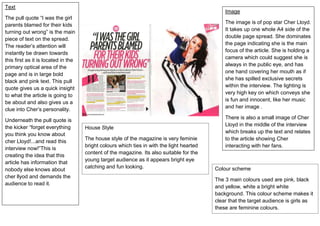
Image
The image is of pop star Cher Lloyd.
It takes up one whole A4 side of the
double page spread. She dominates
the page indicating she is the main
focus of the article. She is holding a
camera which could suggest she is
always in the public eye, and has
one hand covering her mouth as if
she has spilled exclusive secrets
within the interview. The lighting is
very high key on which conveys she
is fun and innocent, like her music
and her image .
There is also a small image of Cher
Lloyd in the middle of the interview
which breaks up the text and relates
to the article showing Cher
interacting with her fans.
Text
The pull quote “I was the girl
parents blamed for their kids
turning out wrong” is the main
piece of text on the spread.
The reader’s attention will
instantly be drawn towards
this first as it is located in the
primary optical area of the
page and is in large bold
black and pink text. This pull
quote gives us a quick insight
to what the article is going to
be about and also gives us a
clue into Cher’s personality.
Underneath the pull quote is
the kicker “forget everything
you think you know about
cher Lloyd!...and read this
interview now!”This is
creating the idea that this
article has information that
nobody else knows about
cher llyod and demands the
audience to read it.