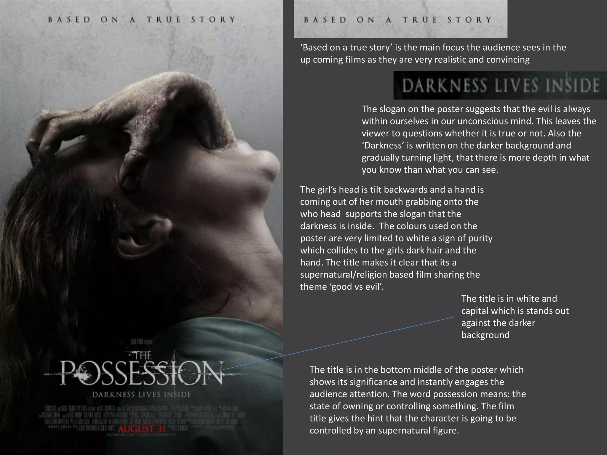
‘Based on a true story’ is the main focus the audience sees in the 
up coming films as they are very realistic and convincing 
The slogan on the poster suggests that the evil is always 
within ourselves in our unconscious mind. This leaves the 
viewer to questions whether it is true or not. Also the 
‘Darkness’ is written on the darker background and 
gradually turning light, that there is more depth in what 
you know than what you can see. 
The girl’s head is tilt backwards and a hand is 
coming out of her mouth grabbing onto the 
who head supports the slogan that the 
darkness is inside. The colours used on the 
poster are very limited to white a sign of purity 
which collides to the girls dark hair and the 
hand. The title makes it clear that its a 
supernatural/religion based film sharing the 
theme ‘good vs evil’. 
The title is in white and 
capital which is stands out 
against the darker 
background 
The title is in the bottom middle of the poster which 
shows its significance and instantly engages the 
audience attention. The word possession means: the 
state of owning or controlling something. The film 
title gives the hint that the character is going to be 
controlled by an supernatural figure.
Others films are 
mentioned that the have 
been made by the director 
so it familiar to the 
audience. 
Mystery is created by the 
misty background, giving the 
viewers an uncertainly of the 
unknown. Its winter times as 
there is a lot of fog. Also the 
trees behind suggest isolation 
and separation from the outer 
world. 
The girl is looking in from 
a window from outside, 
suggest she is either 
trapped outside looking 
in to hide as she may be 
unwanted which links to 
the title ‘uninvited’ 
There is a contrast 
between the dark dressed 
person and the lighter 
foggy forest. It creates an 
effective silhouette 
outcome keeping it a 
suspense of who the girl 
is, fits well with the horror 
genre. 
Again not having a clear 
features of the girl creates a 
sense of confused identity 
A scraggy font is 
used to make it 
looks it is not 
settled 
The tagline is very short 
and catchy . ‘Fear’ doesn't 
exist but it comes along.

Film poster

  • 1.
    ‘Based on atrue story’ is the main focus the audience sees in the up coming films as they are very realistic and convincing The slogan on the poster suggests that the evil is always within ourselves in our unconscious mind. This leaves the viewer to questions whether it is true or not. Also the ‘Darkness’ is written on the darker background and gradually turning light, that there is more depth in what you know than what you can see. The girl’s head is tilt backwards and a hand is coming out of her mouth grabbing onto the who head supports the slogan that the darkness is inside. The colours used on the poster are very limited to white a sign of purity which collides to the girls dark hair and the hand. The title makes it clear that its a supernatural/religion based film sharing the theme ‘good vs evil’. The title is in white and capital which is stands out against the darker background The title is in the bottom middle of the poster which shows its significance and instantly engages the audience attention. The word possession means: the state of owning or controlling something. The film title gives the hint that the character is going to be controlled by an supernatural figure.
  • 2.
    Others films are mentioned that the have been made by the director so it familiar to the audience. Mystery is created by the misty background, giving the viewers an uncertainly of the unknown. Its winter times as there is a lot of fog. Also the trees behind suggest isolation and separation from the outer world. The girl is looking in from a window from outside, suggest she is either trapped outside looking in to hide as she may be unwanted which links to the title ‘uninvited’ There is a contrast between the dark dressed person and the lighter foggy forest. It creates an effective silhouette outcome keeping it a suspense of who the girl is, fits well with the horror genre. Again not having a clear features of the girl creates a sense of confused identity A scraggy font is used to make it looks it is not settled The tagline is very short and catchy . ‘Fear’ doesn't exist but it comes along.