
Recommended
More Related Content
What's hot
What's hot (20)
Similar to Coming of age film poster analysis
Similar to Coming of age film poster analysis (20)
Recently uploaded
Recently uploaded (20)
Coming of age film poster analysis
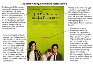
- 1. The Perks of Being a Wallflower poster analysis The background of the poster consists of one colour which is the lime green. The colour green has connotations of life, renewal, nature and energy. These could all link in within the film but by also specifically using such a bright and unlikely colour, it suggests that the story of the film is unique and perhaps quite odd. The central image is evidently separate from the background itself. The idea of the plot being quite odd is brought up again as it is obvious that the images have been edited on top and give an unrealistic look to the poster. Although, this could have intentionally been done as the film was originally a book. Therefore there is little to hide for the audience who have read the book. The font of the title is in a type writer font which suggests the idea that the film is following the story of one character in particular. This is a conventional style of font in particular for the coming of age genre as it indicates that there is a story to be told. The main focus being represented within the poster is the tagline as it is placed directly in the middle of the poster. The tagline ‘WE ARE INFINITE’ could not only be referring to the characters but the target audience. This is especially as the audience is mainly aimed towards teenagers/young adults. Therefore the phrasing suggests that there should be no limits placed on these young and carefree individuals.
- 2. The Edge of Seventeen poster analysis The tagline is placed at the top of the poster to suggest the plot of the film. This is as refers to the youth as the question is being asked to the target audience. The tagline ’You’re only young once...is it over yet?’ also indicates that the film will be showing teenage struggles. The mise en scene shows a teenage girl dressed in a hoodie and shorts. The main suggestion through this is that the girl being presented is not a typical teenage girl as she is not wearing the stereotypical colours such as pink. Moreover, as she is set as the central image of the poster, it shows that she is the main character that the audience will be following. The idea of the main female characters life being followed is apparent as the background where she is walking is blurred out. This is to emphasis the importance of the character which is why the entire background cannot be clearly identified. It could also be suggesting the world in which teenagers live in as stereotypically the young individuals are known to be self absorbed. There seems to be an evident colour scheme throughout the poster. This can be seen from the blurred out trees in the background and within the title itself. The colour orange has connotations of joy, enthusiasm, fasciation and happiness. This could relate to the coming of age genre that the film fits into as the female character is searching for a place where she belongs.