
Recommended
More Related Content
What's hot
What's hot (19)
Similar to Digi-pack inspiration
Similar to Digi-pack inspiration (20)
More from lozsheriston
More from lozsheriston (15)
Recently uploaded
Recently uploaded (20)
Digi-pack inspiration
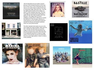
- 1. I like the Mumford and sons album artwork because I think having the picture as the main focus of the cover is more interesting than the text as I am usually drawn to albums that have an interesting image rather than title. I also like the slightly grainy quality of the images as it doesn’t scream squeaky-clean pop. I like how the image set up itself and the quality gives a subtle link the indie folk/rock genre that they belong to. The images have an artistic, ambiguous quality which is effective as it draws the audience in. They also give reference to certain genres of music and cultural values for example the Nirvana and Vampire weekend covers are more Americanised. The other examples also inspire me as it is the main image that evokes thought rather than the font. I also like the alternative set up of the images as they are more interesting than just the artist posing for the camera. My initial idea for the digi-pack would be to create an image similar to this and play around and manipulate the set up and image quality in order to create a similar aesthetic.