
Recommended
More Related Content
What's hot
What's hot (20)
Similar to Caustic love analysis
Similar to Caustic love analysis (20)
More from lilywilkinson
More from lilywilkinson (20)
Caustic love analysis
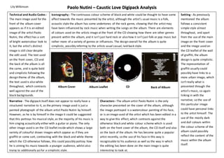
- 1. Paolo Nutini – Caustic Love Digipack Analysis Iconography - The continuous colour scheme of black and white could be thought to have some affect towards the music presented by the artist, although the artist’s usual music is a folk, acoustic style the album has some undertones of the rock genre, showing that the artist may have been influenced by rock music when writing the songs on the album. There are elements of colours used on the artists image at the front of the CD showing how there are other genres present within the album, and it isn’t just hard rock or also how it isn’t just folk or pop music but rather more of a variety of genres or influences. The design overall for the album is quite simplistic, possibly referring to the artists usual casual, laid back style. Album Cover Album Leaflet Back of Album Characters - The album artist Paolo Nutini is the only character presented on the cover of the album, although the image portrayed is a watercolour painting of his face, or is an image used of the artist which has been edited in a way to give this effect, which contrasts against the otherwise black and white colour scheme which is used both on the front cover of the album, the CD itself and also on the back of the album. He has become quite a popular artist recently, so the use of his face in this way is recognisable to his audience as well as the way in which the editing has been done on the main image is quite interesting to look at. Lily Wilkinson Technical and Audio Codes - The main image used for the front of the album cover appears as if it is an edited image of the artist Paolo Nutini, the effect has a sort of bright watercolour look to it, but the artist’s distinct image is still clear despite the edit used. The text used on the front cover, CD and the back of the album is all the same, and is quite bold and simplistic following the design theme of the album, the text used is also white throughout, which contrasts well against the use of the black backgrounds. Setting - As previously mentioned the album follows a consistent simple style almost throughout, and apart from the use of the main image on the front cover and the image used on the CD leaflet of the wall of graffiti, the album design is quite simplistic. The representation of graffiti usually could possibly have links to a more urban image, which isn’t really what is presented through the artist’s music, so again linking in with the narrative; so the use of this particular image could have personal links to the artist himself. The use of the mostly dark and dull colours within the colour scheme of the album could possibly reflect the content of the music within the album itself. Narrative - The digipack itself does not appear to really have a structured narrative to it, as the primary image used is just a painted photograph of the album artist Paolo Nutini by himself. However, as he is by himself in the image it could be suggested that this portrays his musical style, as the majority of his music is him singing acoustically either with a guitar or piano. The only other image used is on the CD leaflet inside which shows a large variety of colourful drawn images which appear as if they are graffiti or some sort, contrasting with the black and white theme which the CD otherwise follows, this could possibly portray how he is aiming his music towards a younger audience, whilst also trying to additionally go for a simplistic style. CD