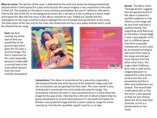
1. Mise-en-scene: This portion of the cover is dedicated to the artist and shows her being provocatively
dressed which is fairly typical for a pop artist because the sexual imagery is very important to the sales
of their CD. The artwork on the album is very summery and displays the sort of ‘california’ vibe which
links to the title of the CD. In the background it looks like a sky and as if she is sitting on a beach towel
which gives the idea that the music in the album could be for very ‘chilled out’ people and the
atmosphere on the cover could be trying to highlight the sort of people that would listen to the music.
The bold colour of her hair and on the cover also shows that she has a very ballsy attitude which could
be reflected by her songs.
Sound: The album name
‘Teenage Dream’ suggests
that the general sound of
the album is based at a
youthful audience so that
informs us the songs will
be very fresh and have a
youthful feeling. The
supporting artist featuring
on the album ‘Snoop Dogg’
is also a very popular artist
but in a different genre
that Perry is typically
involved with so this could
be an attempt at trying to
add some fresh input to
her songs and also gain
more interest from the
other artist’s fans. The
single called ‘California
Girls’ links in with all the
imagery because it is
supposed to come across
as very care free and
provocative and this is
often how Californians are
viewed. The record label
is EMI which tells us that
the music is very popular
as they are very choosy
about the artists that they
promote, so this is a
positive point on her
music.
Conventions: This album is conventional for a pop artist, especially a
stereotypical female pop artist because of the powerful image used and
the connotations we are getting from this cover. The cover overall is very
striking and it accentuates the artists bold and colourful image. The
provocative costume she wears is very conventional as it is more about the
image for the pop artists. I feel like this is the sort of album artwork that my
group would want to try and create because it’s very bold and it gives the
female a very powerful image and this is quite a popular image for artists
recently so I feel like this would be a good route for us to take.
Font: the font
reminds me of the
type of font you
would find on fair
ground rides which
gives the CD cover a
very fun image. The
font is important for
this cover especially
because it really adds
a carnival look to the
cover which detracts
from the more
carefree atmosphere.
2. Image: The artists here are introduced as a band, but as they are a pop band they are represented differently in
comparison as to how a rock band may be promoted because they are shown being friendly and smiling, this
would appeal more to their target audience who care mainly about the appearance of the band as they are
mostly teenage girls who are more fans of the artists than the actual music itself. The fact that the group is shown
messing about with one another could give the idea that they are friends and that they are nice young boys, this
gives them more of a family friendly image rather than a provocative image that some artists try to portray with
use of skimpy costume and body language. This image works well for these artists because they have the sort of
friendly and a very safe vibe to their music style because they are targeted at a much younger audience.
Album artwork: The
front cover adds to
the theme of the
artists album ‘Take
me Home’ because it
is like they are
climbing on the
telephone box in an
attempt to find their
way home. The back
cover displays the
artists carefree
attitude because
there are some hand
drawn stars on the
back which adds to
the child like feeling
of the cover, it gives
a sense of having a
playful attitude
which is good for the
type of audience
they are targeting.
Mise-en-scene: The costumes that they are all wearing have the same sort of colour scheme
which gives them a casual yet very sleek look which would make them seem more ‘normal’ to
the target audience so in turn they would be more relatable. The setting of a park would also
allow people to relate to the group because this is somewhere that they might be familiar
with and it is somewhere that young people may take a day trip to with their friends so they
might see familiarities in the album art work and feel they can relate to the artists.
3. Mise en scene: The artist is introduced with a close up image her which is conventional for a pop artist, the black
and white filter makes the gold a very central colour for the album artwork which gives the idea of wealth and
fame. This particular colour choice is something I have noticed on many female pop artist’s covers, this is
something my group may benefit from by choosing a lead colour such as gold to make the cover so much more
striking.
Imagery: The artwork on the cover looks very gritty and as though it was made very quickly, this could give us
connotations that the artist is very carefree and she doesn’t care so much about appearance, it also gives a
sense of a partying atmosphere because of the purple strobe lights which match the album name ‘ANIMAL’ so it
gives the idea the artist is a very animalistic person who just likes to let loose all the time.
Sound: The sound for this album appears to be very youthful, the mention of drugs and love in the titles of some of
her songs could be appeal to the younger audience as they may be able to relate to some of the things that are
mentioned in her songs. The record label is ‘SONY MUSIC’ so this tells us that the artists songs are very mainstream
and therefore appeal to a very wide audience, this is very conventional of a pop artist as often they are very
mainstream and lots of people like their music.
Font: The font looks
somewhat
handwritten which
gives the idea that she
is very fun and doesn’t
care about how it
looks, it also comes
across as quite
childlike in a sense
that she has doodled
some of the letters in
a way that a child
might.