2. You have been commissioned by the
Northern Echo to produce new magazine or
newspaper product. Your product could be
in any style or genre but it must be self
financed though sales or advertising. You
must also produce your magazine for a
specified audience segment within the 16-25
age group.
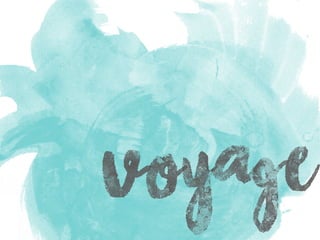
3. Voyage…
I have created a magazine which hybridizes two genres; Travel and Culture.
My magazine is constructed around students, their lifestyles and their interests.
The magazine is self financed through the use of advertisements.
Targeted a young audience, specifically 16-24 year olds
Product Objectives
4. The image cannot be displayed. Your computer may not have enough memory to open the image, or the image may have been corrupted. Restart your computer, and then open the file again. If the red
x still appears, you may have to delete the image and then insert it again.
I chose to create a travel and culture magazine as this
is something I felt the current market was lacking.
There is a gap in the market for a product that
amalgamates the two genres.
I have lived in many different places both inside and
outside of the UK, travelling is something that has
been part of my life since I was young.
6. USP
When conducting my market research I found
there were a few gaps in the market
• A travel magazine for young people
• A magazine which combined both travel and
culture.
7. - Age 16-24
- Female (75%)
- Part of the Aspirant tribe
- BC1C2 socioeconomic status
- Educational status – College or university students
- Willing spend the money on things they want in order
to live the lifestyle they want to live.
8. My secondary audience includes
Males
Older readers: including parents and grandparents
In order to keep my secondary audience satisfied I
will
• Include content that caters to their interests
• Avoid taboo language
• No inappropriate content
9. How will I appeal
• Include article content which is appropriate
for students
• Use young models
• Include content that would appeal to both
sexes
• Use unique, eye-catching design and layout
• Create conversational tones throughout my
articles
11. Bold Masthead
Main sell line
central on page.
Vibrant,
warm
colours
Additional sell
lines fill empty
space
T shape format
Idealistic
imagery
Window to future self
Catchy
sell lines
16. Positive Response
• Appeals well to the middle socioeconomic groups
• Imagery is appropriate for article
• Tone and style is suitable for T.A.
• Short paragraphs keep young T.A.’s attention
• To the point content
• Collage of images is eye-catching
Negative Response
• Colour scheme isn’t very eye-catching
• Title doesn’t capture your attention
• Lacks some important information
• Overall, DPS1 isn’t as eye-catching as DPS 2
18. Positive Response
• Professional appearance
• Main title looks different to other magazines
• Vibrant images catch the audience’s eye
• Overall look Appeals to both a male and female audience
Negative Response
• Main text isn’t very easy to read
• Not many images to accompany article
• Layout is a bit simplistic
20. Front cover
Positive, aspirational, active
Simple, T-format
Monochrome with pops of vibrant colour, bright,
positive,
Masthead: Modern, ‘handwritten’ style, connotes
spontaneity
Sell lines: Easy to read, simplistic, sans-serif
21. Contents
Includes images which coincide with articles,
Static, simplistic
Monochrome with pops of vibrant colour, bright,
positive,
Mixture of fonts used on each DPS, incorporate
elements from all parts of the magazine.
22. Durham City
Candid, Literal, Natural, Idyllic
3 page article, Simplistic, organised
Monochrome with pops of vibrant colour, fresh,
bright.
Title: Polished, Serif, cursive
Main body: Serif, simple, easy to read
1st and 2nd person narrative, conversational tone,
informative, enthusiastic
23. Insight into Indian
CultureStudio based, literal, idealistic, active
Layered, active layout, 50:50 text: image ratio.
Bright, jewel tones, eye-catching, contrasting colour
scheme
Title & Subtitles: Indian inspired font, authentic,
unique
Main body text: Serif, simple to read.
3rd person narrative, formal register, use of
terminology.
24. Bring This, Not That!
Studio based, literal, idealistic., vibrant and eye-
catching
Simple, static layout, text separated into small boxed
and breakout boxes, 50:50 text to image ratio
Monochrome colour scheme, neutral, vibrant colours
found in images.
Title: Indian inspired font, authentic, unique
1st person narrative, conversational, personal, ‘matey’
comedic tone.
32. Marketing strategy
Free to distribute
Why?
• My T.A. don’t have much money to
spare
• Helps establish an audience
• Saves money as I don’t have to pay
distributors etc.
33. Advertising Rates
Back cover £2500
Inside front £2300
Inside back £2000
Double page spread £4000
Full page £1900
Half page £900
Quarter page £500
Eighth Page £300